9
8
7
6
5
4
3
2
1

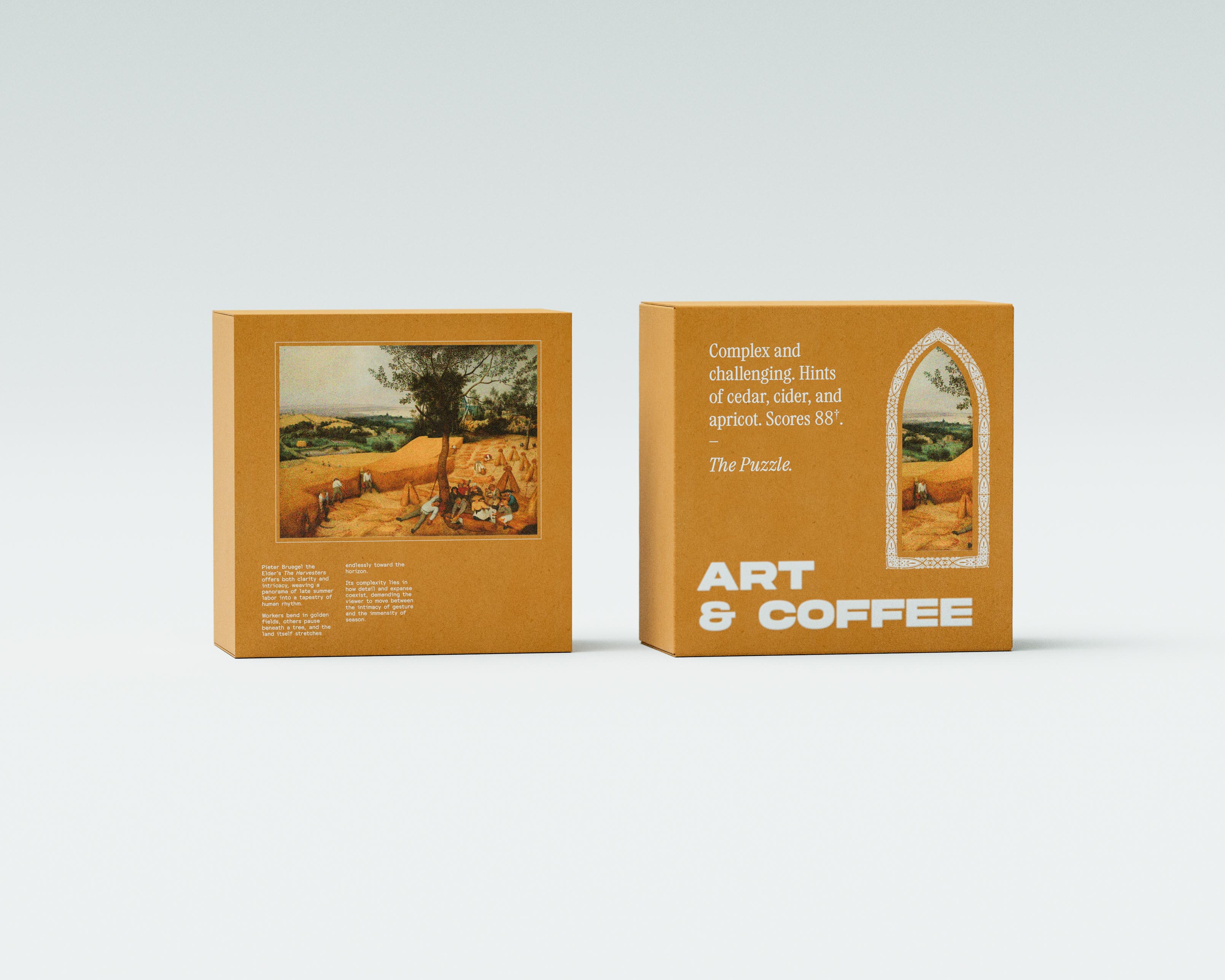
Art in Coffee - US 2026

contact@packaging.art

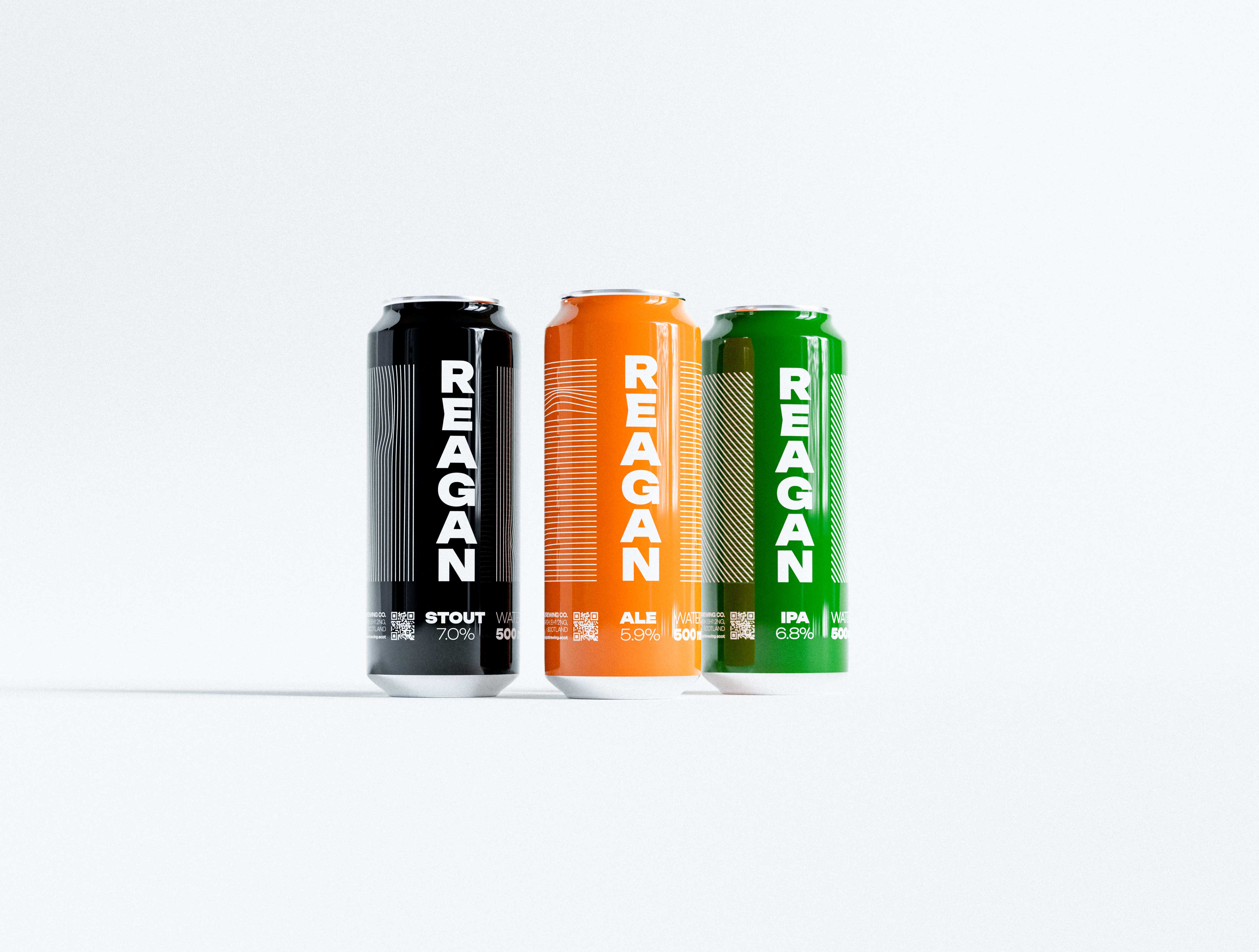
Nice beer. - Reagan. Scotland. 2024

contact@packaging.art
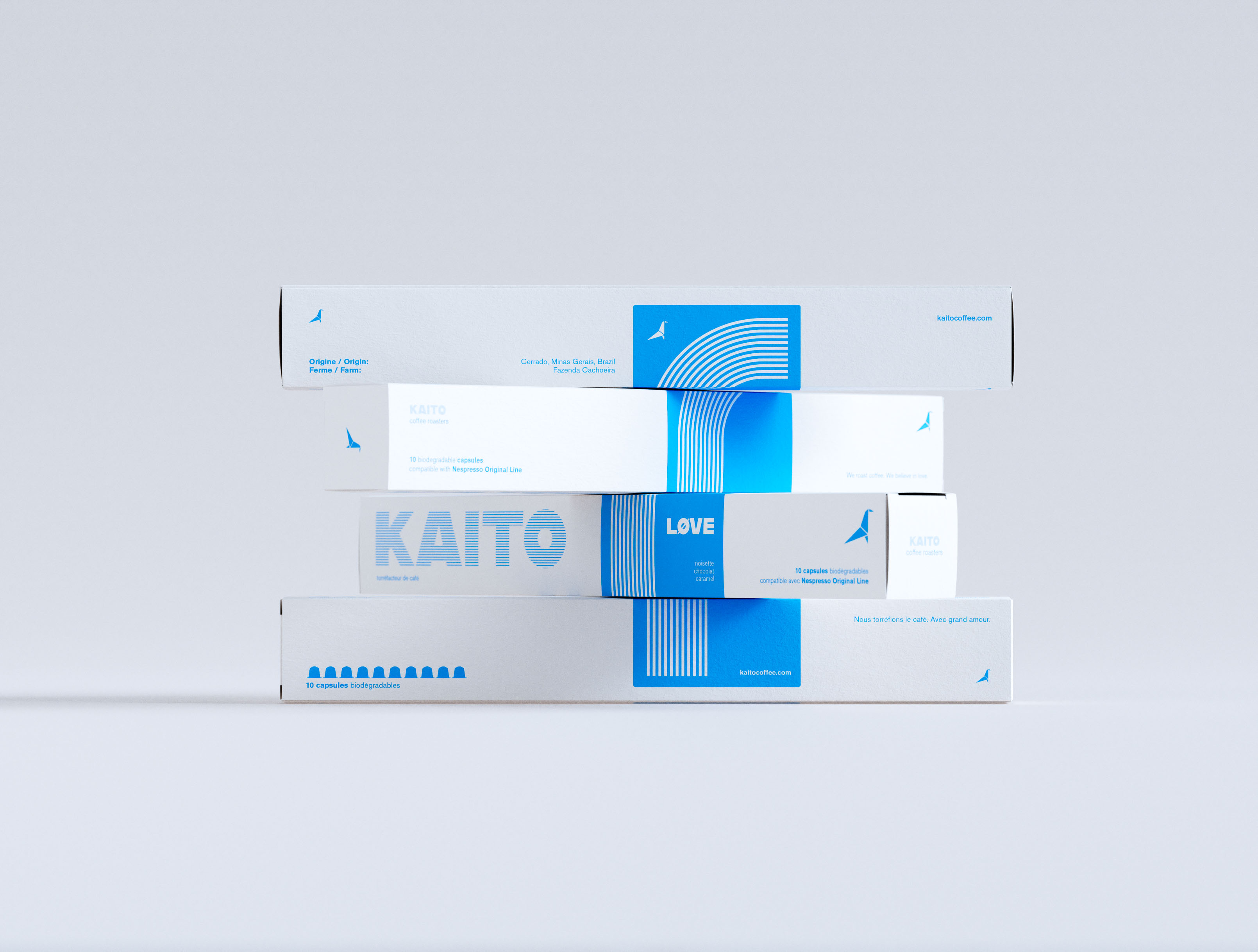
Four KAITO coffee capsule boxes in a cascading staggered arrangement, each box displaced progressively to the left on a neutral grey ground. White coated paperboard, single-color cyan print. KAITO wordmark in horizontal stripe type fill across the front face; LØVE variant wordmark and concentric arc stripe pattern on the blue vertical band. Bilingual English/French copy: "10 capsules biodégradables." Origami bird logomark on all boxes. Art-directed multi-format range composition — visual identity design system and art direction by a packaging design studio.

Nespresso. Minimalism in pantone. - Kaito. Quebec. 2024

contact@packaging.art
INVASATI label macro. INVASATI bold black condensed serif against vibrant lime-green. Multiple Italian text layers revealing product information. Premium print quality close-up. Typography and graphic design detail for Italian specialty food packaging by a branding studio.

Canning obsession. - INVASATI. Italy. 2025

contact@packaging.art
A tall, tapering tower stacks the full Earnest Pursuit range on a pale grey backdrop: three coffee tins in blush, forest green and yellow balance on top of a staggered column of white shipping boxes, each carton alternating the letter-spaced forest-green EARNEST PURSUIT wordmark with the fine single-line New York skyline vignette of a bird, cup, cloud and Chrysler spire. A second, shorter stack of mailers sits to the right. The tins are lithographed metal; the boxes are matte uncoated corrugate printed in a single green ink, lit softly so the whites stay clean and the greens saturated. The playful, precarious arrangement shows the whole system at once — packaging design, illustration and art direction for a New York specialty-coffee brand by AOFP Studio.

Fits four. Stays minimal. - Earnest Pursuit. NYC. 2026

contact@packaging.art
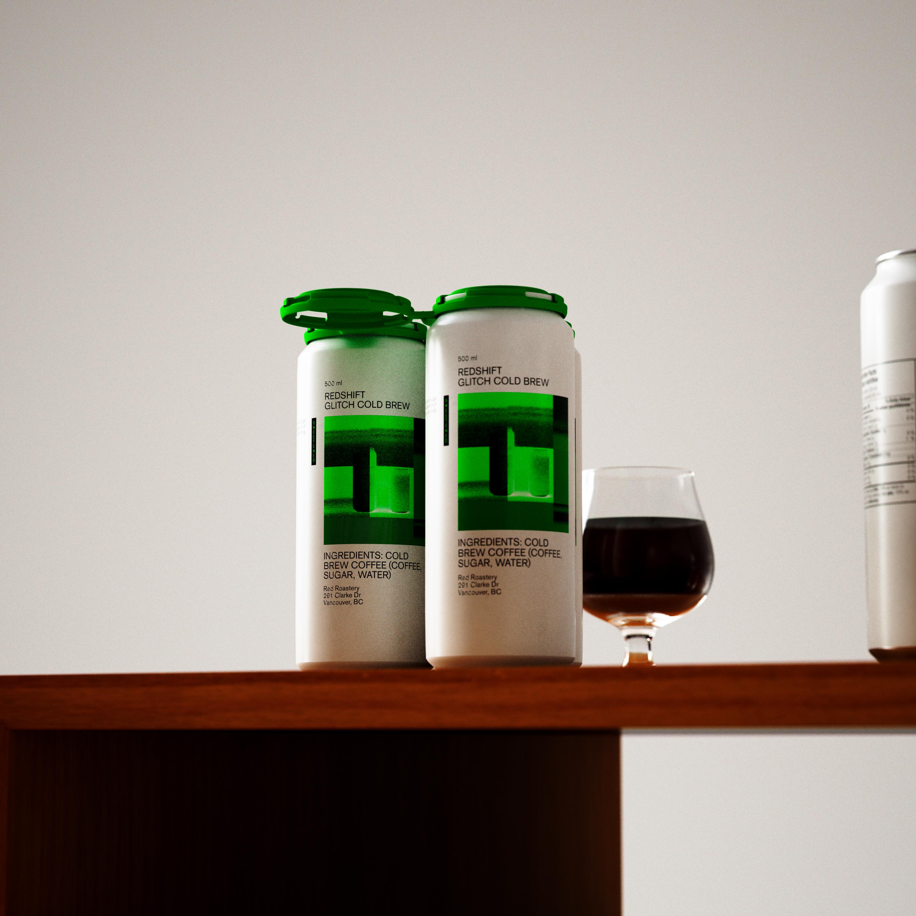
Two Redshift Glitch Cold Brew 500ml cans and glass of cold brew on wooden surface. White body with bold green glitch graphic and minimal black type. Environmental product shot. Art direction and visual identity design for specialty coffee by a packaging design studio in Vancouver.

Cold brew. In neon. - Red Roastery. Canada. 2024

contact@packaging.art
Two yellow plastic squeeze tubes of Zghushchenka condensed milk from UKR Dairy, stood upright and spaced apart on a warm grey-brown studio backdrop with soft directional lighting casting long, low-contrast shadows behind each tube. The tube on the left is front-facing and carries the brand wordmark "ЗГУЩЕНКА" set vertically in a bold, hand-drawn graffiti-style Cyrillic script in white, running the full length of the tube and overlapping a loose repeating pattern of fluorescent yellow-green "CONDENSED" stamp-block type used as a secondary motif. A small green sunburst badge reads "ORGANIC" and a shoulder label carries the UKR Dairy mark and a 100 g net weight mark. The tube on the right shows the reverse: barcode, ingredients and nutrition panel, and the tagline "Condensed milk. Liquid candy, lasts forever, good on everything" set rotated ninety degrees and running vertically up the body. Both tubes wear matte white screw caps at the base. The squeeze-tube format is a deliberately unconventional structural choice for a product category that is almost always canned. Custom display lettering, layered typography system, tube dieline development, and direct-print production in yellow, white and fluorescent green. Packaging design for a new condensed milk brand launch by Art of Packaging.

Condensed milk. Liquid candy. - UkrDairy. 2025

contact@packaging.art
The CLAY Champagne carton photographed at a three-quarter turn with its candle still perched on top, so cream front and shadowed deep-green side panel both read in one frame. The glossy pitcher-shaped candle sits centred above the printed silhouette, its ombré lacquer fading from full green at the spout to a chalky pale base marked with the lowercase "clay." deboss; the side panel's blind-embossed scent-pyramid copy sits just out of full legibility in the raking light, more texture than text at this angle. It's a styling choice rather than a specification shot — showing how object and pack are meant to be seen together on a shelf. Packaging design for a New York candle brand, where every angle, not just the flat-on hero, has to hold up as a still life.

Luxury candle. - Clay. NYC. 2026

contact@packaging.art
Wide studio photograph presenting all four Earnest Pursuit specialty coffee tins in a single editorial stack against a warm greige gradient backdrop — the complete four-SKU lineup balanced vertically in ascending size from top to bottom. The top tin is tangerine orange: "EARNEST PURSUIT" in wide-tracked white condensed monospace, a delicate white line illustration of a reclining figure with a glass and bicycle, small tasting-note type, and a sky-blue pill badge reading "The Vine." The second tin is warm cream with "EARNEST PURSUIT" in cornflower blue, a blue line-drawn figure beside a small sailboat, and the "Let's Chill" badge. Third is deep forest green — white wordmark, a tall crane-like bird illustration in pale linework, and an "All Set" badge. At the base, the widest and tallest tin is pale warm yellow: "EARNEST PURSUIT" in periwinkle blue, a stacked-objects line illustration, and "The Match" badge for the house blend sourced from the Pacific Islands and Latin America. Metal roll-seam lids catch bright specular rim light against the matte direct-printed panels throughout. Spot colour, four-SKU direct-print tin system with a distinct custom line illustration per SKU. Packaging design for a new specialty coffee brand launch in New York, complete multi-SKU system by Art of Packaging.

Specialty coffee. - Earnest Pursuit. NYC. 2026

contact@packaging.art
image use
switch to info view
call for artists
studio@packaging.art