All tinned in.

Earnest Pursuit
New York
2026

A distinct line of coffees with an expansive illustration family.

Client

Earnest Pursuit sources, scores, and roasts coffee with distinct flavor profiles that are bright, accessible, and delicious.

Dylan Marvin, the owner of Earnest Pursuit, reached out to the studio after seeing the brand for Condensed Milk and Dulce de Leche liquid candy packaging from 2025.
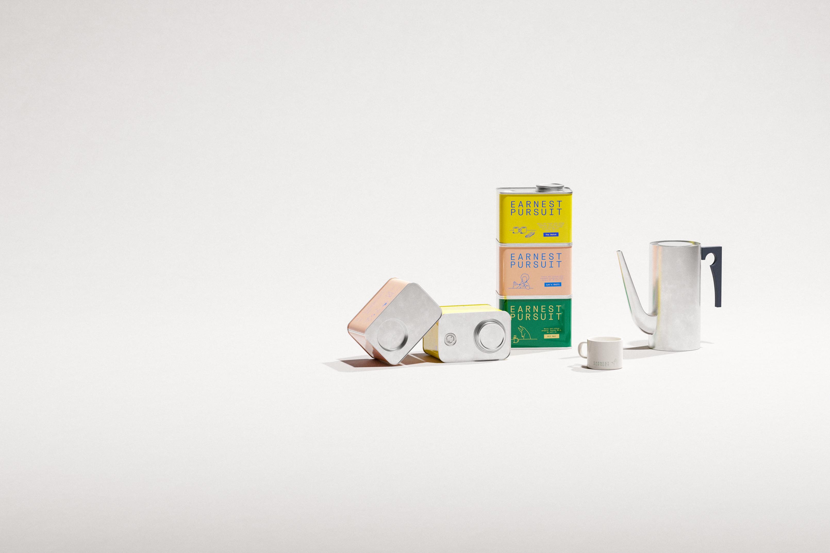
Three Earnest Pursuit coffee tins float in a vertical stack against a soft grey studio wall, offset so their lids and bases almost touch. Each is a different colourway with the wordmark set in cobalt blue or cream: a blush tin reading "Fruity and citrusy with standout blueberry notes. Scores 86. We call it Let's Chill"; a forest-green tin reading "Berry and citrus sangria. Scores 86.5. We call it All Set"; and a yellow tin describing a Pacific Islands and Latin America house blend, "Scores 85.5. The Match". A small line drawing sits beside each cupping note — a reclining figure with a cup, a goat at a mug, two mugs and a card. Behind, white shipping boxes carry the green skyline mark. The tins are lithographed metal with matte labels — a multi-SKU packaging system with character illustration and cupping-score information design by Art of Packaging.

Results

A lively visual identity, with minimal illustrations paired with a structured but expressive typeface. All set by hand on glossy, tactile metal tins, direct printed with spot colors.

Irreverent tone of voice and a naming direction building on the illustration system, exploring life's small vignettes.

Encyclopedia of relevant content about coffee, life, and New York with an accompanying (and ever expanding) illustration system.

A design system that scales to additional roasts, wholesale and delivery packaging, merchandise and communications.

Assignment

Dylan had a specific vision for the brand, which we developed into a focused brief through initial research and discussions.

Lighthearted, irreverent, aspirational. A product that is excellent and design direction allowing it to stand out in all matching areas.

The scope spanned naming, identity, brand, art and creative direction. With a focus on packaging that will expand. And an overall visual language with a developed, intentional tone of voice.

Process

As we've already had a clear vision from our initial work with Dylan, we proceeded into creative concept development. A set of focused sprints visualizing creative approaches that fit established brand vision.

Concurrently we explored the technical packaging options and creative range that exists.

Through several rounds of conversation, the creative concept got fine-tuned and adjusted into selected packaging options.

As is common to brands in initial stages, the cycle of work is ongoing, expanding the brand into advertising and communications.

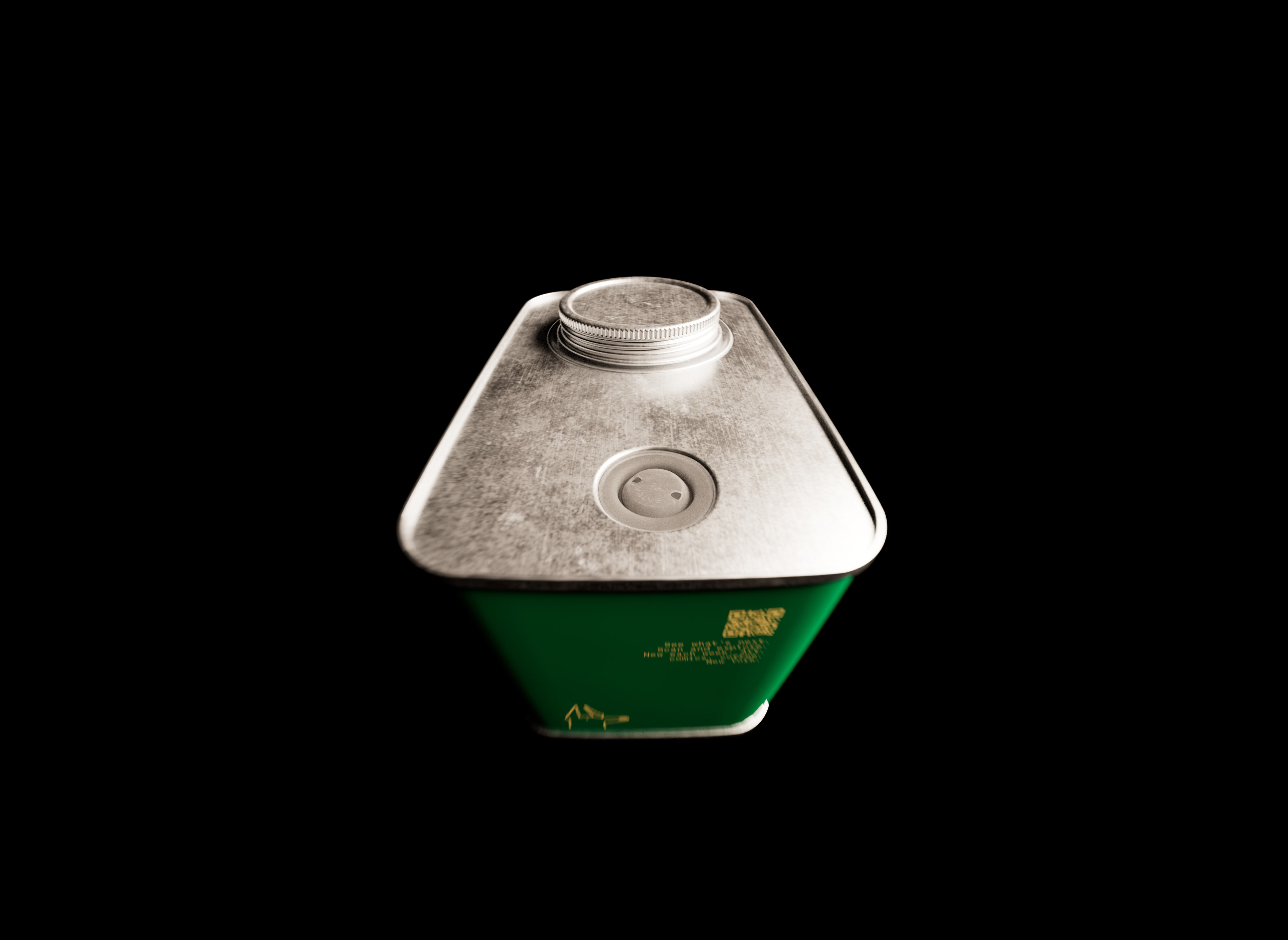
Good coffee starts with an exhaust valve.
-
While that is an exaggeration, the relatively recent introduction of valves into tinned format allowed for unique visual directions in a not overused physical form.
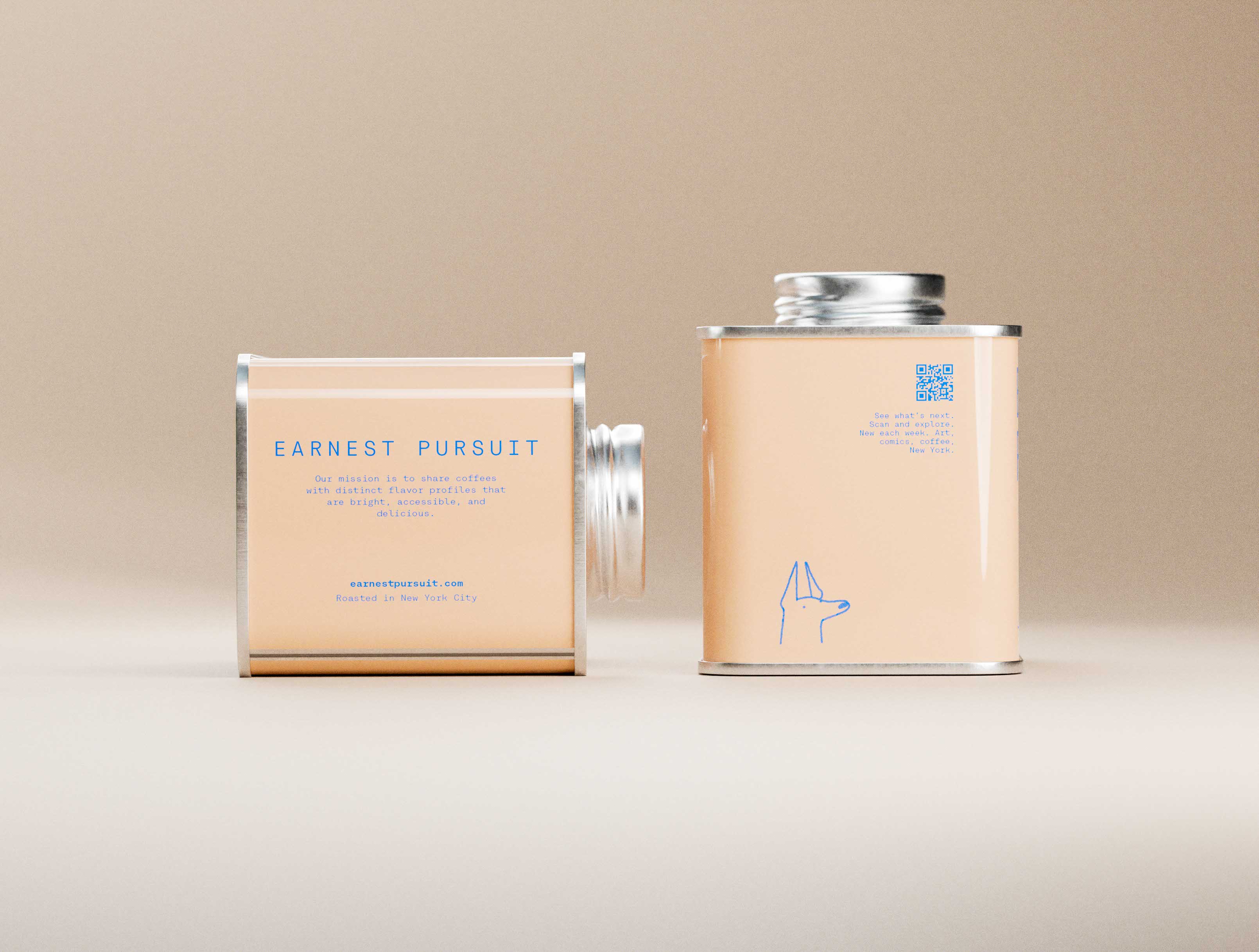
Two sand Earnest Pursuit tins -- upright and base-revealing -- on warm neutral. Bold blue sans-serif, mission text, roasting location, QR code top right, Doberman illustration at base. Metallic lid contrast under directional light. Typographic hierarchy and art direction by a packaging design studio.
Two sand Earnest Pursuit "Let's Chill" coffee tins on a warm cream gradient surface. Left tin lies on its back face, revealing the rear panel: centred EARNEST PURSUIT in compact monospace, the studio's mission statement in small type, earnestpursuit.com URL, and "Roasted in New York City." Right tin stands upright facing forward: bold blue EARNEST PURSUIT wordmark filling the upper label, a hand-drawn seated figure reading with a cup, fruity and citrusy tasting note, cupping score, and a solid blue Let's Chill pill callout. Both tins show polished silver lids and direct-printed matte sand labels under soft directional studio light. Packaging design for specialty coffee with a complete front-and-back label system — brand identity and print production by Art of Packaging, New York.
Green Earnest Pursuit tin front detail. Large gold sans-serif EARNEST PURSUIT, minimal composition on matte green. Art direction and typography and graphic design for specialty coffee by a packaging design studio.
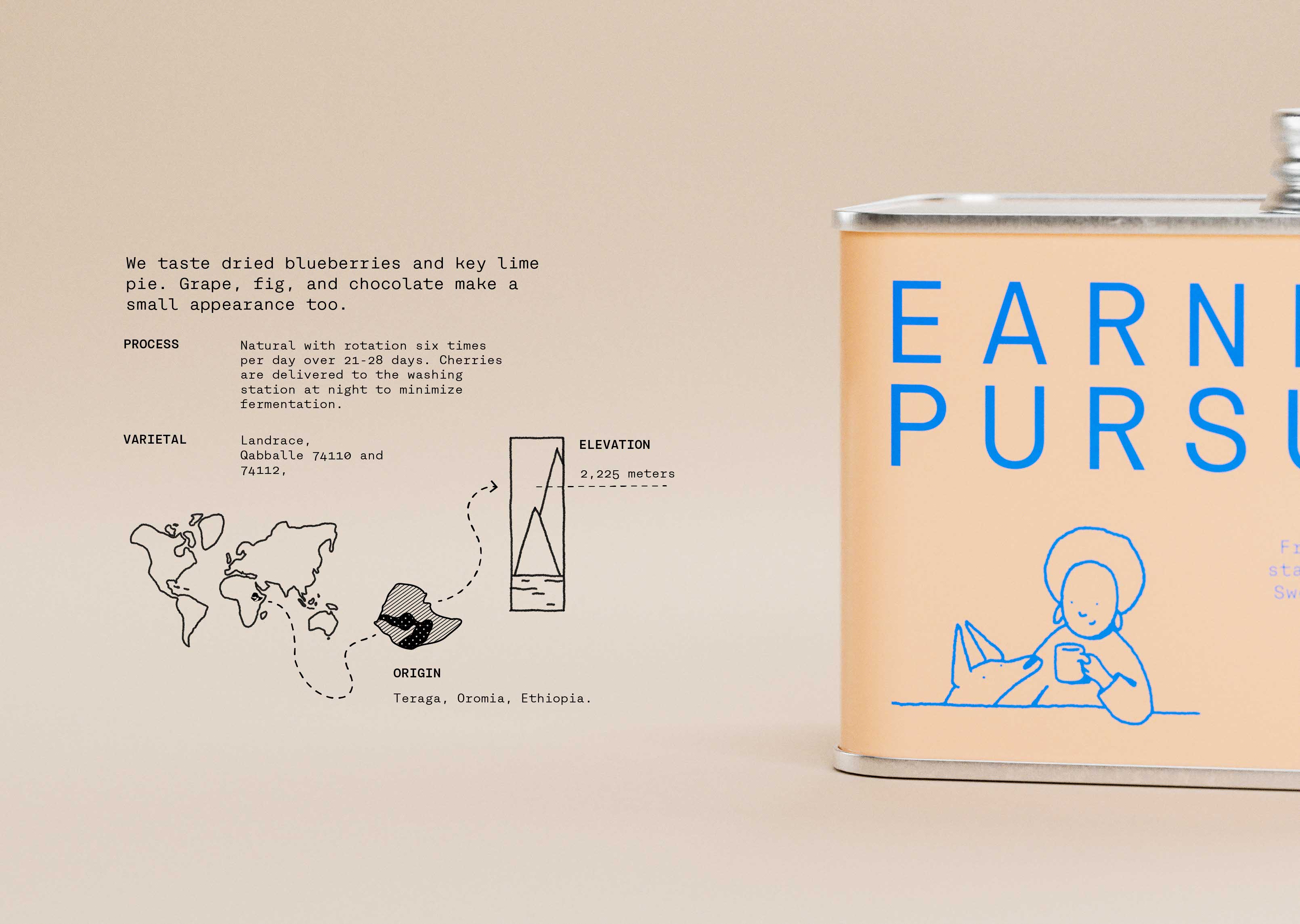
Split: sand Earnest Pursuit tin right, enlarged origin panel left. Tasting note: dried blueberries and key lime pie. Process, varietal, elevation. Minimal world map highlights Ethiopia (Teraga, Oromia), dotted path to elevation diagram. Blue type on sand. Information design, data visualisation, and typography and graphic design by a branding studio.
Earnest Pursuit book on the loop product demo system on black. Two deep green cards on silver ring: structured white typography (producer, origin, varietal, process, altitude, score) left; fox-and-cup illustration with tasting note right. Enameled keychain extending brand into tactile object. Art direction, information design, and visual identity design for specialty coffee distribution by a graphic design studio.
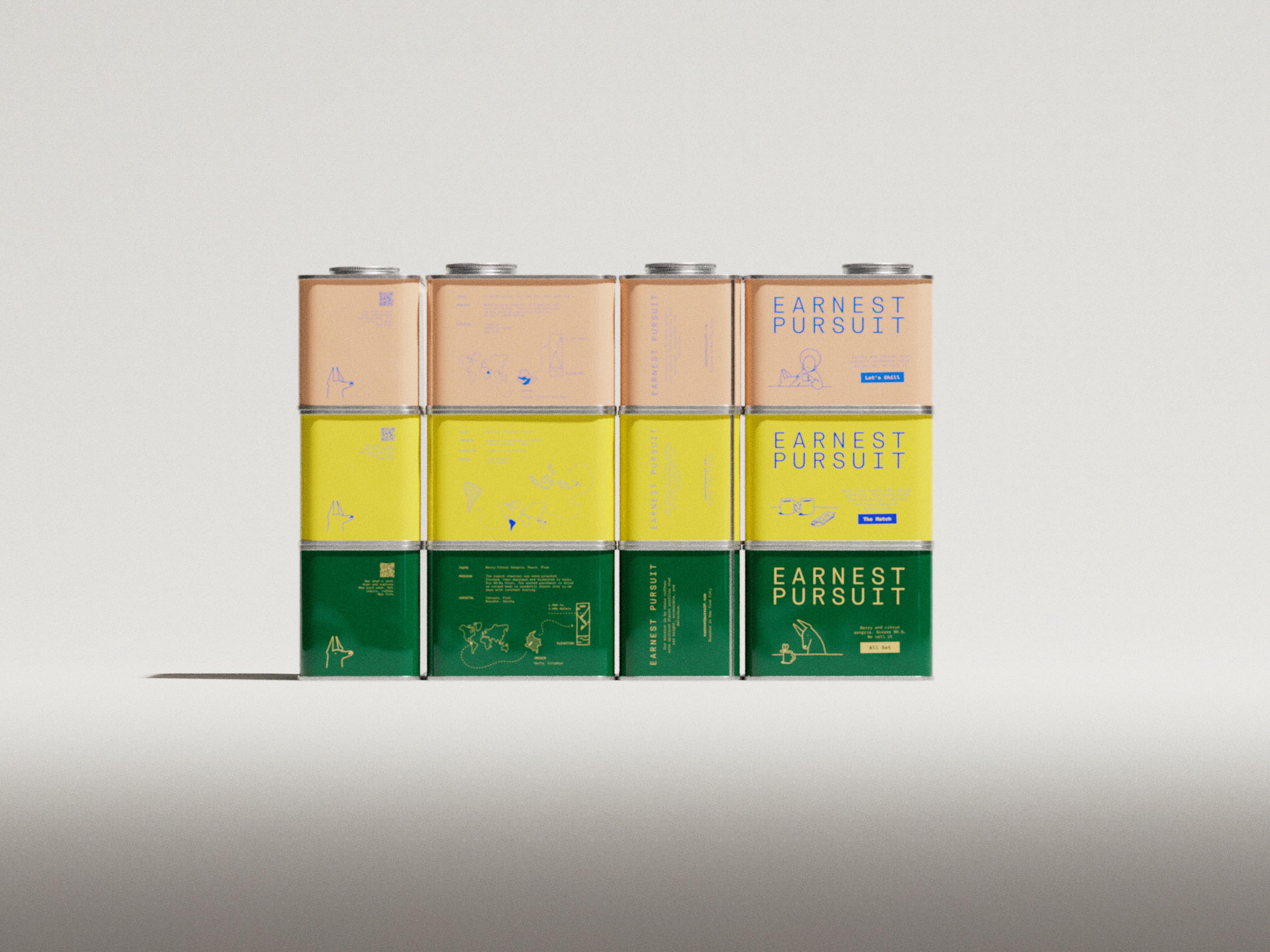
Wide studio photograph presenting all four Earnest Pursuit specialty coffee tins in a single editorial stack against a warm greige gradient backdrop — the complete four-SKU lineup balanced vertically in ascending size from top to bottom. The top tin is tangerine orange: "EARNEST PURSUIT" in wide-tracked white condensed monospace, a delicate white line illustration of a reclining figure with a glass and bicycle, small tasting-note type, and a sky-blue pill badge reading "The Vine." The second tin is warm cream with "EARNEST PURSUIT" in cornflower blue, a blue line-drawn figure beside a small sailboat, and the "Let's Chill" badge. Third is deep forest green — white wordmark, a tall crane-like bird illustration in pale linework, and an "All Set" badge. At the base, the widest and tallest tin is pale warm yellow: "EARNEST PURSUIT" in periwinkle blue, a stacked-objects line illustration, and "The Match" badge for the house blend sourced from the Pacific Islands and Latin America. Metal roll-seam lids catch bright specular rim light against the matte direct-printed panels throughout. Spot colour, four-SKU direct-print tin system with a distinct custom line illustration per SKU. Packaging design for a new specialty coffee brand launch in New York, complete multi-SKU system by Art of Packaging.

Illustration by:

Buy coffee from: