contact@packaging.art
-
Branding and communication design.
Graphic design.
Packaging design.
-
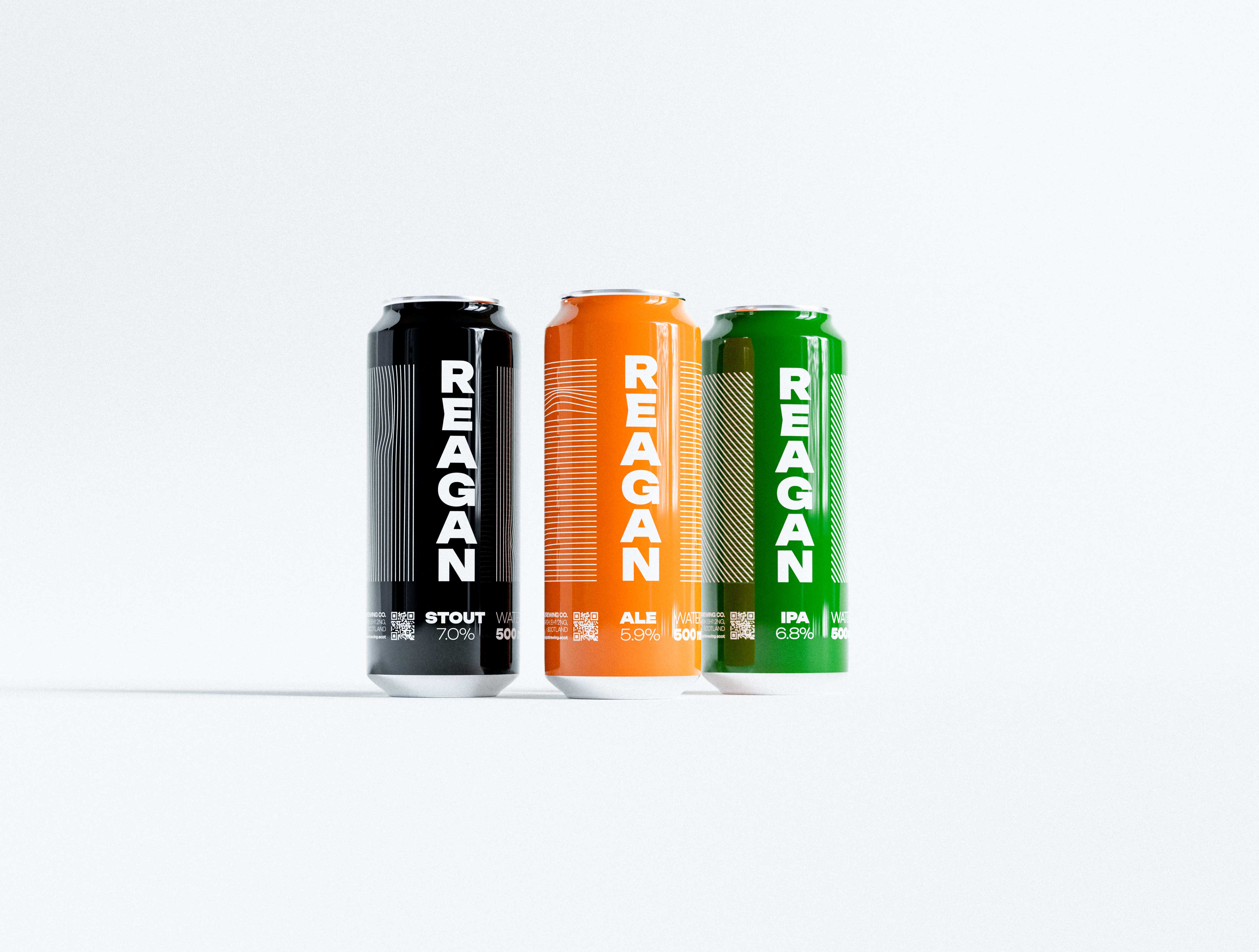
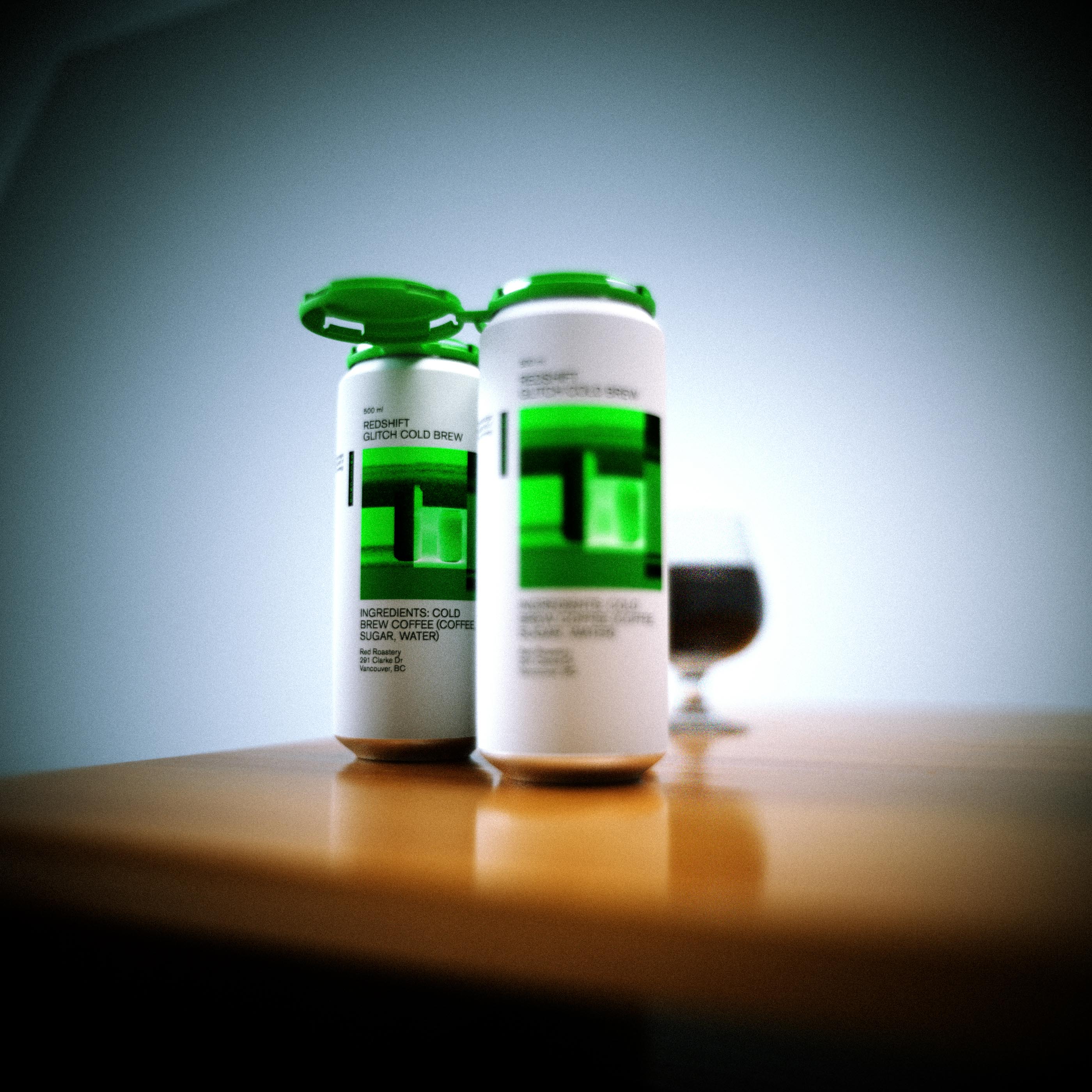
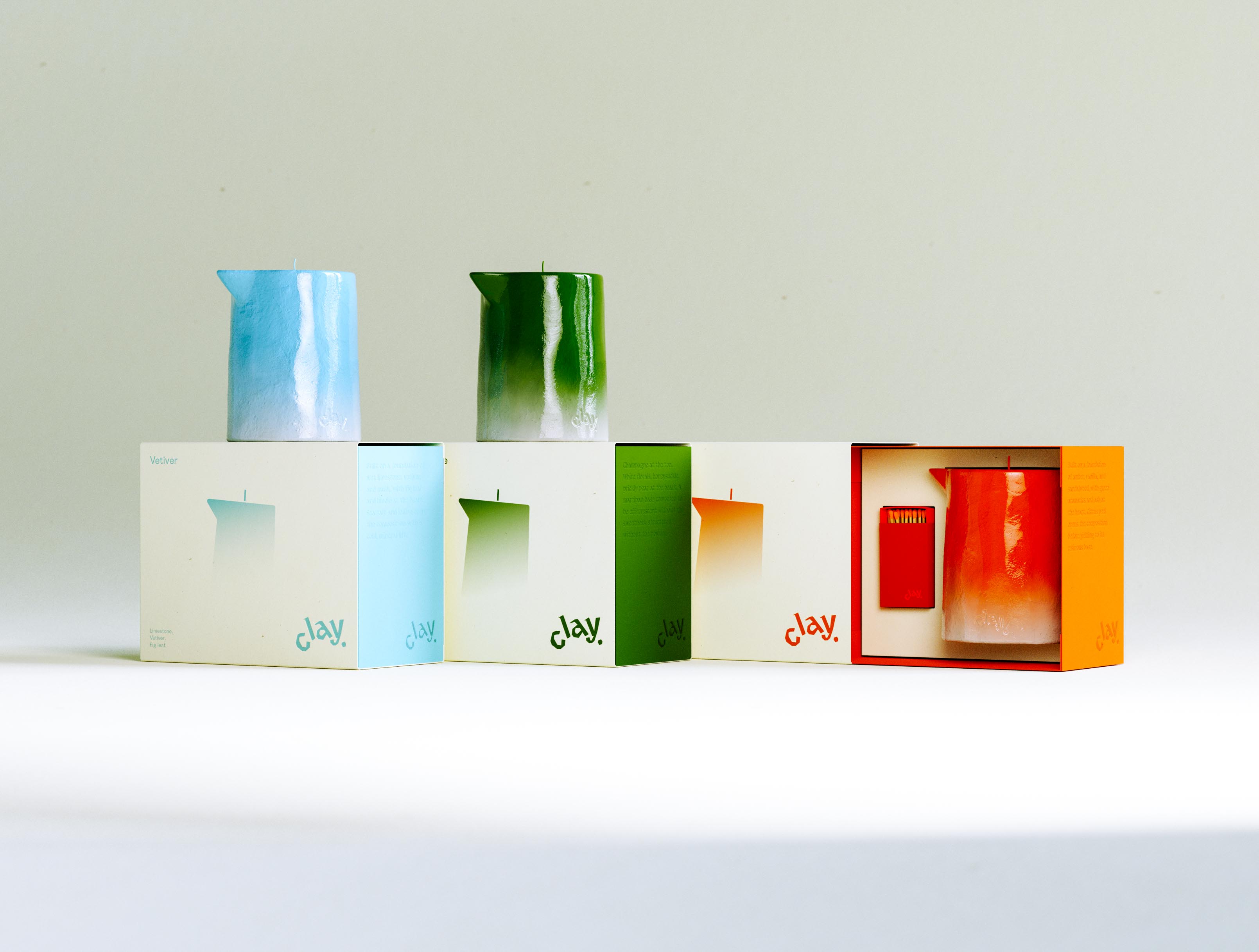
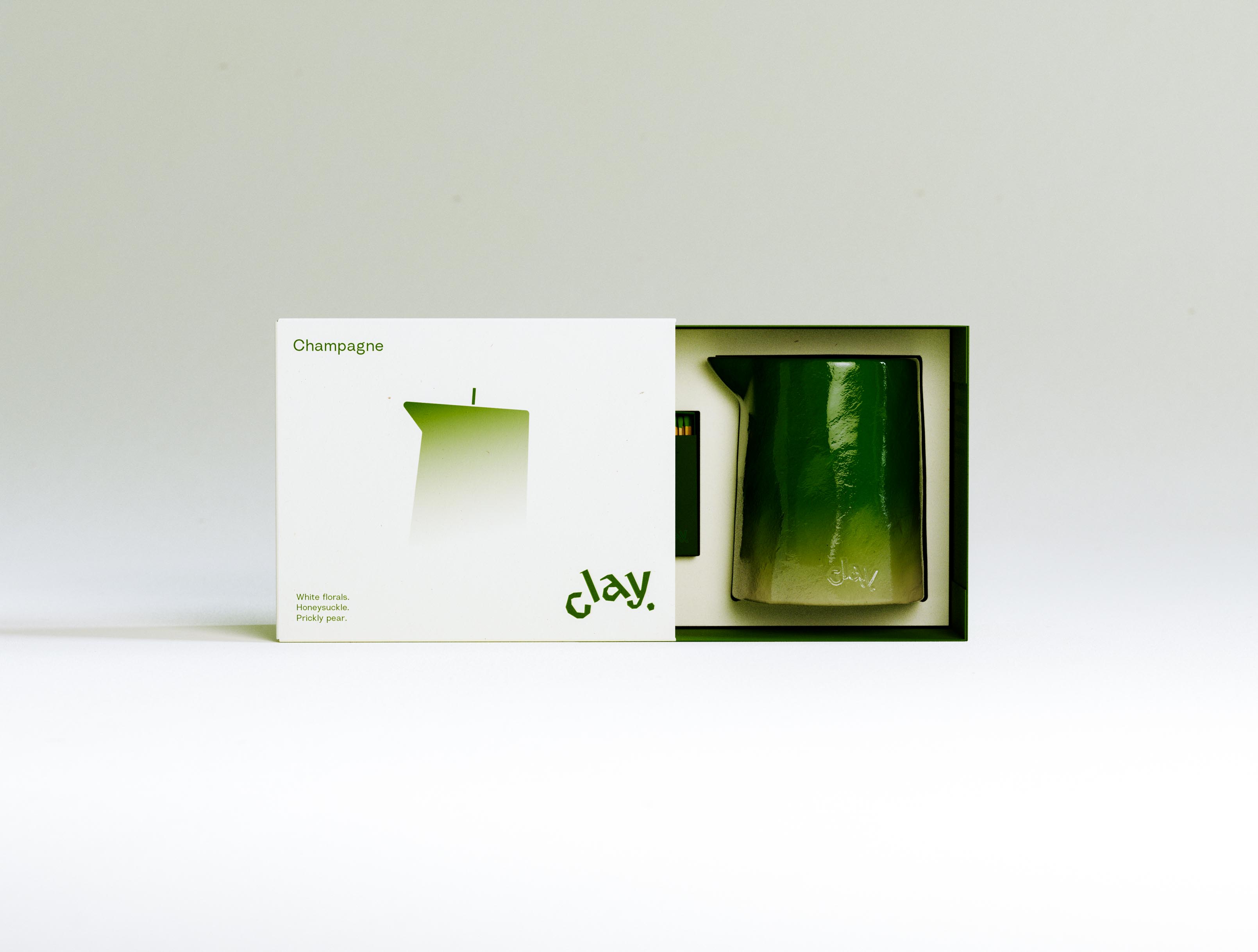
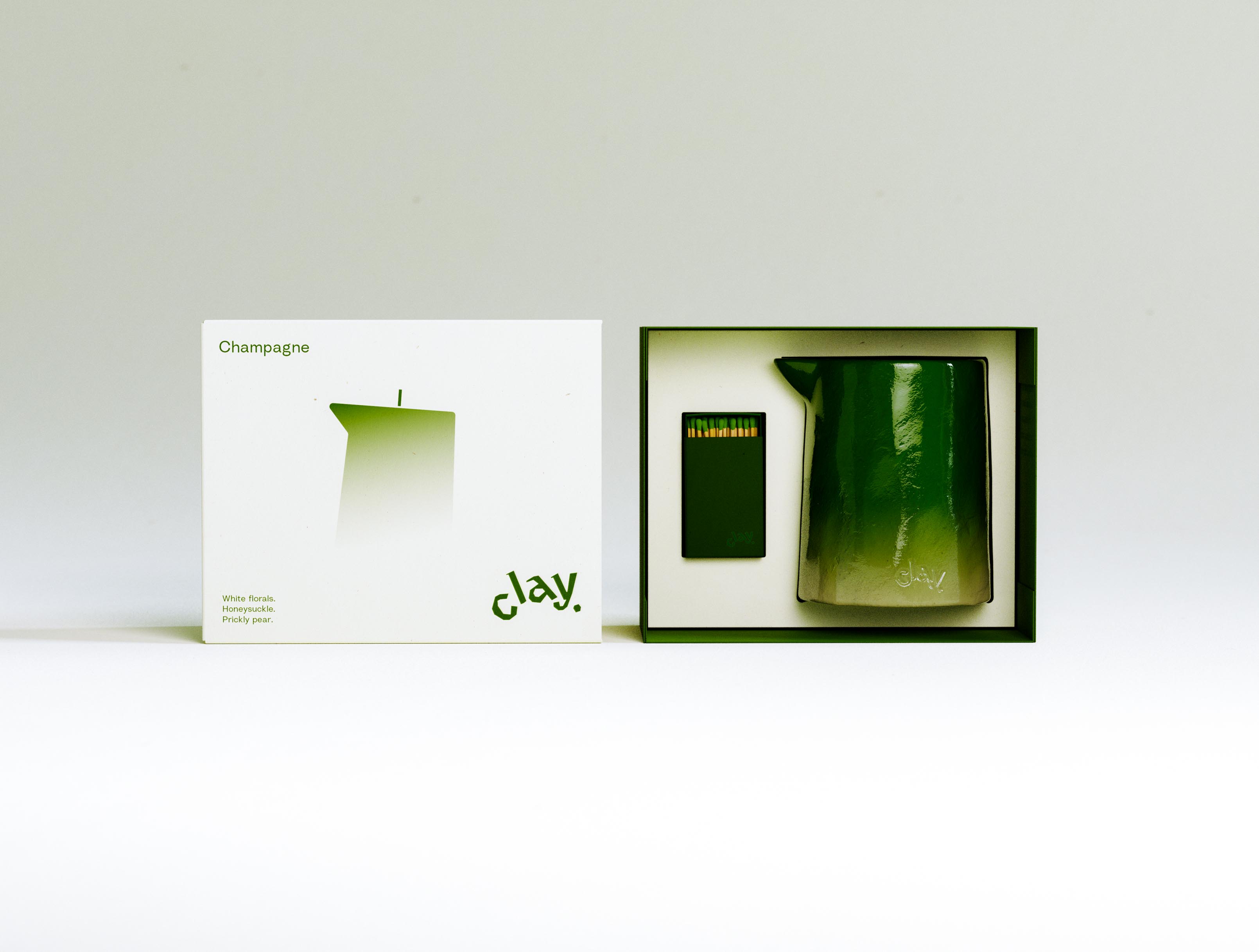
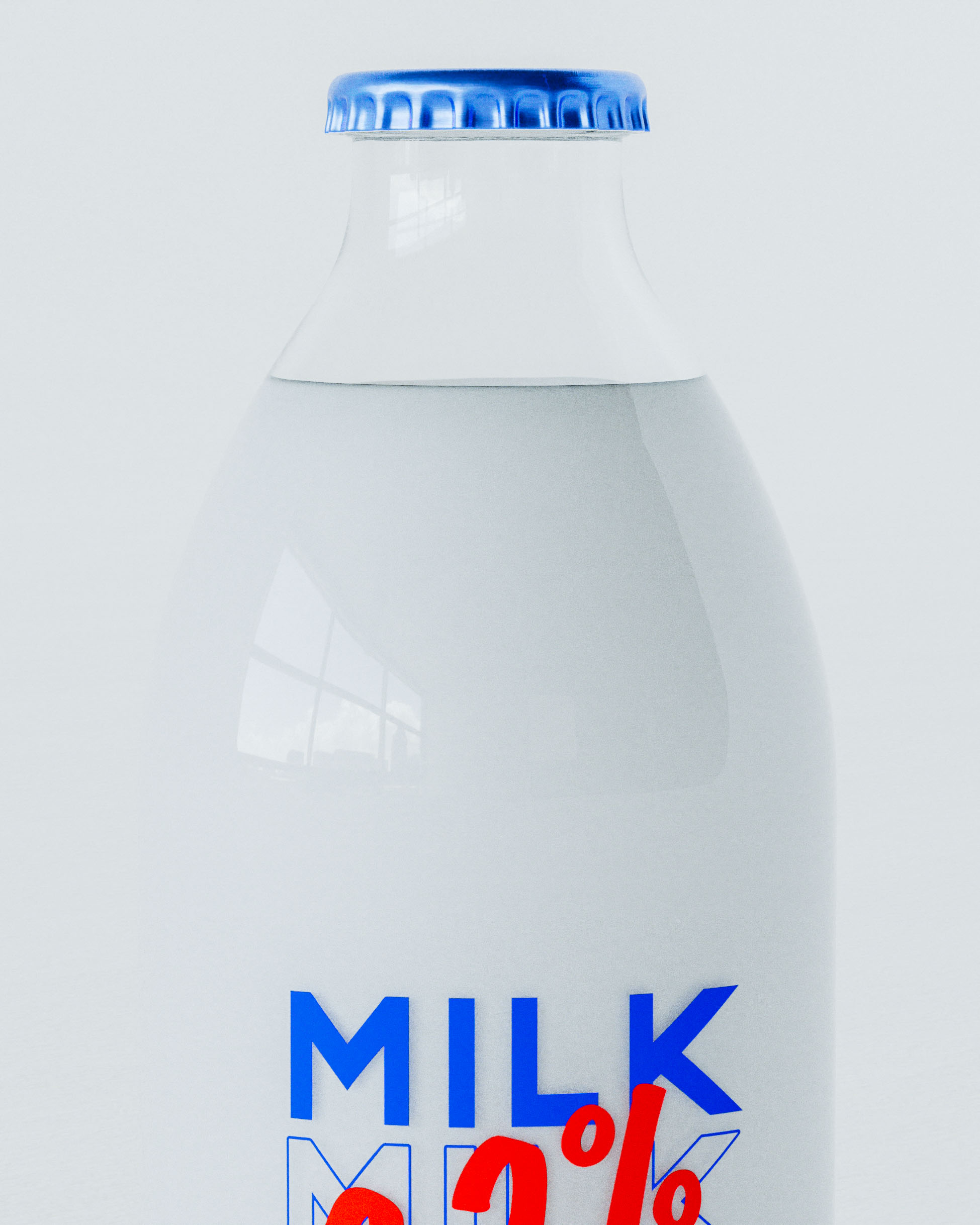
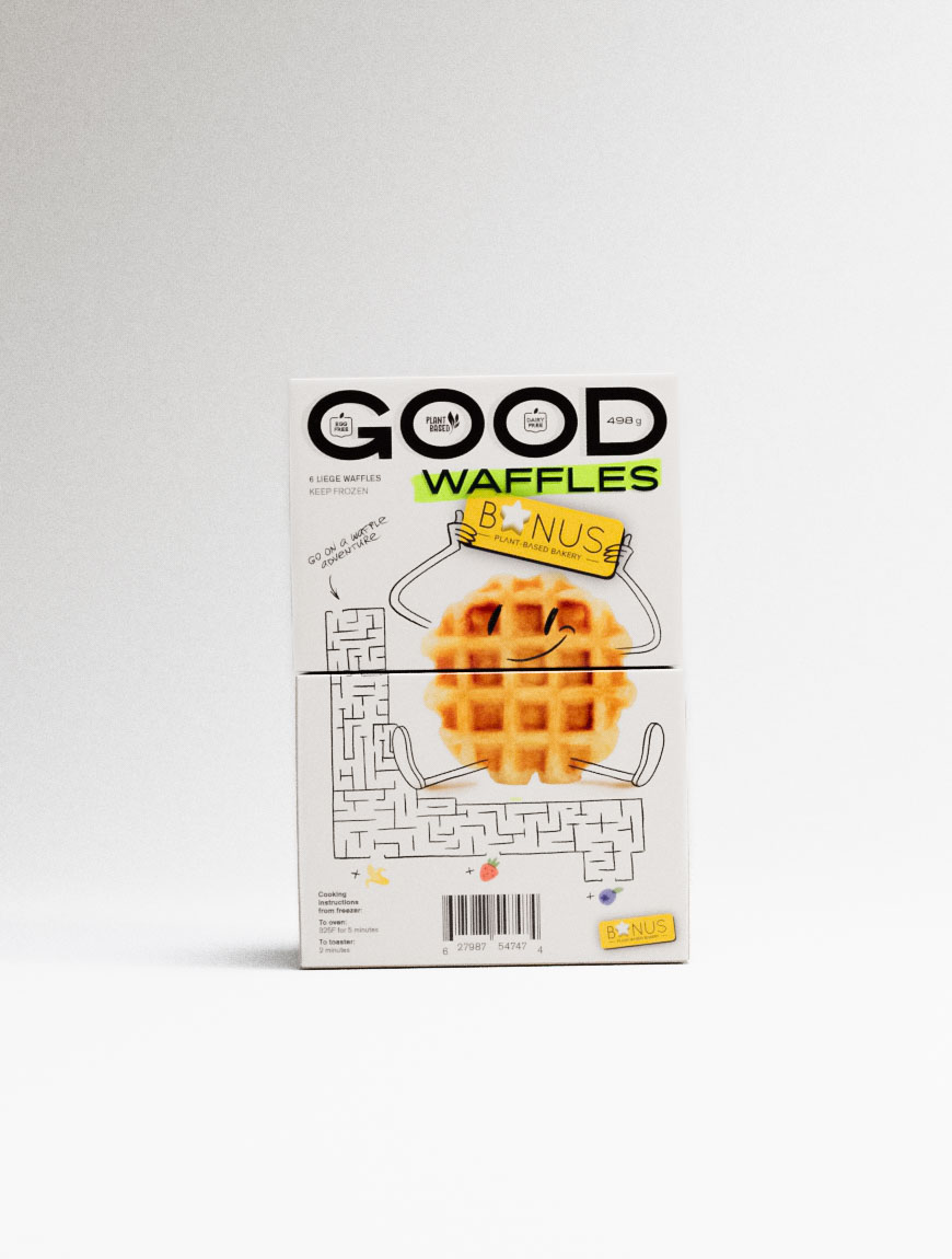
Select visuals ⇨
Project photography ⇨
what is art of packaging?
Branding and graphic communication design. High-level concepts, finessed, and guided to production.
how does it unfold?
Conversation and visualization. Feedback and visualization. Two to three rounds for concepts, then finessing. Production timing varies with scale and project requirements.
what is involved in a project?
First a comprehensive, visualized exploration of a few creative concepts. Next a wide range of creative, organizational, and manufacturing design finessing selected direction into final form. This includes naming, packaging, advertising, physical and digital communication design, and many more highly varied things.
why packaging?
It’s fun to do. Photographs well. Multiple markets, geographies, regulations. With practice a detailed understanding of industry, structural design, printing processes, manufacturing, supplier communications, materials and production sourcing. Complex systems or boutique one-offs.
projects without packaging?
Yes, - branding and communications.
☂

☂

♣
♥


♠

☎


☀


♥


☀


☝

♪


♣


♡


♣


◉


♢


☃


☀