Punk rock.
Client
Kaito is a coffee roaster in Hudson, Quebec with a distinctly minimalist visual design language driven by color based flavour, mood, and feel signifiers.
In 2015 AOFP developed and applied the name, identity and visual language to packaging, communications, and interior/cafe designs.
In 2024 Kaito merged with Mikko, a lifestyle cafe carrying its roasts. We kept the visual aesthetic and design language of Kaito, while updating the brandmark with Mikko as brandname.
In 2015 AOFP developed and applied the name, identity and visual language to packaging, communications, and interior/cafe designs.
In 2024 Kaito merged with Mikko, a lifestyle cafe carrying its roasts. We kept the visual aesthetic and design language of Kaito, while updating the brandmark with Mikko as brandname.
Assignment
For this project (the last one prior to brands merging) Kaito looked to expand the visual language and create packaging for a line nespresso pod coffee.
Keep it minimal, artistic, unique. Avoid typical nespresso pod packaging approaches.
Keep it minimal, artistic, unique. Avoid typical nespresso pod packaging approaches.
Process
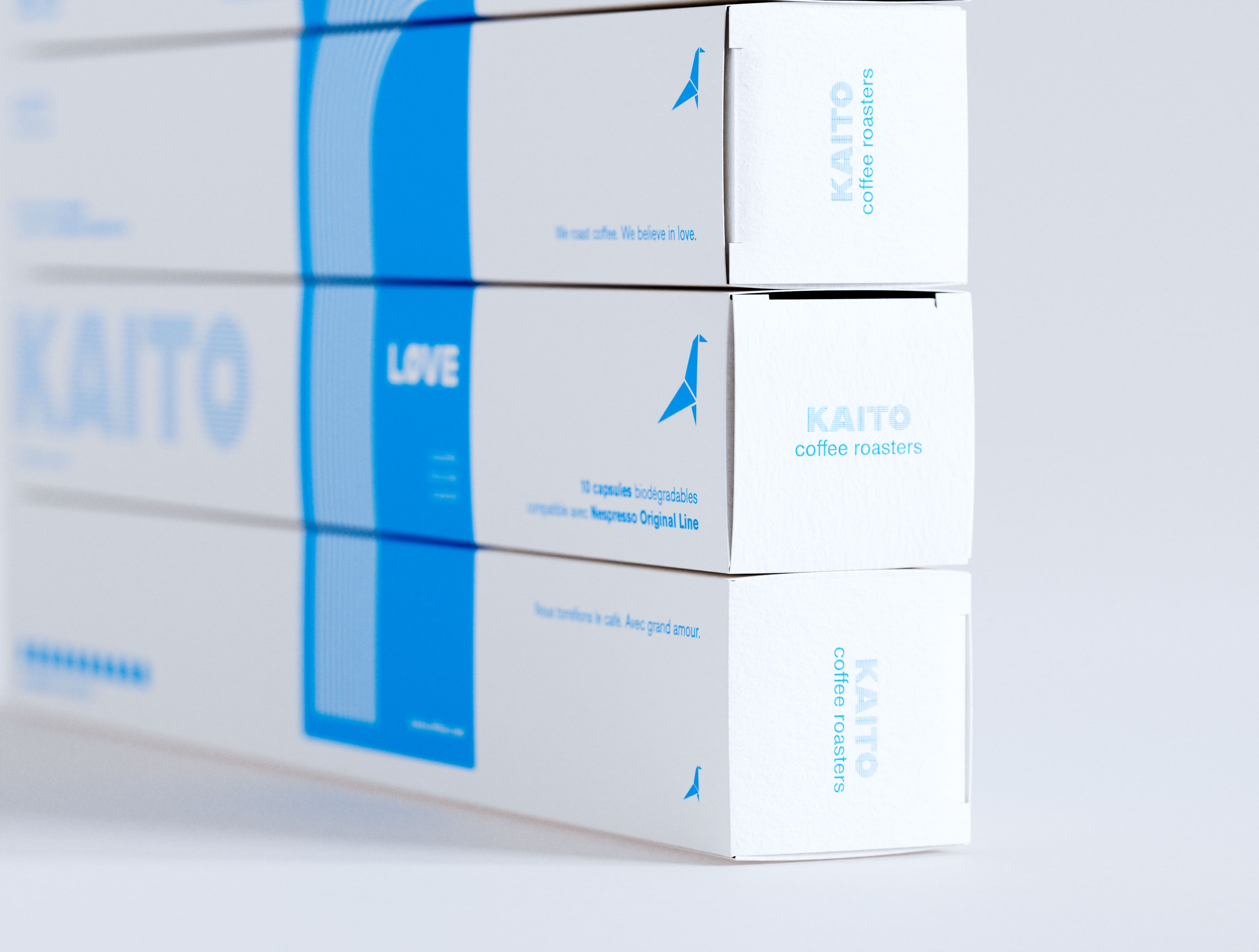
First a tactile folding board cardstock from Neenah was selected for its textured, raw feel, and excellent spot color reproduction.
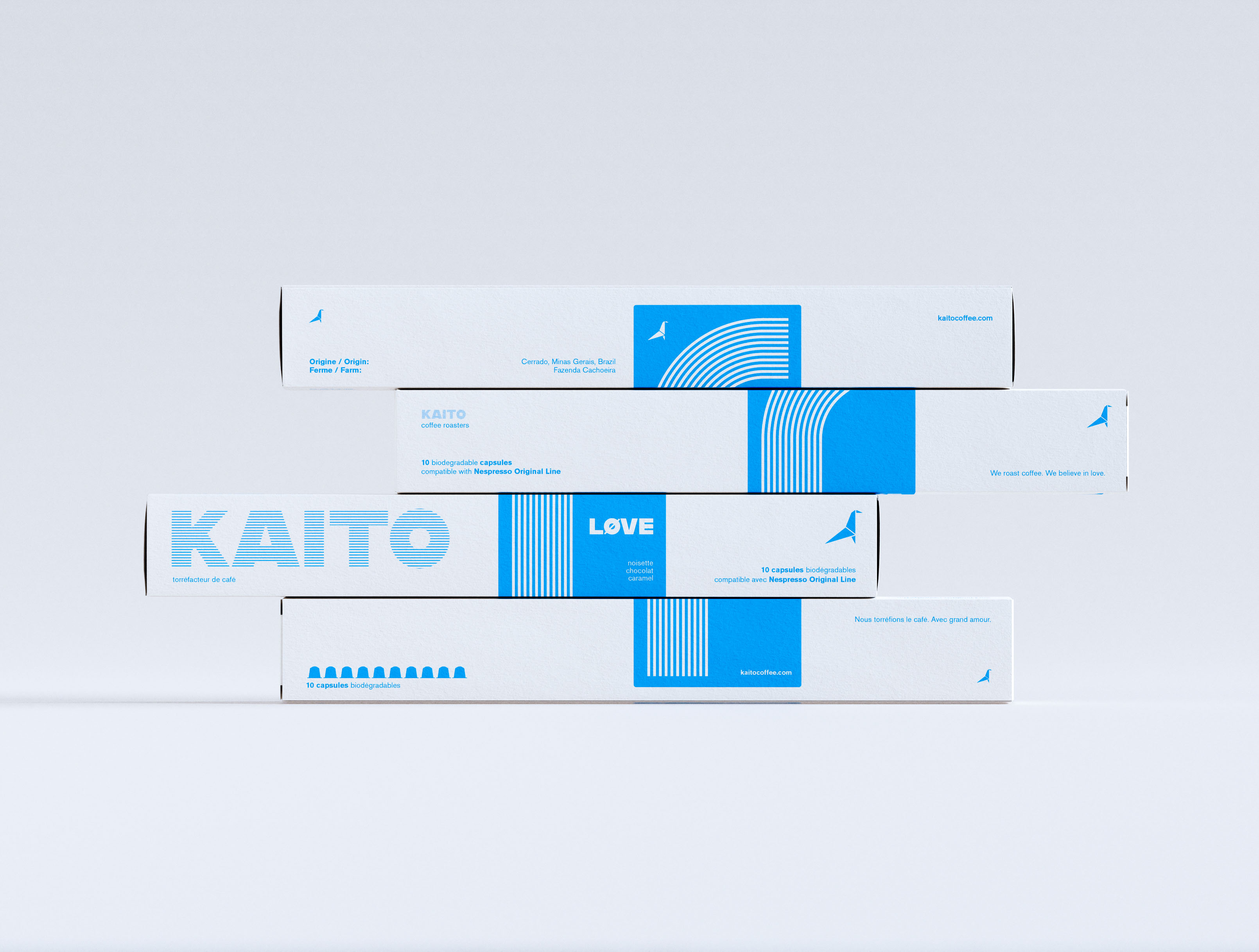
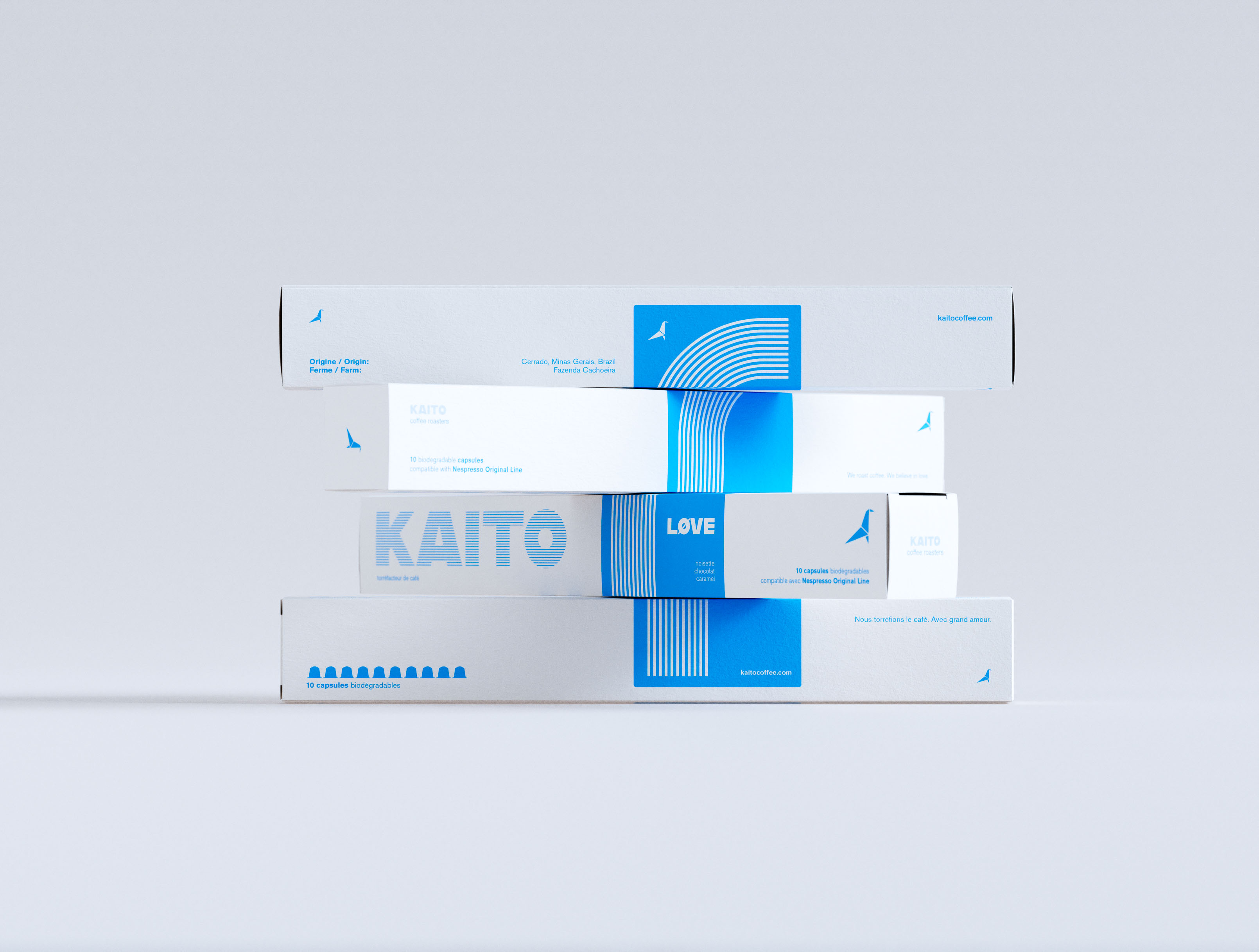
Then a series of illustrations were developed wrapping the packaging with an identifying color.
Then a series of illustrations were developed wrapping the packaging with an identifying color.
Results
Tactile, textured, minimal, eye-catching.
An artwork on the shelf, in store, on the counter.
An artwork on the shelf, in store, on the counter.
Kaito’s visual language is distinctly minimalist.
-
Very normal for coffee brands. Not so much for nespresso variants.