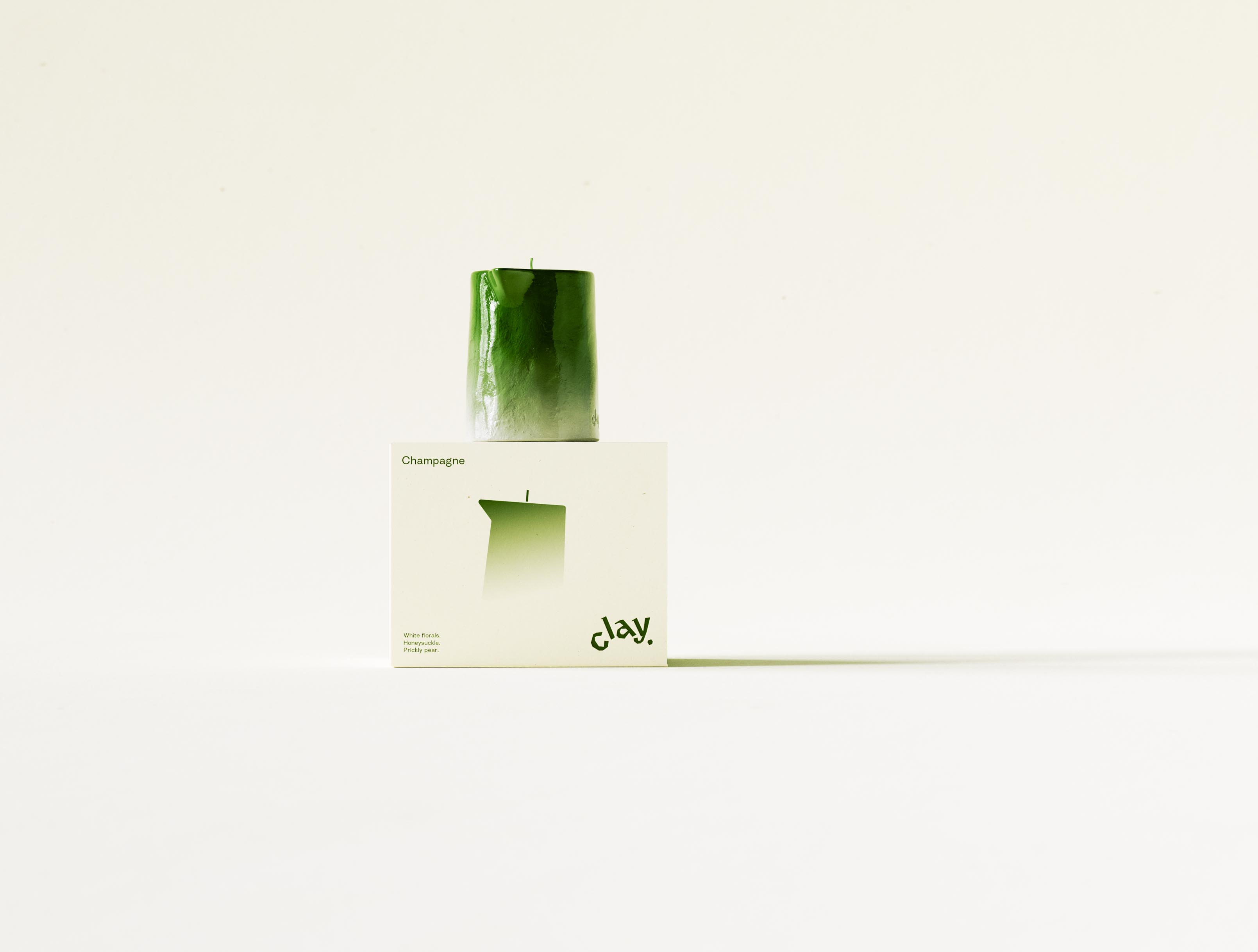
The CLAY Champagne carton photographed at a three-quarter turn with its candle still perched on top, so cream front and shadowed deep-green side panel both read in one frame. The glossy pitcher-shaped candle sits centred above the printed silhouette, its ombré lacquer fading from full green at the spout to a chalky pale base marked with the lowercase "clay." deboss; the side panel's blind-embossed scent-pyramid copy sits just out of full legibility in the raking light, more texture than text at this angle. It's a styling choice rather than a specification shot — showing how object and pack are meant to be seen together on a shelf. Packaging design for a New York candle brand, where every angle, not just the flat-on hero, has to hold up as a still life.
The brief.
Affordable luxury, - nice but not pretentious.

Initially we explored the brief figuring out where that definition lands.
Client.
Clay makes candles in New York City.

Clay team commissioned branding after their experience with Earnest Pursuit project.
How it developed.
First, over two rounds, studio developed multiple structural forms with the initial form ending up selected.

Over the next five rounds branding was finessed using the selected form. Starting with typography, brand mark and color, through to texture, finishing, materials, packaging and a thoughtfully included pair of matches.

Finally, monochromatic, real world rich color palette (down to the color of the matchhead) was prototyped in production.
Finally.
Signature form. An inviting experience. Thoughtful details.

Stylish luxury in New York City.

Form, brand, and packaging for a maker of fine scented candles.
Clay
New York
2026
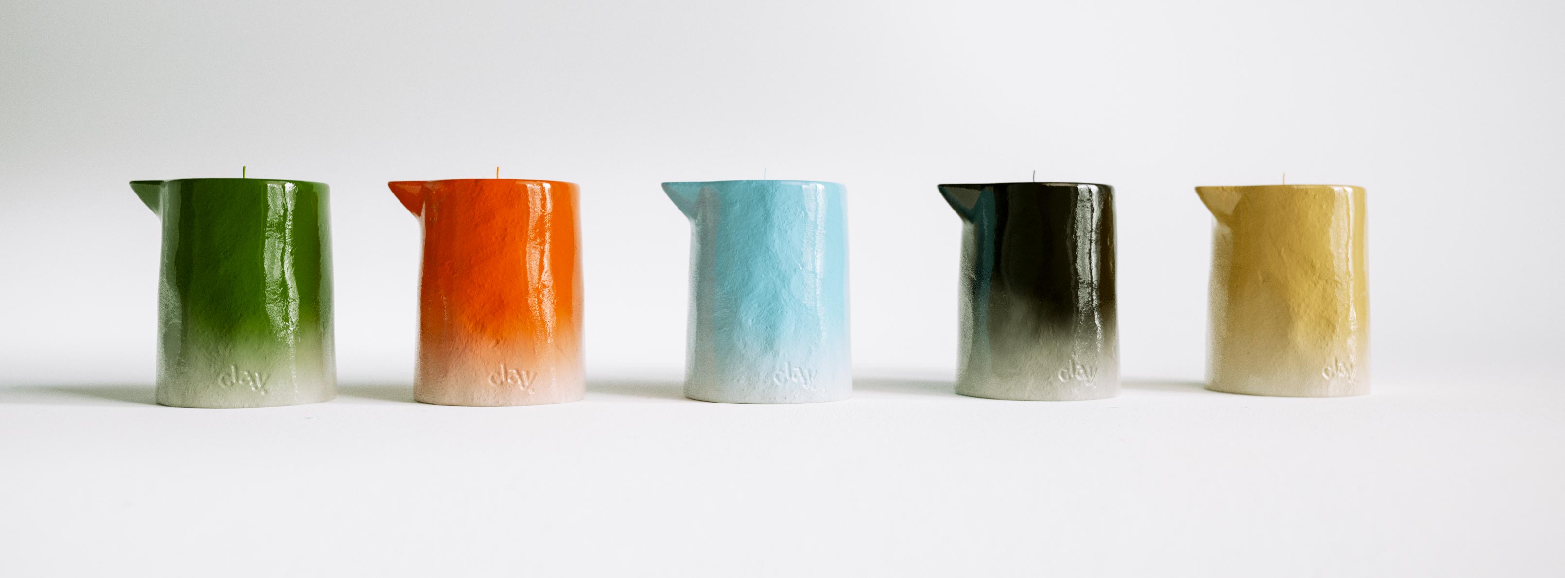
A tight lineup of five CLAY pitcher-form candle samples side by side against a plain white ground, each showing the brand's signature ombré lacquer fading into a pale raw base stamped with the lowercase "clay." deboss. Left to right the row runs deep green, burnt orange, pale blue, near-black charcoal and warm tan, the first three matching the confirmed Champagne, Amber and Vetiver colourways, the black and tan two additional development samples not yet assigned to a released scent. Shown unboxed and unstyled, it's a colour and wax-finish reference rather than a product shot — the kind of side-by-side comparison a multi-SKU colour system gets checked against before a new scent is signed off. Brand identity and colour development for a growing candle range.
A single CLAY Champagne candle centred on top of its closed carton, both lit softly against a warm cream sweep so the glossy green pitcher form and the printed front face read as one still life. The candle's ombré lacquer runs from saturated green at the pinched spout to a pale raw base stamped with the lowercase "clay." deboss, while the carton beneath repeats the scent name, the gradient candle silhouette, the scent notes and the olive "clay." wordmark. Held dead-centre with generous negative space either side, the frame favours quiet product theatre over busy composition. Bringing a new candle collection to launch — the object, the printed system and the photography all resolved to one calm image — is packaging and art direction AOFP Studio carries through from concept to final shot.
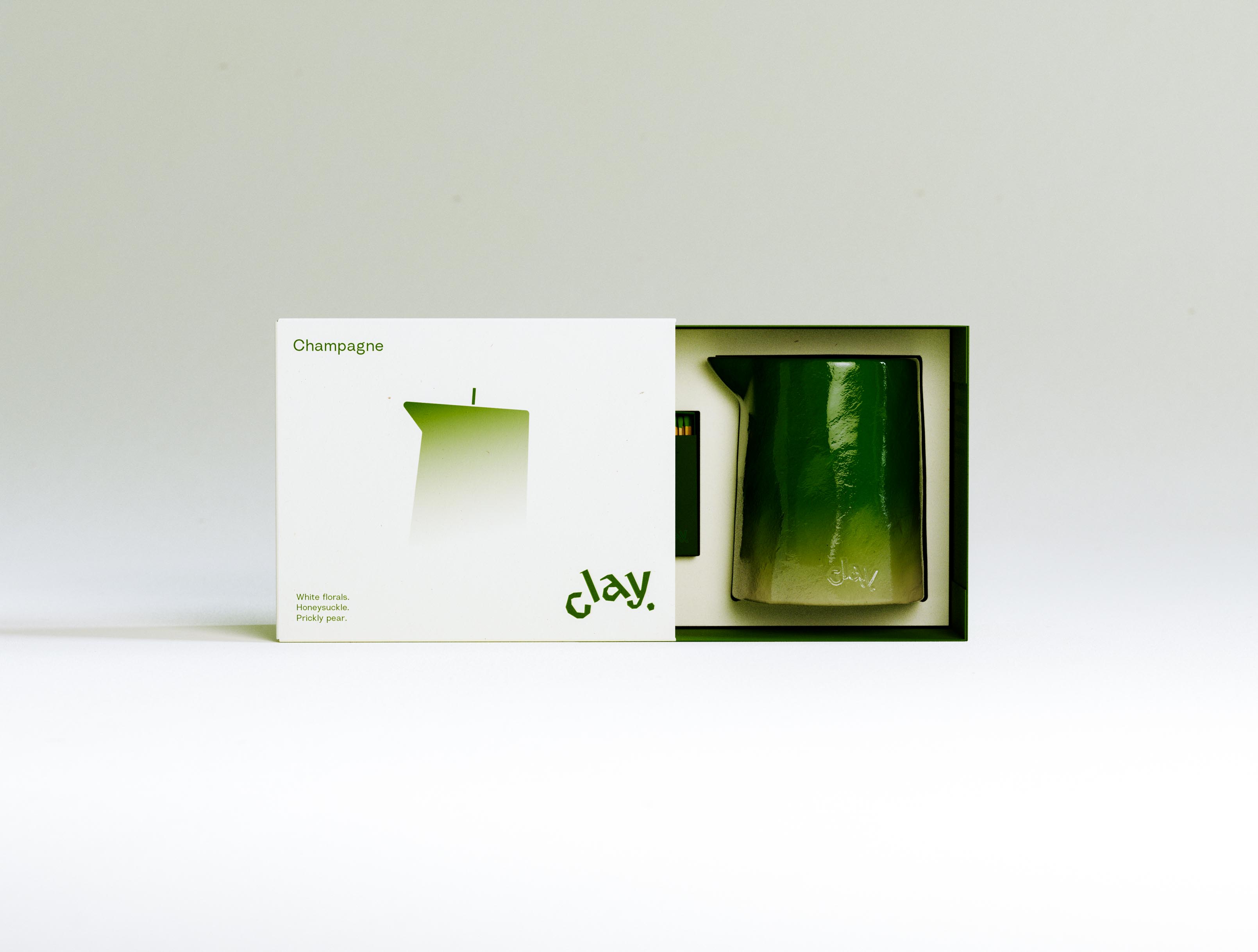
The CLAY Champagne gift box shown part-opened: the printed cream outer sleeve is drawn to the left to reveal a fitted deep-green tray cradling the glossy green pitcher-shaped candle, with a slim dark-green matchbox seated in its own recess alongside. The candle's lacquered surface catches a soft highlight and shows the lowercase "clay" deboss near its pale ombré base. The sleeve repeats the scent name, gradient silhouette, notes and olive wordmark; tray and candle share a single tonal green. It is a two-piece rigid sleeve-and-tray build in colour-matched board — the structural packaging and fitted-insert engineering a candle set needs to feel considered from the first slide of the box, with vessel, tray and bespoke matchbox all tuned to one palette.
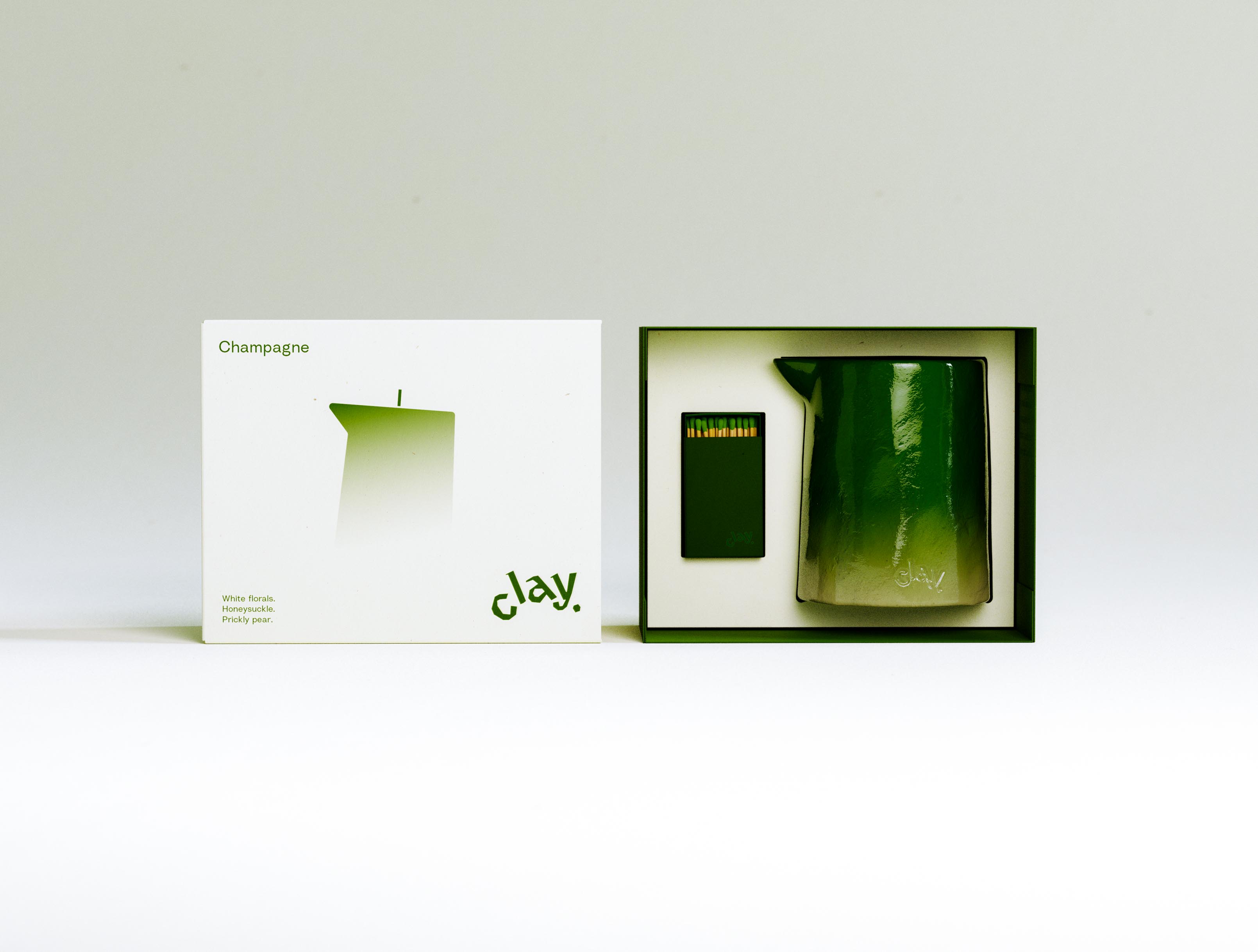
An open-presentation view of the CLAY Champagne set: the cream printed sleeve stands upright at the left while the deep-green tray at the right holds the glossy green pitcher candle beside an open dark-green matchbox, its green-tipped matches visible in the drawer. The candle's ombré runs from saturated green at the spout to a chalky pale base stamped with the lowercase "clay" deboss. Tray, candle and matchstick tips are tuned to one continuous green against the warm cream board. Details like colour-matched matches are where a launch earns its positioning, and producing them — sourcing the matchbox, specifying the tip colour, matching it to the wax — is part of how AOFP Studio carries a new candle brand from concept through to a finished, shelf-ready gift set.
A clean front-facing line-up of the three CLAY cartons — Vetiver, Champagne and Amber — each with its candle perched on top: blue, green and orange glossy pitcher forms above their matching boxes. Every front carries its scent name, a colour-matched gradient candle silhouette, the scent notes ("Limestone. Vetiver. Fig leaf." / "White florals. Honeysuckle. Prickly pear." / "Amber. Vanilla. Sandalwood.") and the "clay." wordmark in the scent's colour. Read together, the row makes the system legible in a second: one structure, one candle form, three scent-coded colourways. It is the catalogue view of a scented-candle range where the packaging design does the merchandising — each SKU distinct, the family unmistakable, the set built to sit together on a shelf in NYC and online.
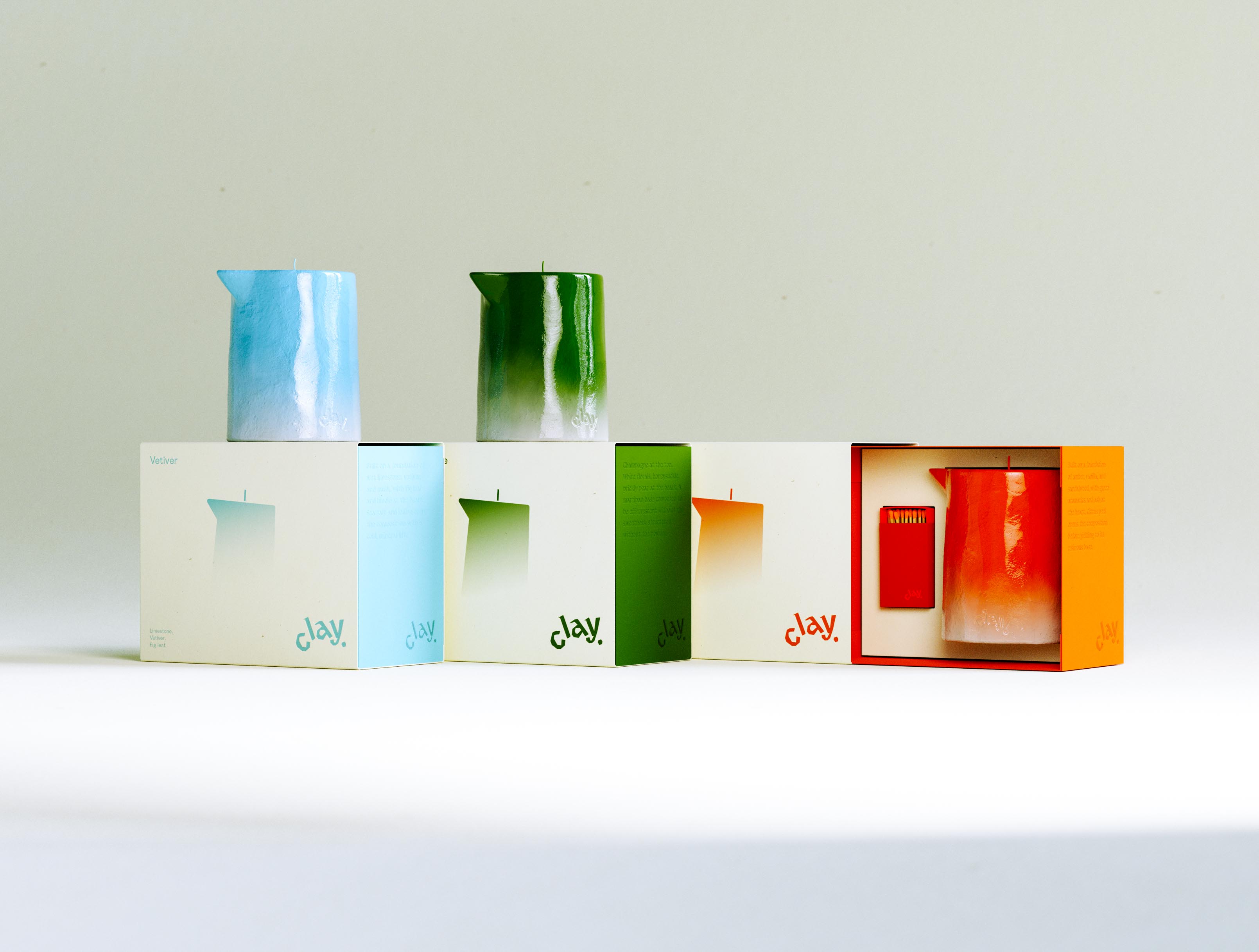
A wide line-up of the complete CLAY range: three cream cartons run left to right showing fronts and scent-coloured side panels, the blue Vetiver and green Champagne candles perched on the first two boxes while the orange Amber box at right is opened to reveal its candle beside a colour-matched orange matchbox with matches in the drawer. The "Vetiver" front, gradient silhouettes and colour-coded "clay." wordmarks step across the row, tying printed system, sculptural object and gift architecture into one frame. Bringing a three-scent candle line to launch at once — every carton, vessel and bespoke matchbox produced to spec and to schedule — is the end-to-end packaging and production Art of Packaging runs for a new home-fragrance brand.
The full CLAY range shown as a trio: three pitcher-shaped candles — pale blue Vetiver, green Champagne and orange Amber, each in a glossy lacquer that fades to a raw base — stand atop three colour-matched boxes turned to their scent-coloured panels, each blind-embossed with its own scent-pyramid copy and the "clay." wordmark in blue, green and orange. One sculptural form recurs across all three while colour and copy do the work of telling the scents apart, which is the whole trick of a multi-SKU identity: maximum shelf variety from minimum structural change. A home-fragrance line built this way — shared vessel, scent-coded colourways, a single confident wordmark — is brand identity and packaging design working at full range, New York.