art of packaging creates unique, intricate brands and finessed packaging.

Wide studio photograph presenting all four Earnest Pursuit specialty coffee tins in a single editorial stack against a warm greige gradient backdrop — the complete four-SKU lineup balanced vertically in ascending size from top to bottom. The top tin is tangerine orange: "EARNEST PURSUIT" in wide-tracked white condensed monospace, a delicate white line illustration of a reclining figure with a glass and bicycle, small tasting-note type, and a sky-blue pill badge reading "The Vine." The second tin is warm cream with "EARNEST PURSUIT" in cornflower blue, a blue line-drawn figure beside a small sailboat, and the "Let's Chill" badge. Third is deep forest green — white wordmark, a tall crane-like bird illustration in pale linework, and an "All Set" badge. At the base, the widest and tallest tin is pale warm yellow: "EARNEST PURSUIT" in periwinkle blue, a stacked-objects line illustration, and "The Match" badge for the house blend sourced from the Pacific Islands and Latin America. Metal roll-seam lids catch bright specular rim light against the matte direct-printed panels throughout. Spot colour, four-SKU direct-print tin system with a distinct custom line illustration per SKU. Packaging design for a new specialty coffee brand launch in New York, complete multi-SKU system by Art of Packaging.
The CLAY Champagne carton photographed at a three-quarter turn with its candle still perched on top, so cream front and shadowed deep-green side panel both read in one frame. The glossy pitcher-shaped candle sits centred above the printed silhouette, its ombré lacquer fading from full green at the spout to a chalky pale base marked with the lowercase "clay." deboss; the side panel's blind-embossed scent-pyramid copy sits just out of full legibility in the raking light, more texture than text at this angle. It's a styling choice rather than a specification shot — showing how object and pack are meant to be seen together on a shelf. Packaging design for a New York candle brand, where every angle, not just the flat-on hero, has to hold up as a still life.
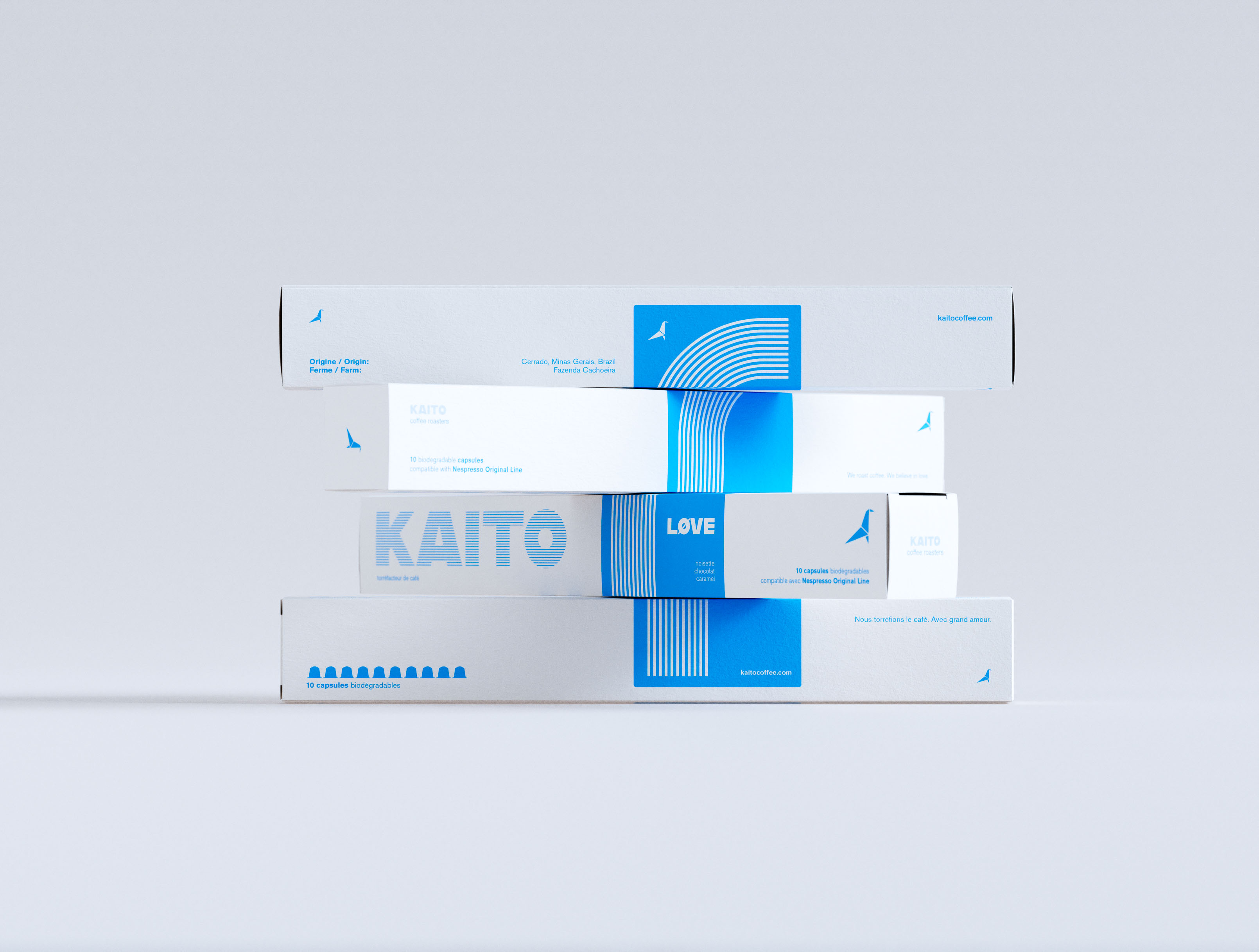
Four KAITO coffee capsule boxes in an alternating staggered offset arrangement against neutral grey, each box shifted to expose the box beneath. White coated paperboard, single-color cyan print. Front face shows the large striped KAITO wordmark; LØVE variant in white on the blue vertical band with concentric arc stripe pattern. Tasting notes: noisette, chocolat, caramel. Bilingual French/English pack copy. Origami bird logomark throughout. Art direction and brand identity and graphic design by a packaging design studio.
The CLAY Champagne carton photographed at a three-quarter turn with its candle still perched on top, so cream front and shadowed deep-green side panel both read in one frame. The glossy pitcher-shaped candle sits centred above the printed silhouette, its ombré lacquer fading from full green at the spout to a chalky pale base marked with the lowercase "clay." deboss; the side panel's blind-embossed scent-pyramid copy sits just out of full legibility in the raking light, more texture than text at this angle. It's a styling choice rather than a specification shot — showing how object and pack are meant to be seen together on a shelf. Packaging design for a New York candle brand, where every angle, not just the flat-on hero, has to hold up as a still life.

would you like to see your art define a brand? - send your book of work and rates to artists@packaging.art
-

Studio references a catalog of artists and commonly will design and present concepts to clients with an artist and style in mind.

Resulting in focused briefs delivered to the artist, payment ahead of execution, full credit, and a direct relationship with the client for recurring work.

Get it touch, help us get you known : )

what is art of packaging?

Branding and graphic communication design. High-level concepts, finessed, and guided to production.

how does it unfold?

Conversation and visualization. Feedback and visualization. Two to three rounds for concepts, then finessing. Production timing varies with scale and project requirements.

what is involved in a project?

First a comprehensive, visualized exploration of a few creative concepts. Next a wide range of creative, organizational, and manufacturing design finessing selected direction into final form. This includes naming, packaging, advertising, physical and digital communication design, and many more highly varied things.

why packaging?

It’s fun to do. Photographs well. Multiple markets, geographies, regulations. With practice a detailed understanding of industry, structural design, printing processes, manufacturing, supplier communications, materials and production sourcing. Complex systems or boutique one-offs.

projects without packaging?

Yes, - branding and communications.

art of packaging is a full service design atelier.

contact@packaging.art
call for artists