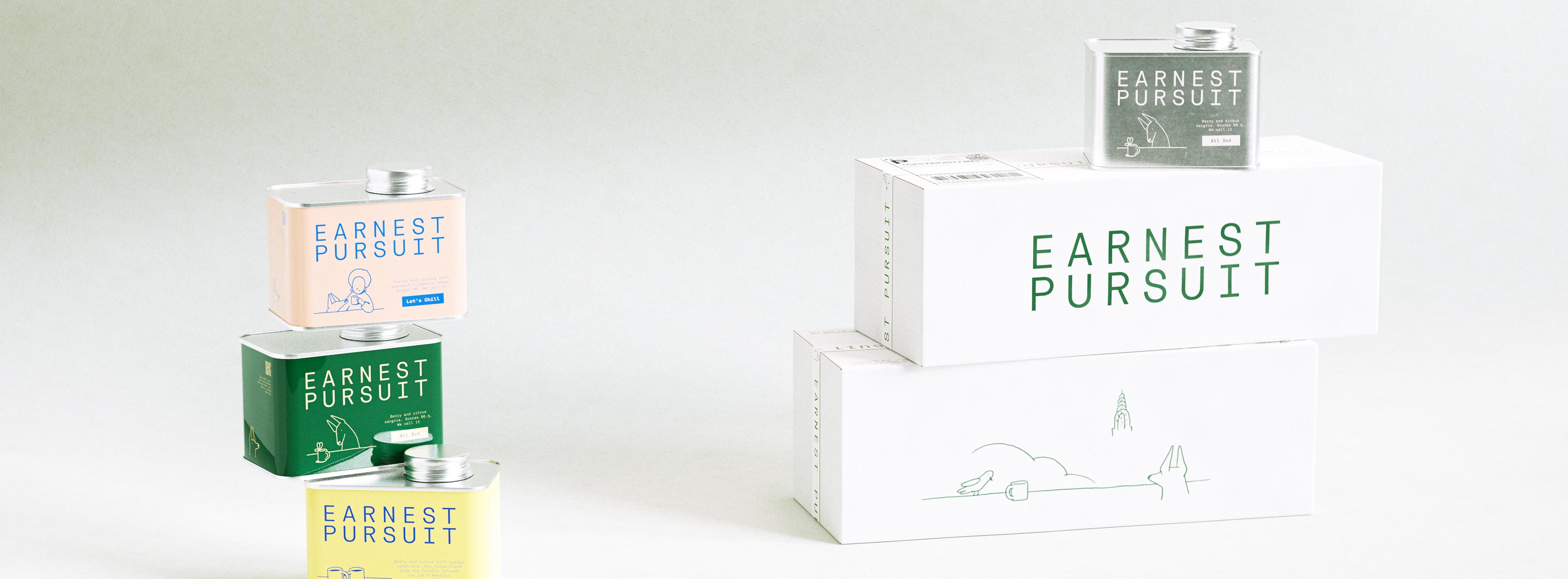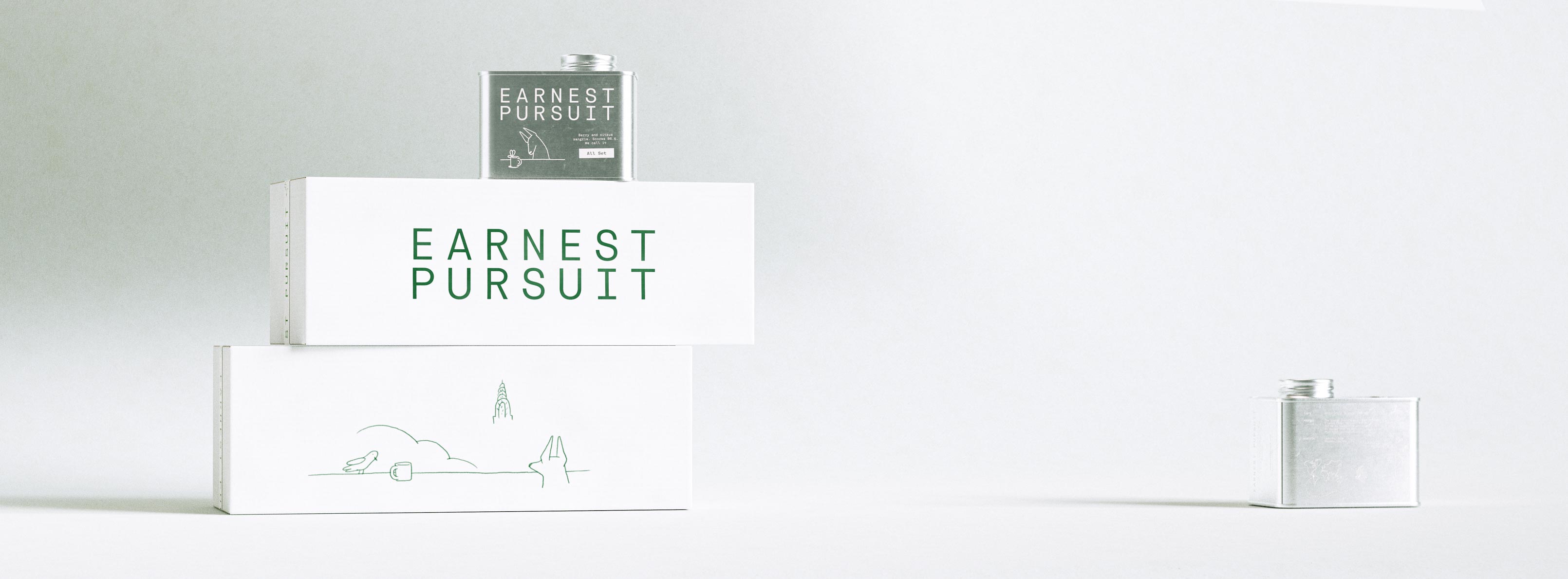
Two long white shipping boxes lie stacked horizontally against a gentle grey gradient, the upper carton carrying the forest-green EARNEST PURSUIT wordmark and the lower one the delicate single-line skyline illustration of a bird, cup, cloud and city spire. A forest-green tin sits on top, its label bearing a small drawing and an "All Day" descriptor, while a bare silver tin rests on the surface to the right. The cartons are matte uncoated corrugate printed in a single green ink; the tin is lithographed metal. The photograph highlights structural packaging design, a coordinated tin-and-carton system and print production — a shipping-packaging programme with matched illustration and typography by Art of Packaging.Two Earnest Pursuit specialty coffee tins in a stacked vertical portrait composition against a warm neutral gradient background. The back tin floats higher in the frame, angled to show the info panel with origin data for a Colombian Huila coffee — variety Caturra and Pink Bourbon, flavour notes Berry-Citrus Sangria, Peach, Pine — alongside a hand-drawn world map illustration and an elevation diagram. The front tin sits lower, displaying the EARNEST PURSUIT wordmark in Rational TW monospace type, the hand-drawn seated-dog-and-figure line illustration, and the All Set SKU badge. The staggered positioning creates depth without a formal prop — the tins balance naturally in the frame, product weight implied through placement alone. Both tins are flat rectangular metal with silver aluminium screw caps, direct-printed in forest green with cream spot-colour type and illustration. No paper label — graphics go straight onto the tin surface, giving the packaging a tactile, object-like quality. Design disciplines include packaging design for specialty coffee, custom illustration system, direct-print production, and art direction. Brand naming and identity design for a specialty coffee brand launch by Art of Packaging, New York.
Brief.
Packaging for shipping.
Client.
Earnest Pursuit is a distinct coffee roaster in New York.

Studio developed Earnest Pursuit name brand, and packaging in 2026.
How it developed.
Design process for additional applications on already developed brands typically creates a few concepts folllowing the system.

And as a rule an additional few pushing the system creatively.
Current result.
Minimal.
Neat.
On brand.
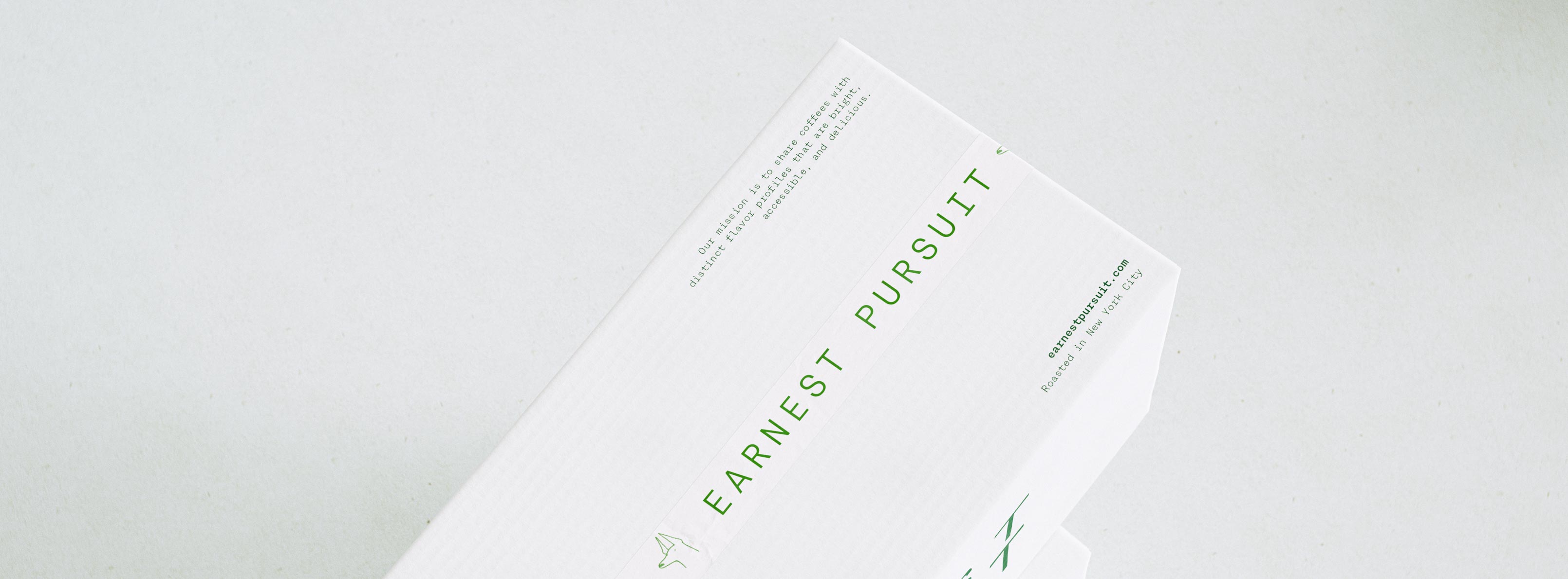
A macro of the top edge of a white Earnest Pursuit mailer, angled so the letter-spaced green EARNEST PURSUIT wordmark runs along the box beside its small-print mission statement: "Our mission is to share coffees with distinct flavor profiles that are bright, accessible, and delicious." Below sit the earnestpursuit.com URL and the "Roasted in New York City" line, with a small skyline glyph tucked in. The carton is uncoated corrugate printed in a single forest-green ink, the copy set in a fine, monospaced-feeling grotesque. The frame foregrounds information design and typographic hierarchy — brand identity and packaging for a new coffee launch from a New York roaster, art direction by AOFP Studio.
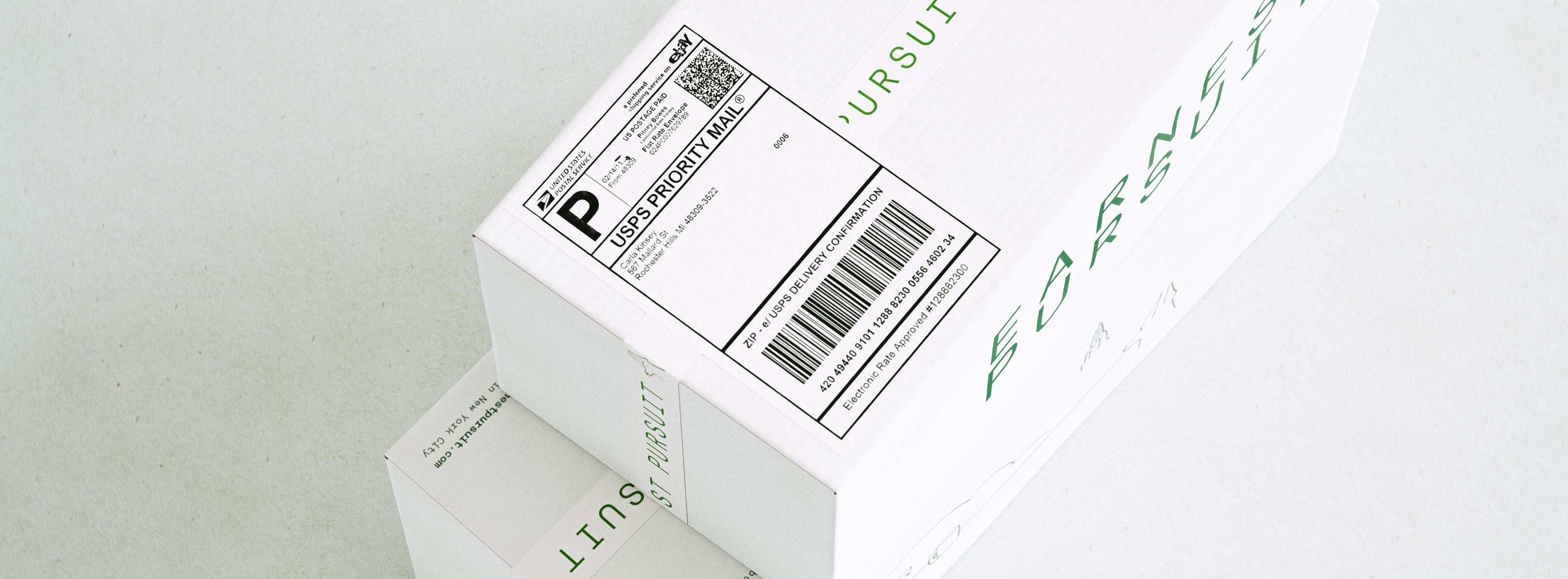
A tight, angled macro of a white shipping box focuses on its USPS Priority Mail label — the bold black "P" logo, printed sender block, delivery-confirmation barcode and rate-approved line — applied cleanly to the corrugated lid. Behind and around it, the forest-green EARNEST PURSUIT wordmark and the fine single-line skyline illustration wrap the box, with a second carton stacked beneath. The board is uncoated matte corrugate printed in one green ink, the shipping label integrated so it sits comfortably beside the brand graphics rather than fighting them. The image speaks to structural packaging design and print-ready artwork that accommodates real carrier labelling — the practical side of designing a shipping system for direct-to-consumer coffee.
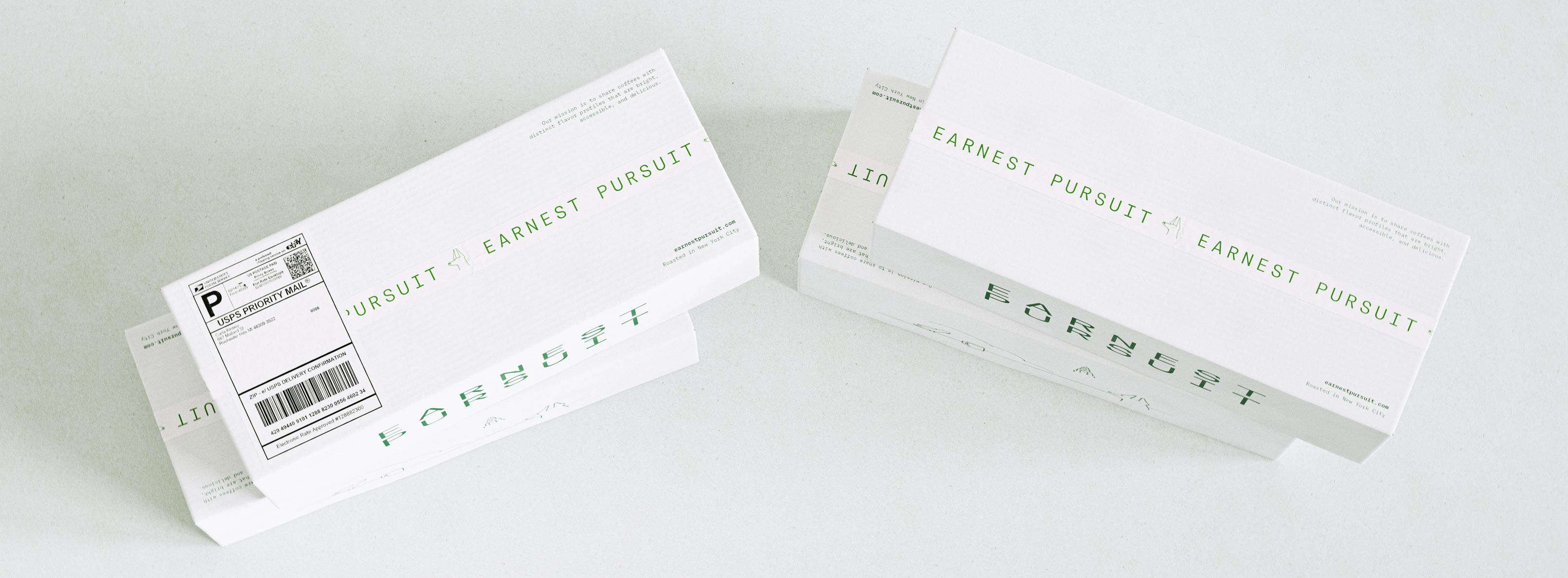
Two slim white mailer boxes lie flat at opposing angles on a pale grey surface, one bearing a USPS Priority Mail label with barcode and delivery confirmation. Across the long faces the forest-green EARNEST PURSUIT wordmark runs in a widely spaced grotesque, mirrored and repeated as a graphic motif, alongside a small mission line and the "Roasted in New York City" credit. The mailers are matte uncoated corrugate printed in a single green ink, engineered as long, low shipping cartons. This is a typography-led, minimalist packaging design — brand identity and print production for the launch of a new mail-order coffee service, built to look considered from warehouse to doorstep.
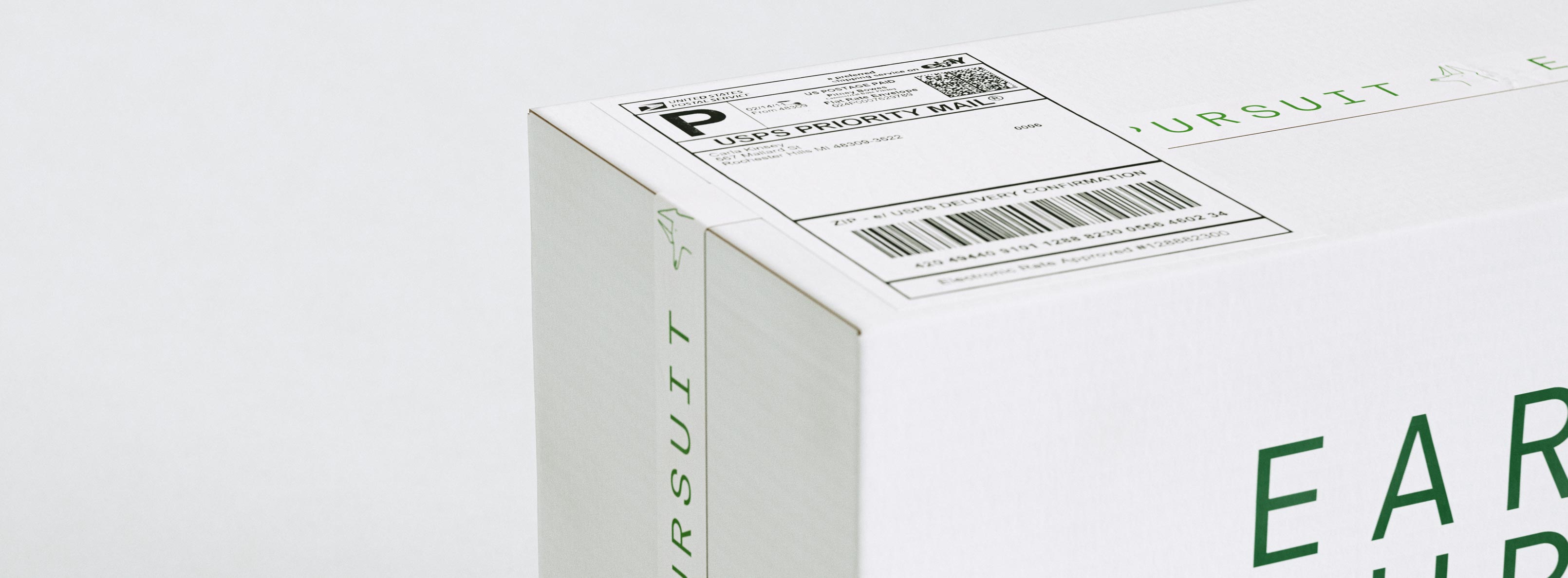
An extreme close-up of the corner of a white shipping mailer, shot at a low angle so the box edge cuts diagonally across the frame. A USPS Priority Mail label sits on the top face, its barcode and "P" mark crisp against the matte board, while the forest-green EARNEST PURSUIT wordmark and a tiny single-line city glyph run along the visible side panel. The carton is uncoated corrugate with restrained one-colour green printing and generous negative space. This macro highlights the finish and detailing of the shipper — the typography, label placement and material feel — the sort of packaging design for specialty-coffee brands that Art of Packaging develops.
A full family shot of the Earnest Pursuit system arranged on a pale grey surface. On the left, three coffee tins stack into a column — a blush tin reading "Let's Chill", a forest-green tin and a yellow tin — each printed with the wordmark and its own small line drawing. On the right, two white shipping cartons sit stacked, one showing the letter-spaced green wordmark and the other the single-line New York skyline illustration, with a green tin resting on top. Materials range from lithographed metal tins to uncoated corrugated board, all held to a tight palette of green with warm accent tones. The image showcases a multi-SKU identity, structural packaging and illustration built for the launch of a direct-to-consumer coffee brand roasted in New York.
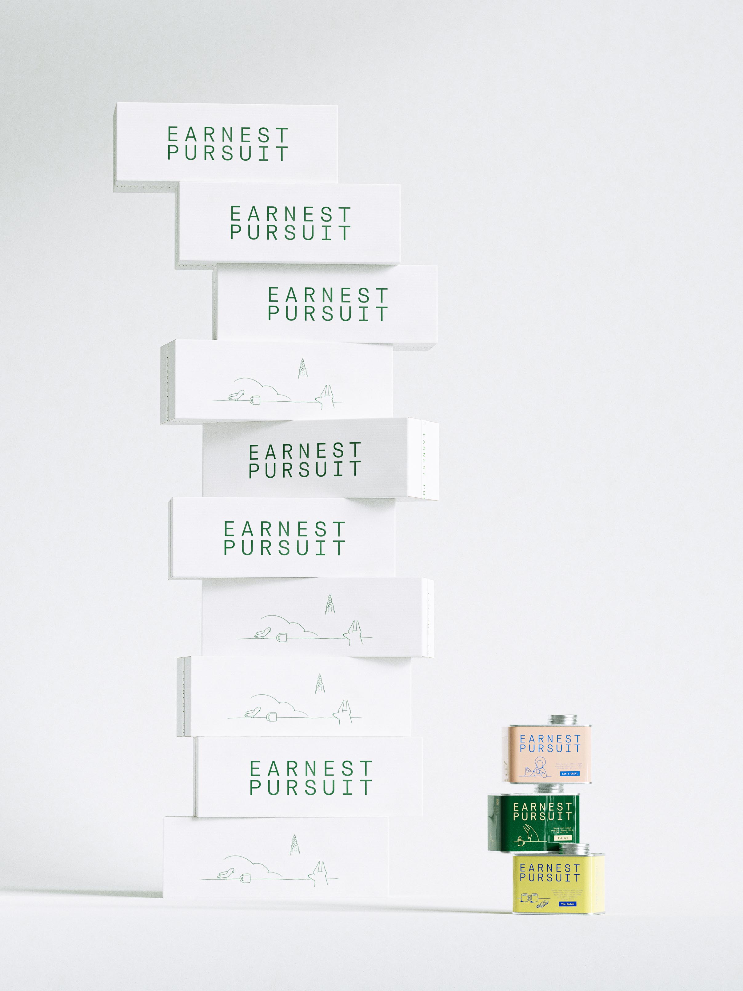
A tall, staggered tower of white corrugated shipping mailers rises against a soft grey studio backdrop, each carton offset from the one below so the stack reads like a precarious skyline. Alternating faces carry the forest-green EARNEST PURSUIT wordmark — a widely letter-spaced grotesque — and a fine single-line illustration of a New York vignette: a bird, a steaming cup, a cloud and the Chrysler spire on a thin horizon. To the right sits a trio of stacked tins in blush, deep green and yellow. The mailers are matte uncoated board with restrained one-colour green print; the tins are lithographed metal. The work spans packaging design, brand identity, illustration and art direction for a New York specialty-coffee brand — design by AOFP Studio.

Specialty coffee. Tailored shipping. New York City.

Earnest Pursuit
United States
2026