Say hello!
it‘s ice cream

Ice cream tastes better packaged in a cube.
-
No small effort to cube it.
-
No small effort to cube it.
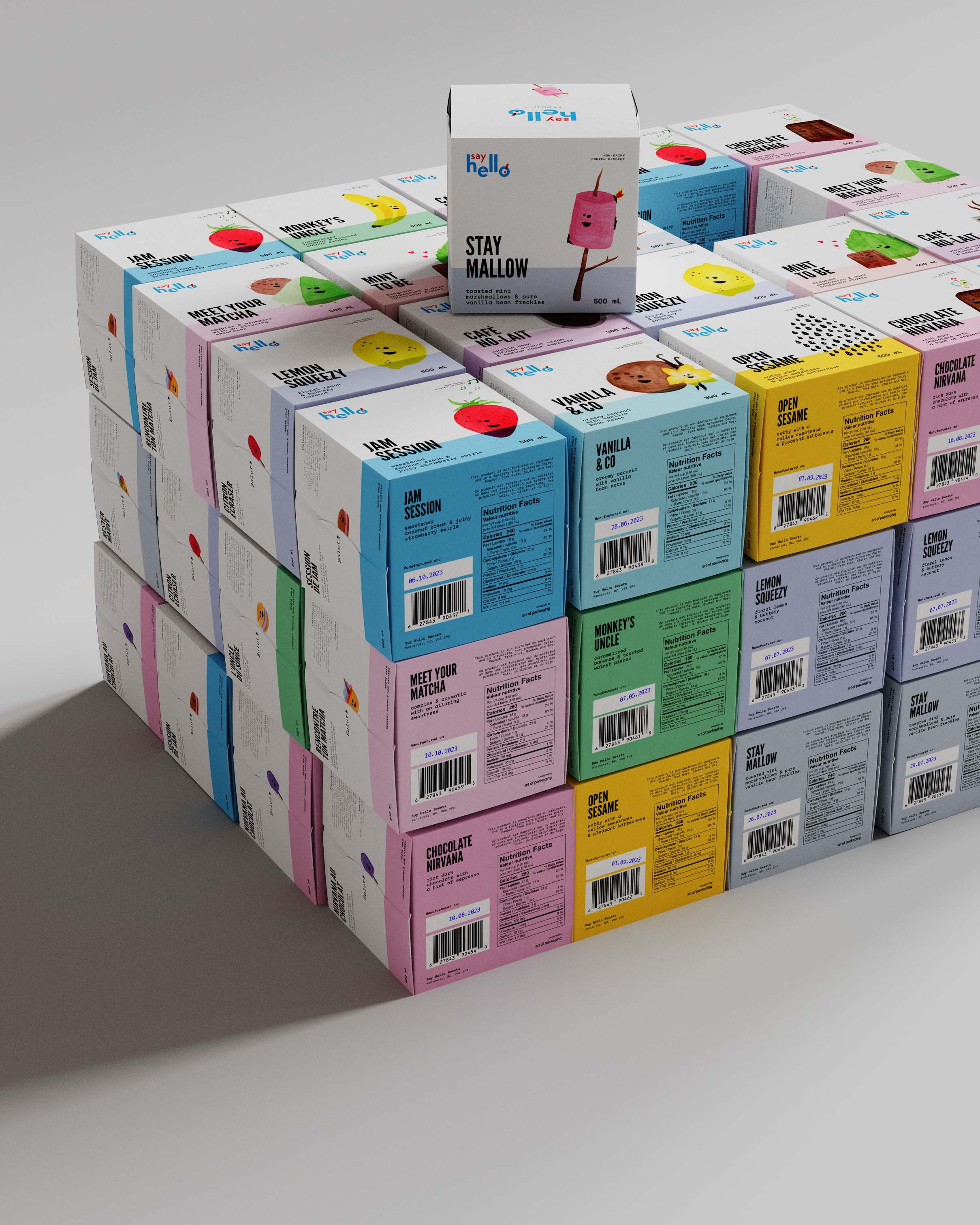

Lets not look like typical ice cream, - Say Hello asked. Looking eye brandmark was paired with hand drawn family of animated characters, and dipped in matching colors on bespoke structural cube packaging design.


Made with food safe Aquapel paper, the structural is leak proof and glue free. Side folds snap into each other creating a tight seal.
