Redshift Cold Brew.
-
Sweetened and Unsweetened. Glitch Art. Matte Finish Aluminium. Cold Coffee, Cool in Hand.
Client
Red Roastery coffee located in Vancouver, BC, is known for reinventing the coffee experience for its customers with unexpected roasts, and unique flavours.
Brief
Red Roastery team wanted a striking look for its inaugural line of packaged cold brew coffee. Their brief called for a minimal, bold packaging concept, aiming to go in the opposite direction of retro-inspired cold brew looks. The design was to appeal to a younger, audience, capturing attention and resonating with a unique, contemporary aesthetics.
“A cool can in hand"
Solution
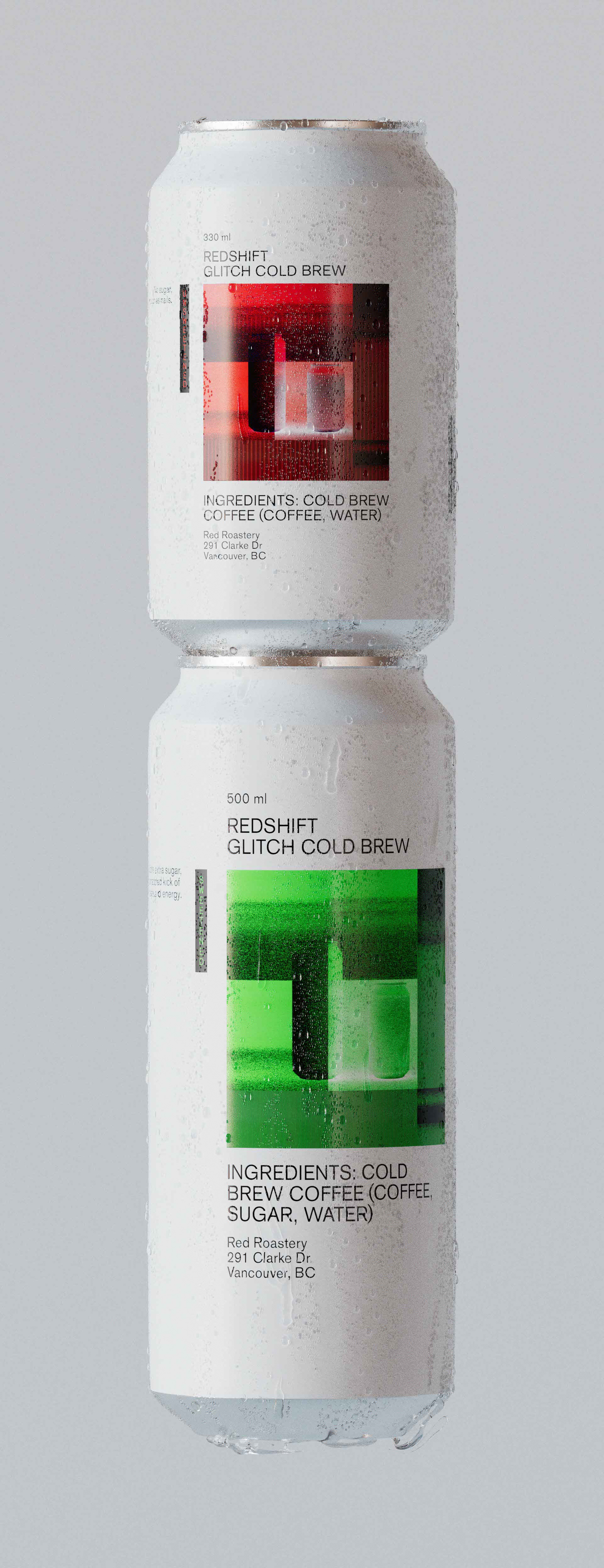
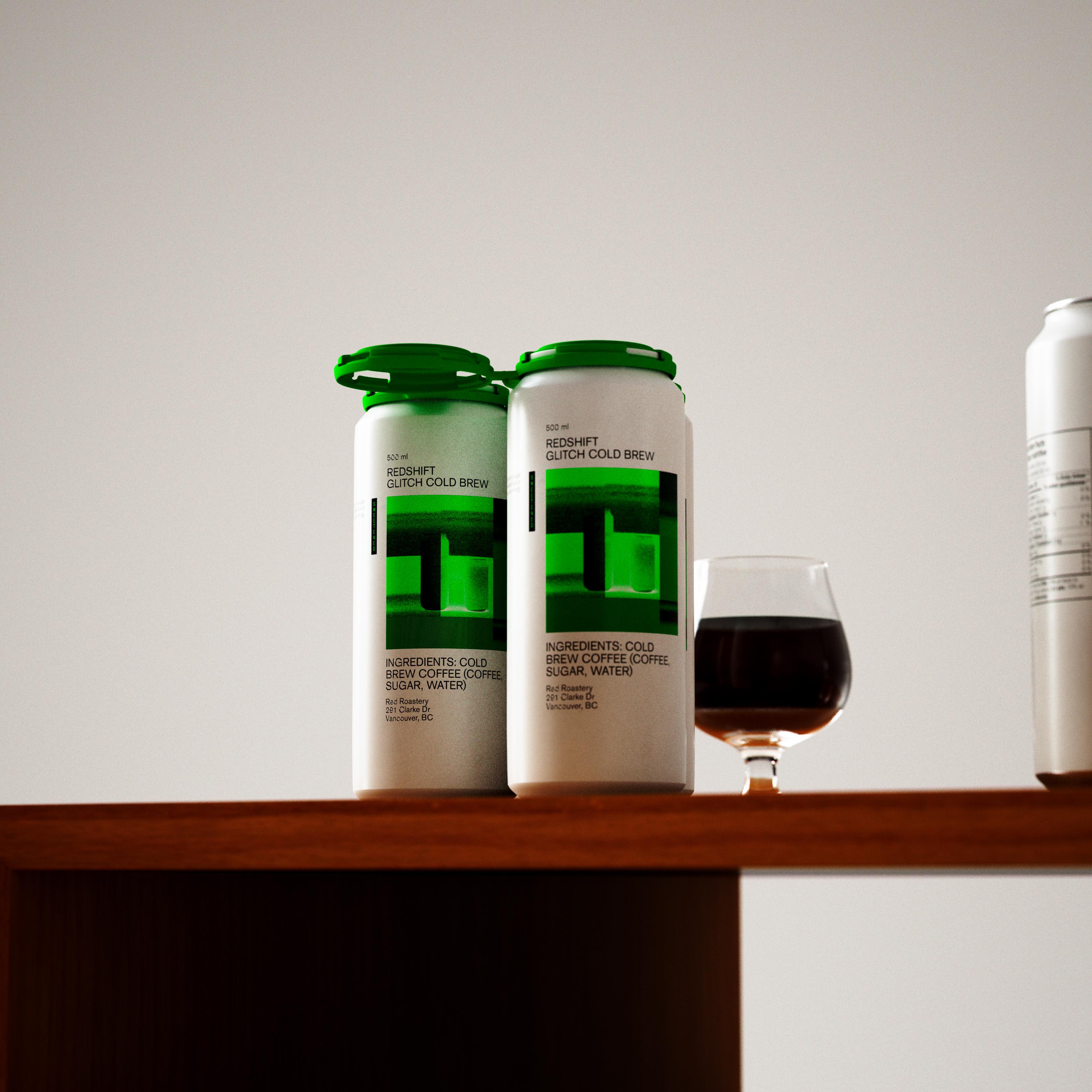
Packaged in 500ml and 330ml aluminium cans, the design centres around a sleek, matte white finish juxtaposed with vibrant glitch art.
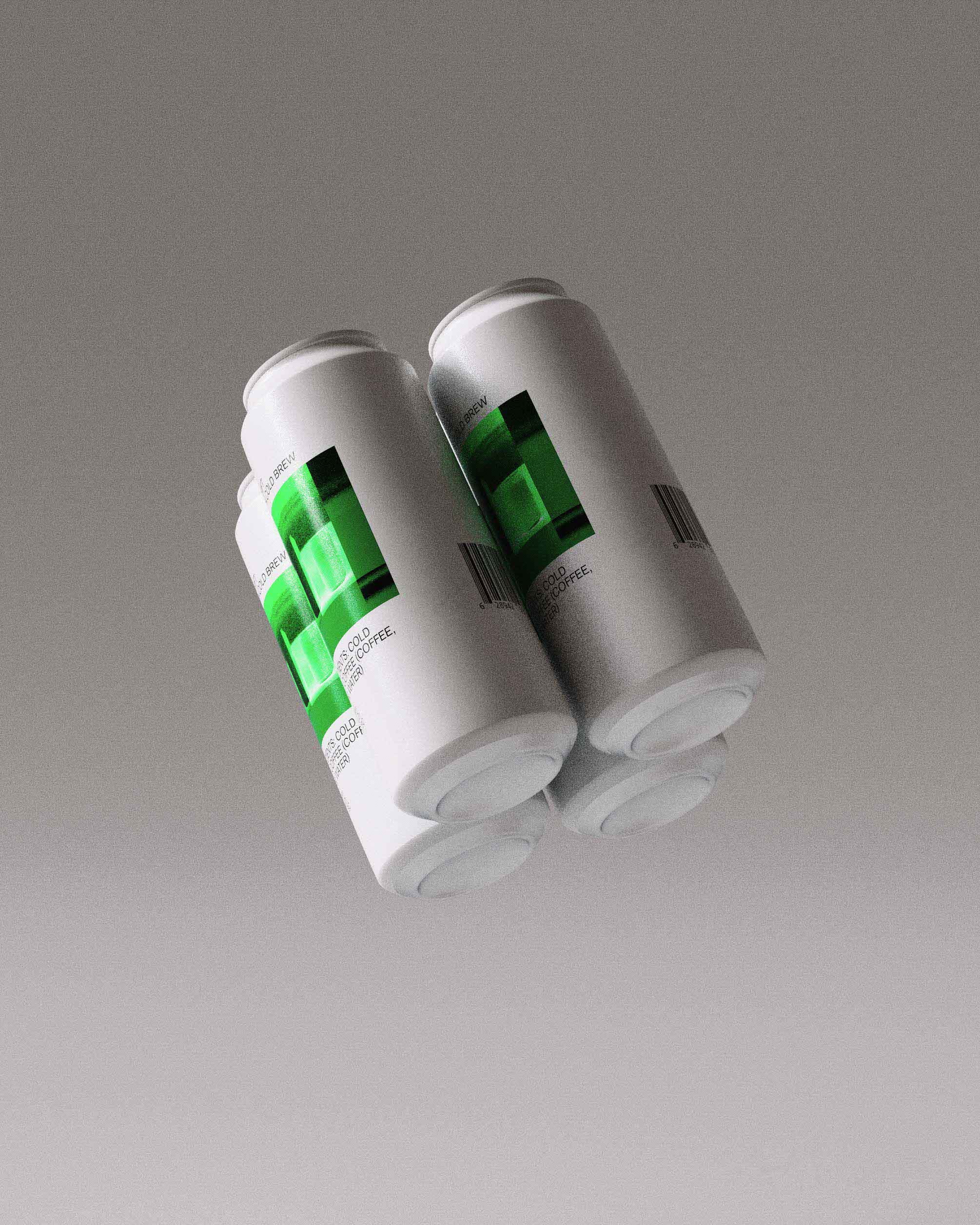
The art features an abstract representation of the can, depicted in a bold glowing green for the sweetened version and fire hydrant red for the pure black roast. The minimalism of the white matte finish contrasts with the complexity of the glitch art, creating a visual draw that immediately stands out.
This two-tone contrast lends a bold aesthetic, all while maintaining an element of simplicity, speaking to Red Roastery's mastery in delivering complex tastes through intricate, high-quality blends from around the world.
Process
New cold brew cans were introduced through a curated launch campaign. High-definition, digital product images were shared on social media platforms, with vibrant colors and unique design sparking conversations amongst the brand's followers.
Prominent placement in retail locations was key in the physical introduction a key role. Brews were positioned to take full advantage of the natural light, making the metallic glitch art pop.
Through a blend of digital and physical marketing strategies, Red Roastery successfully broke through the clutter of traditional cold brew offerings, position as a standout choice for young, contemporary coffee lovers.
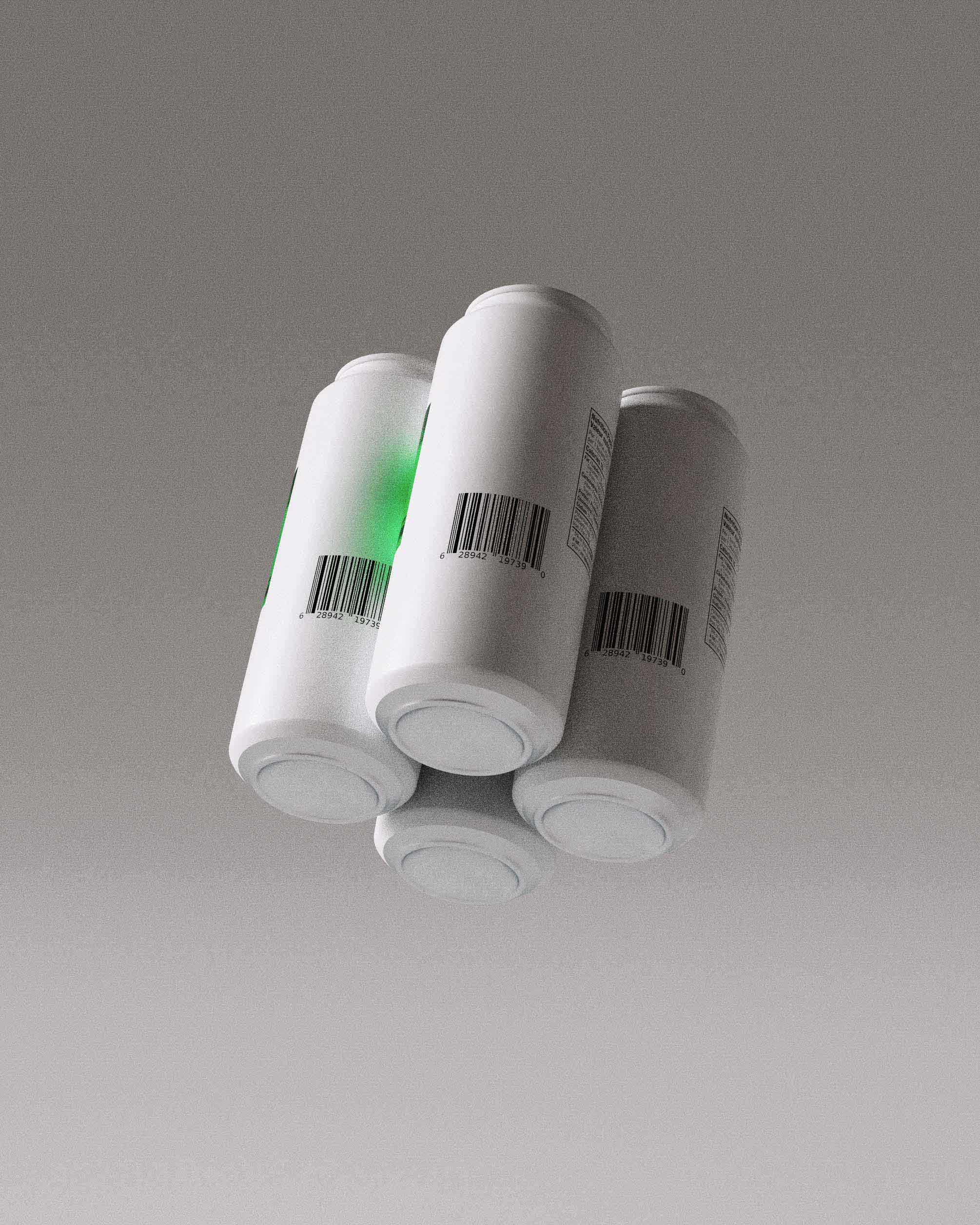
Matte, all-over white print finish made the cans distinctly pleasant to hold in hand. While spot gloss on text and artwork creates a stylish and tactile contrast.
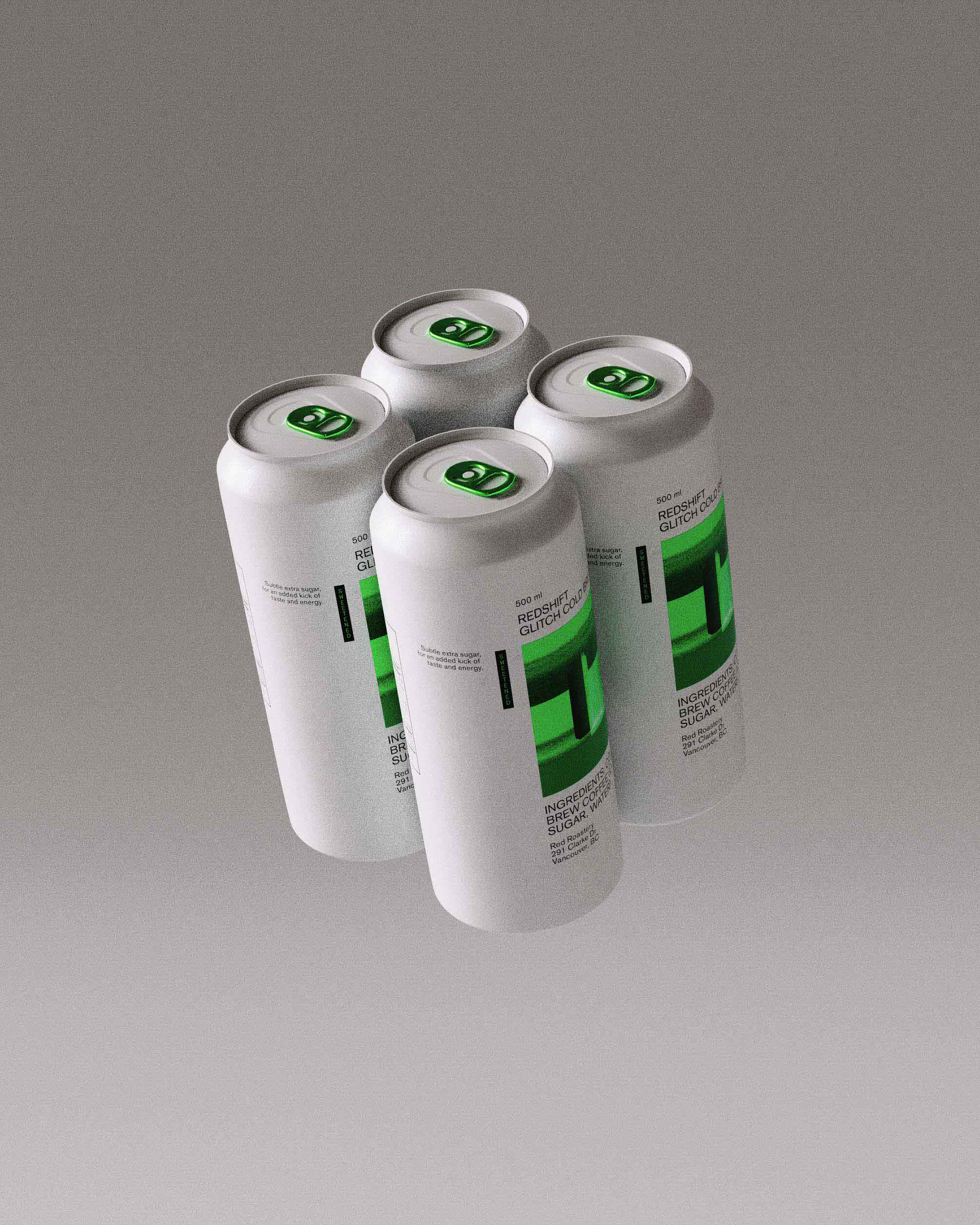
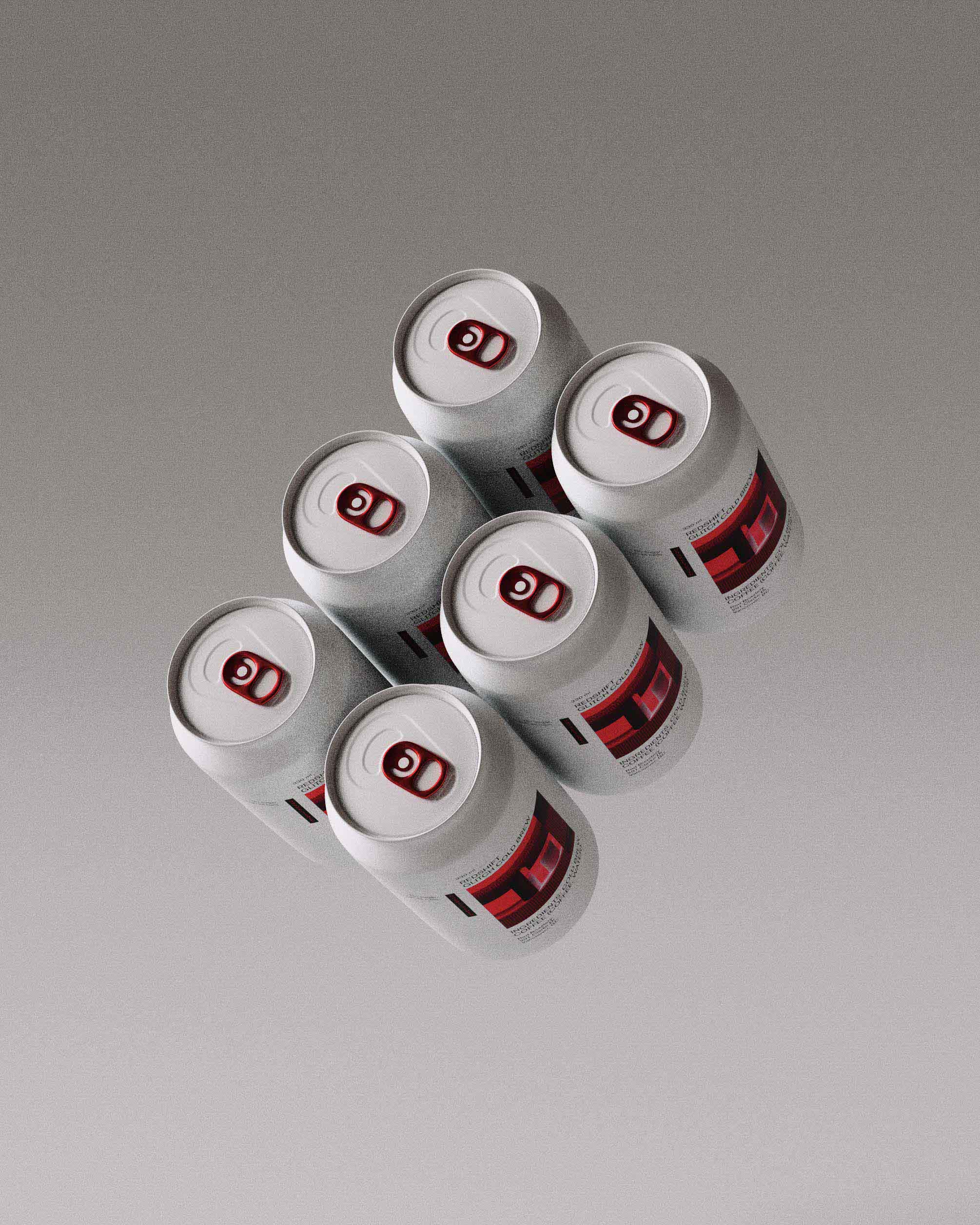
PakTech lids were sourced and color matched to artwork. Recyclable, stylish and easy to carry, they make for a striking pairing with the cans.
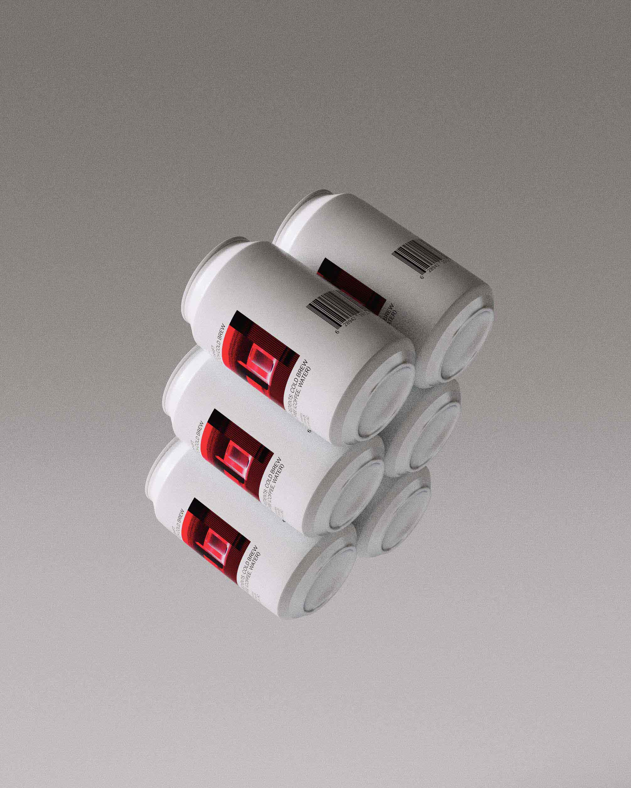
Custom white lids with color matched pull tabs were selected to complete the look. The interplay between white and vibrant metallic colors creates an inviting visual pairing.