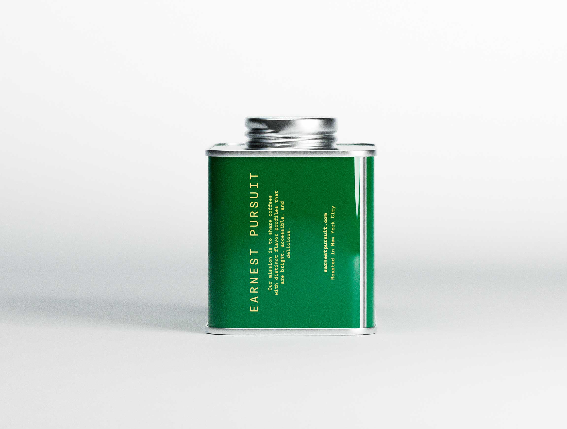
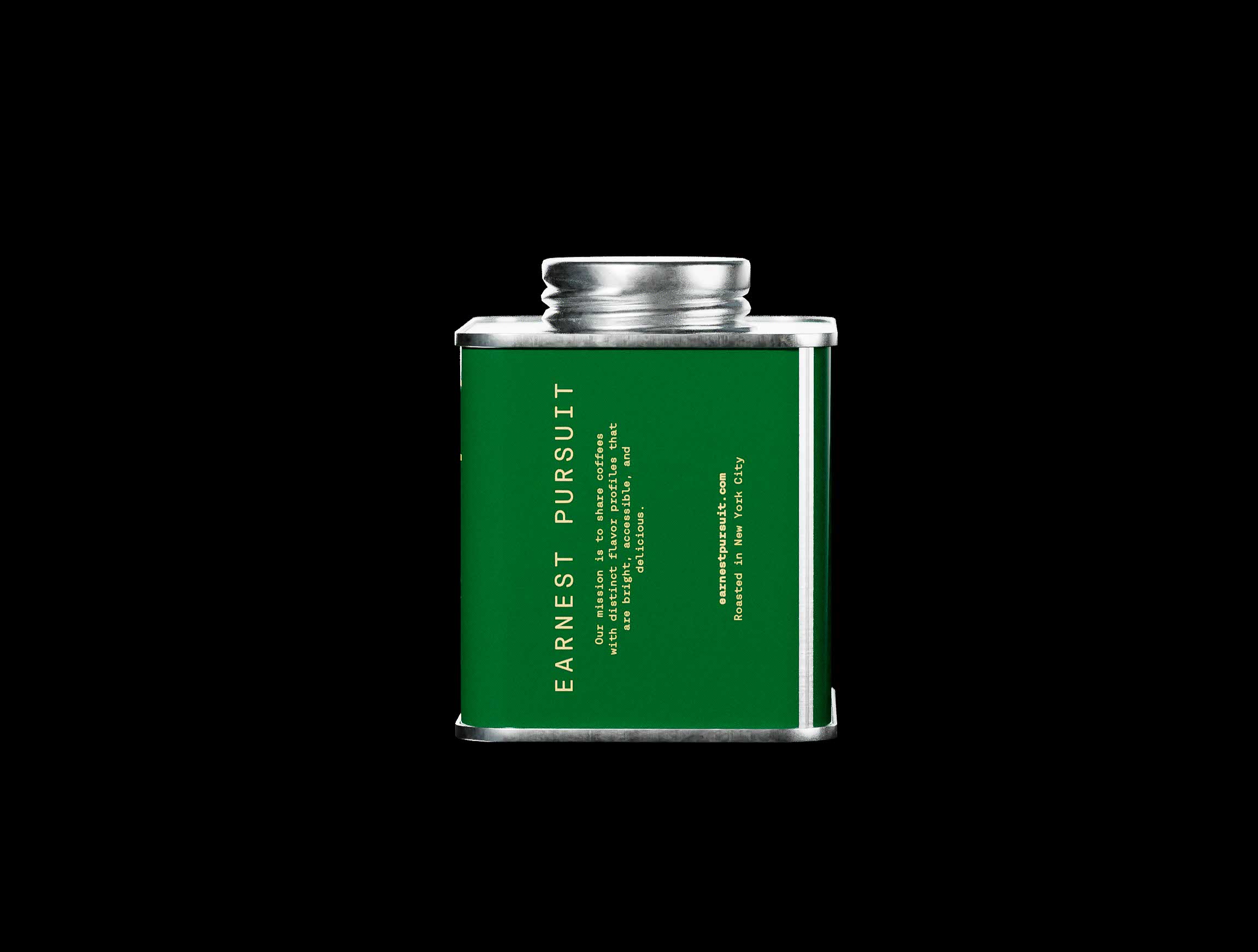
Focus photography on product.
In studio or on black. Showcase the details, illustrations, gloss finish and rich colors.
Avoid intricate sets and decorations. Gradually introduce color and additional elements to develop brand photography. Retain the focus on the product (with reasonable exceptions). Shoot above 100mm in f16-18 range.
Remember.
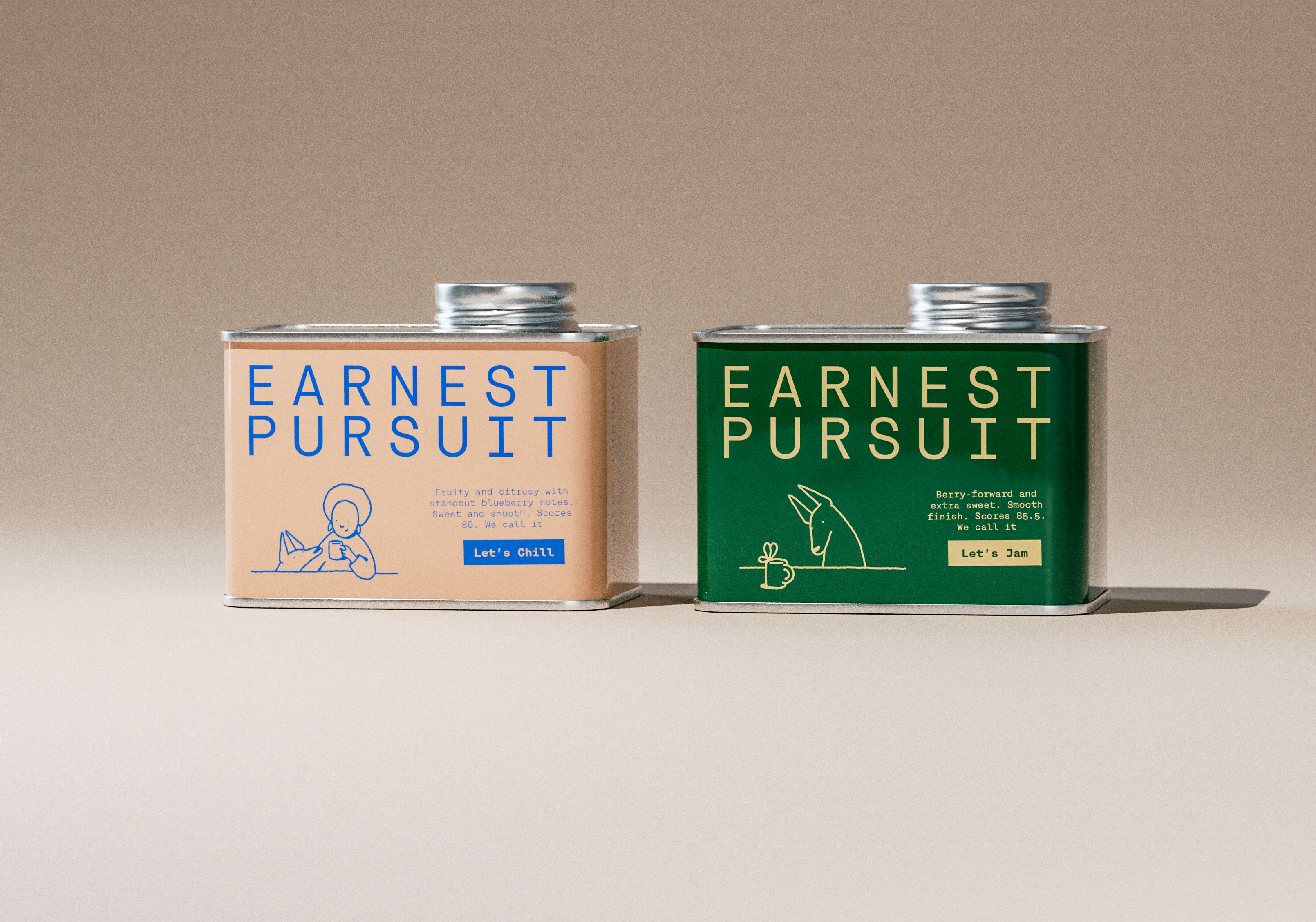
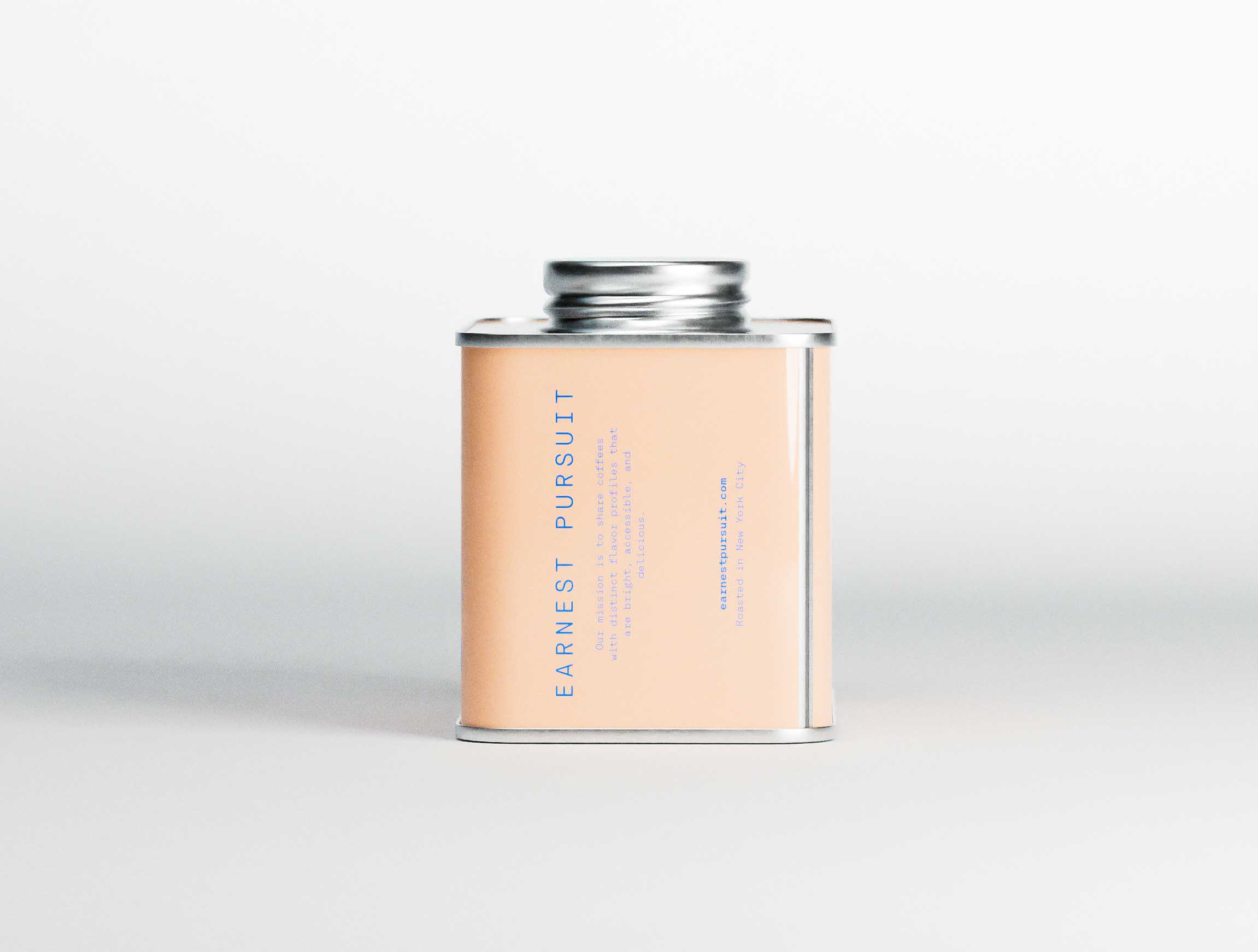
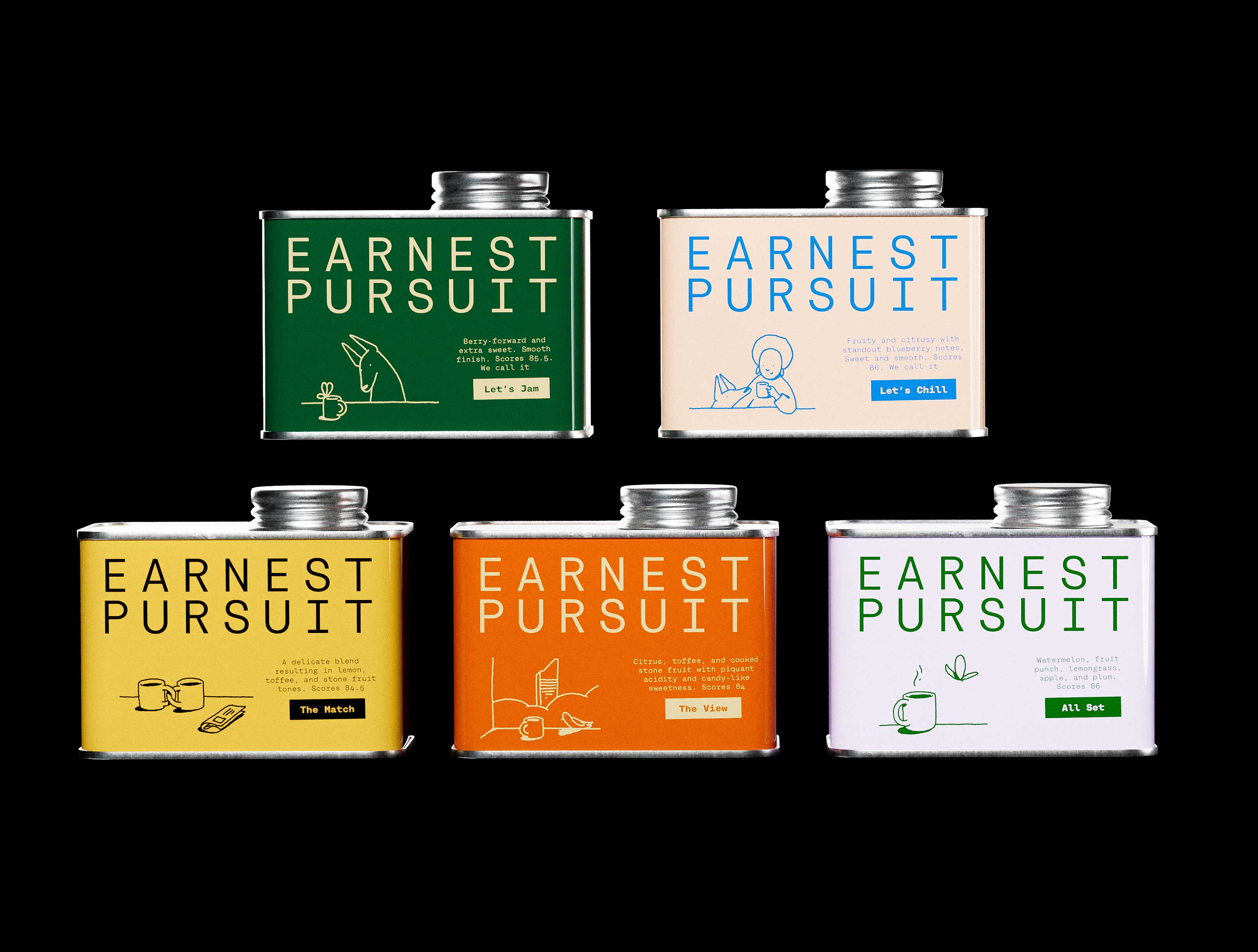
Earnest Pursuit is both quality coffee and an object of desire, interior design. Relaxed, non-chalant, it lives on the counter, enjoyed in view, not hidden in the pantry.
Art direction — clear, interesting, charming.
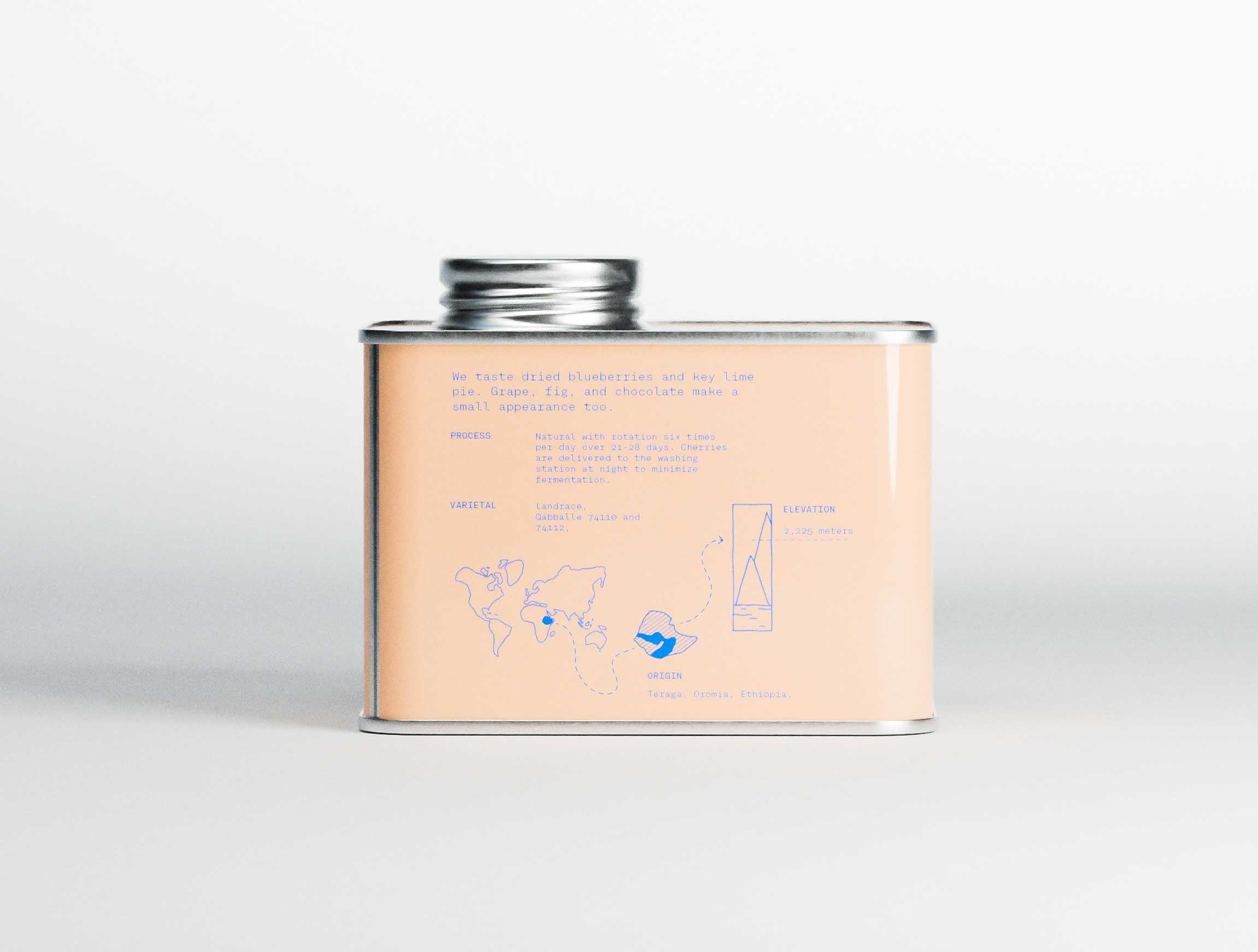
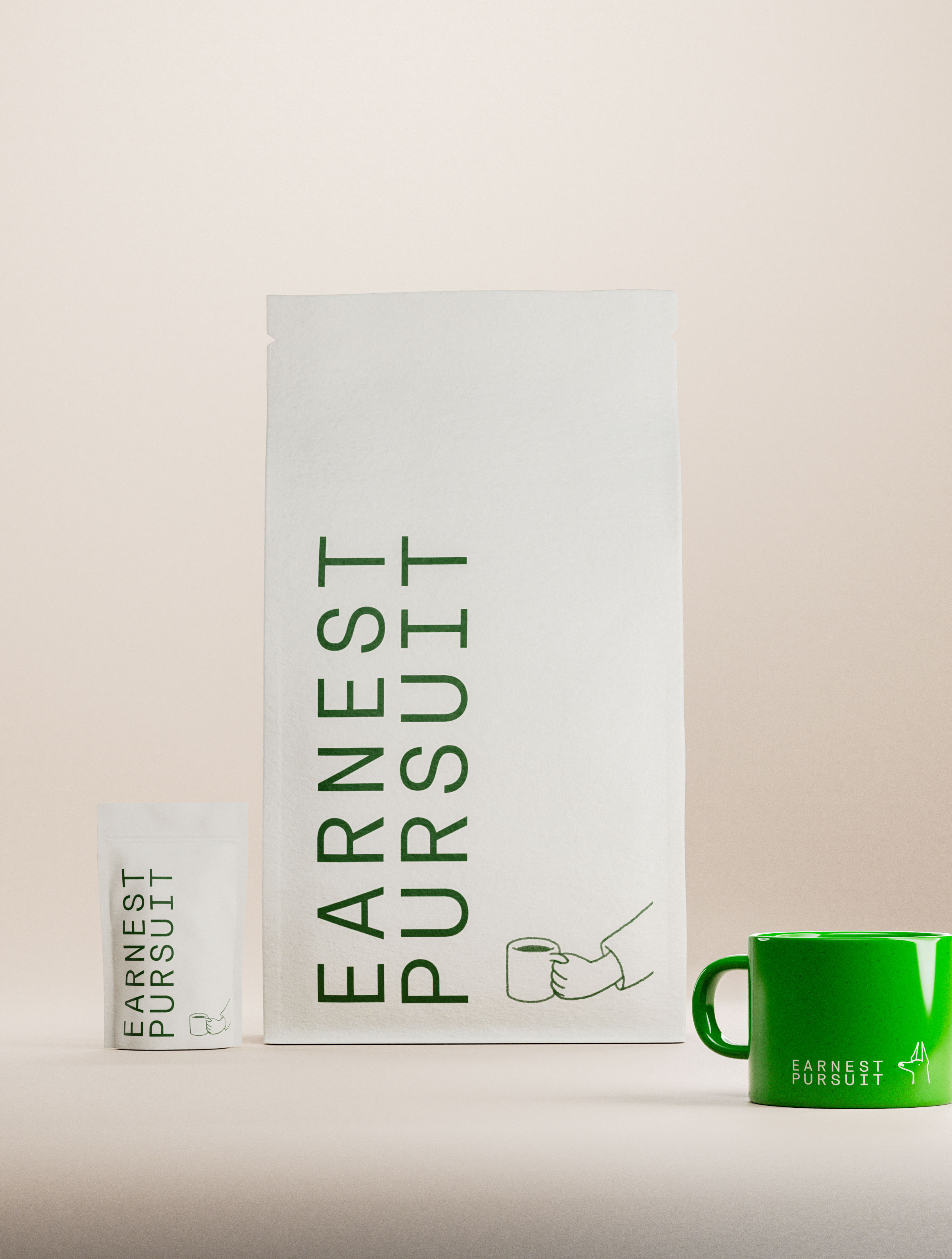
Monospace structure of Rational TW typeface gives order and rhythm to the visual system. At the same time its unique individual characters give text a lively, intentional feel.
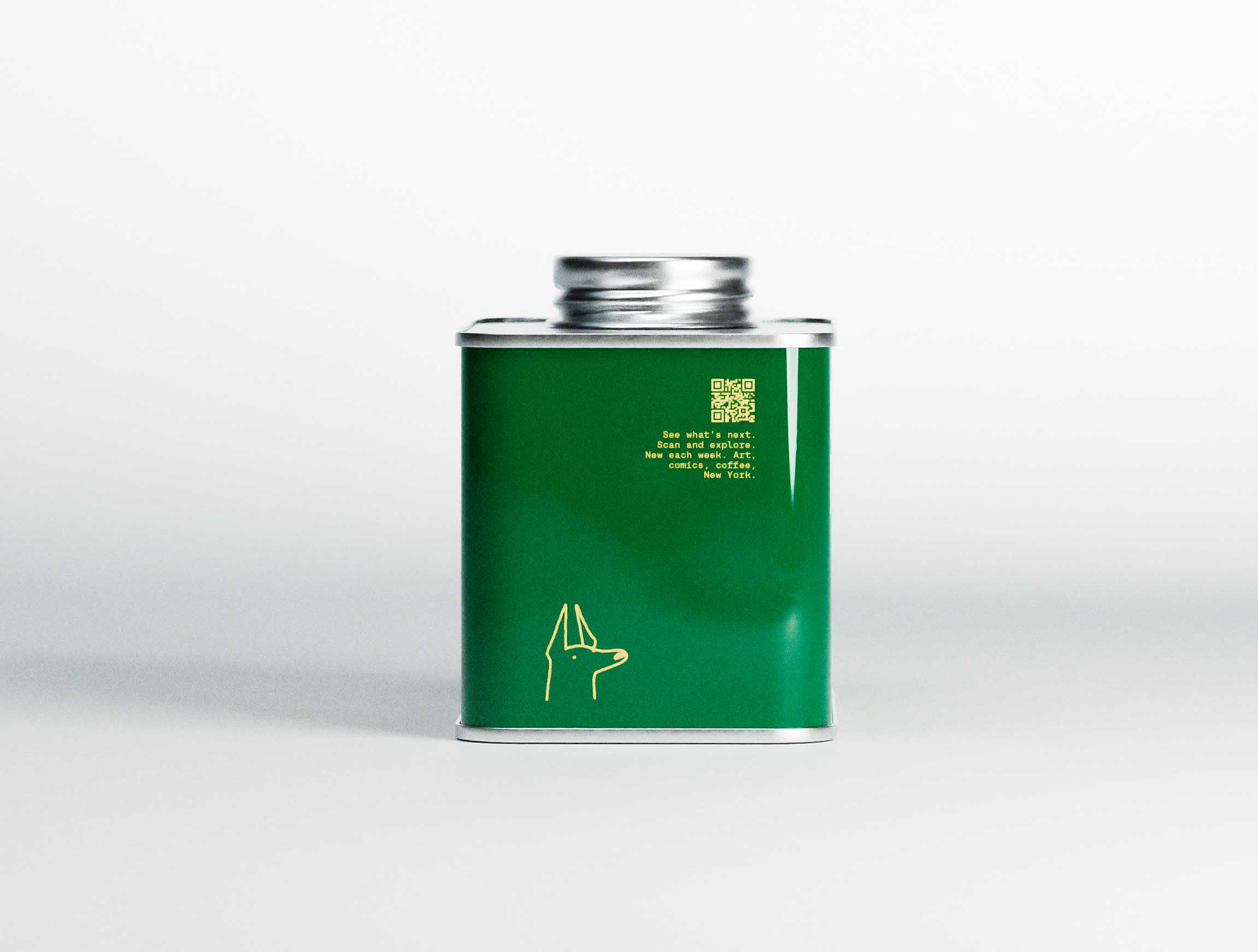
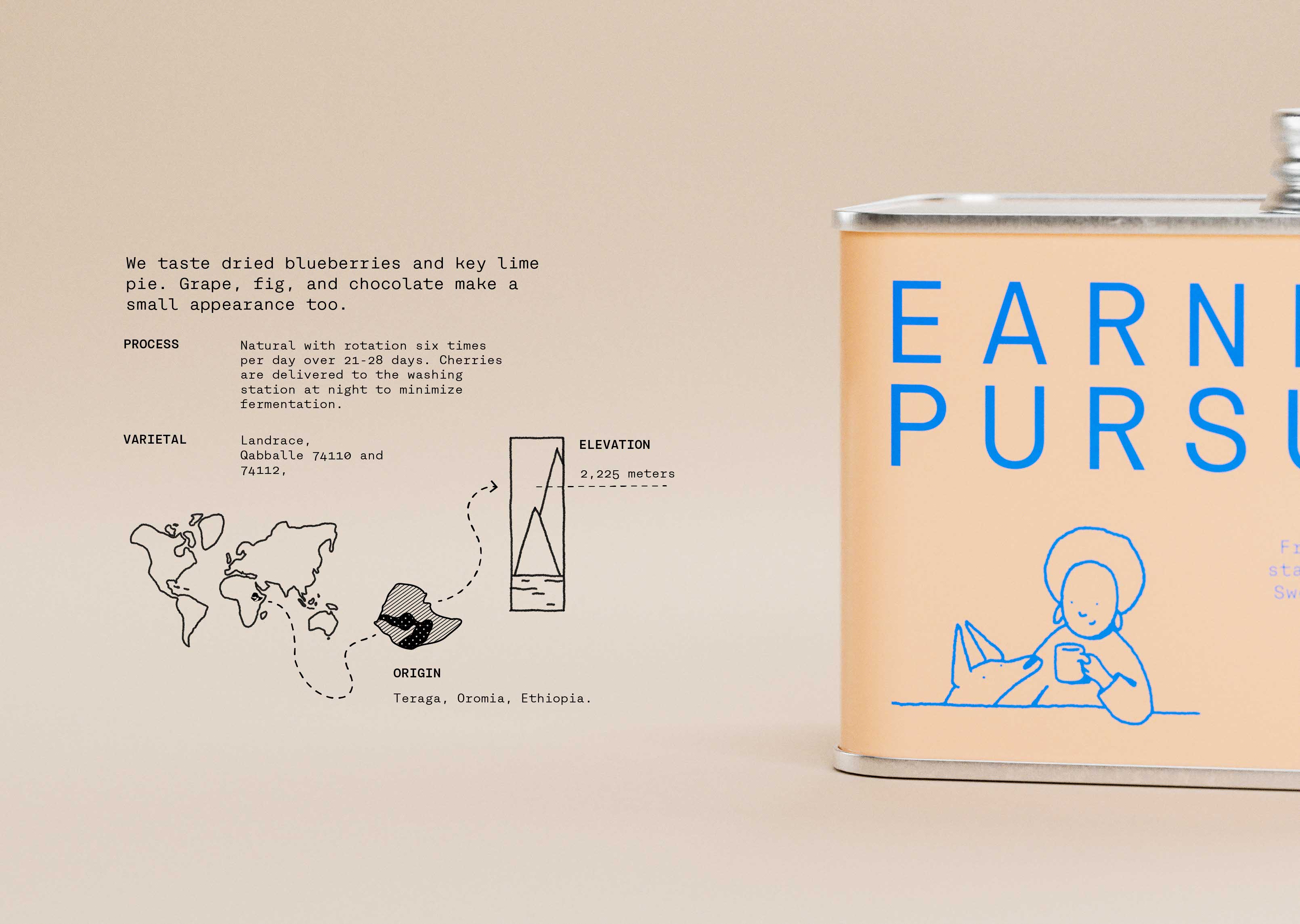
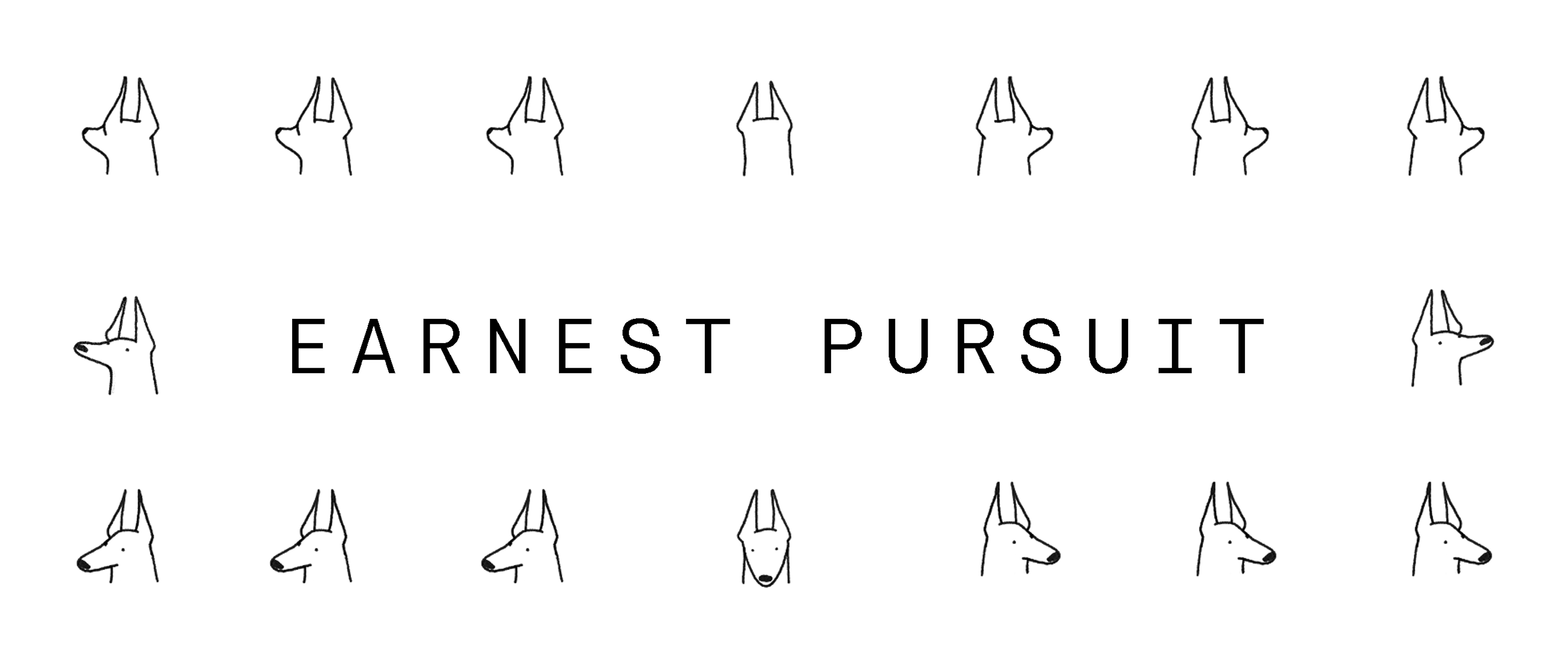
The system is brought alive through hand drawn illustration.
Illustration drives Earnest Pursuit's identity.
Brands art direction is hand made, custom tailored, slightly imperfect, irreverent.
Earnest Pursuit is the work of an expert.
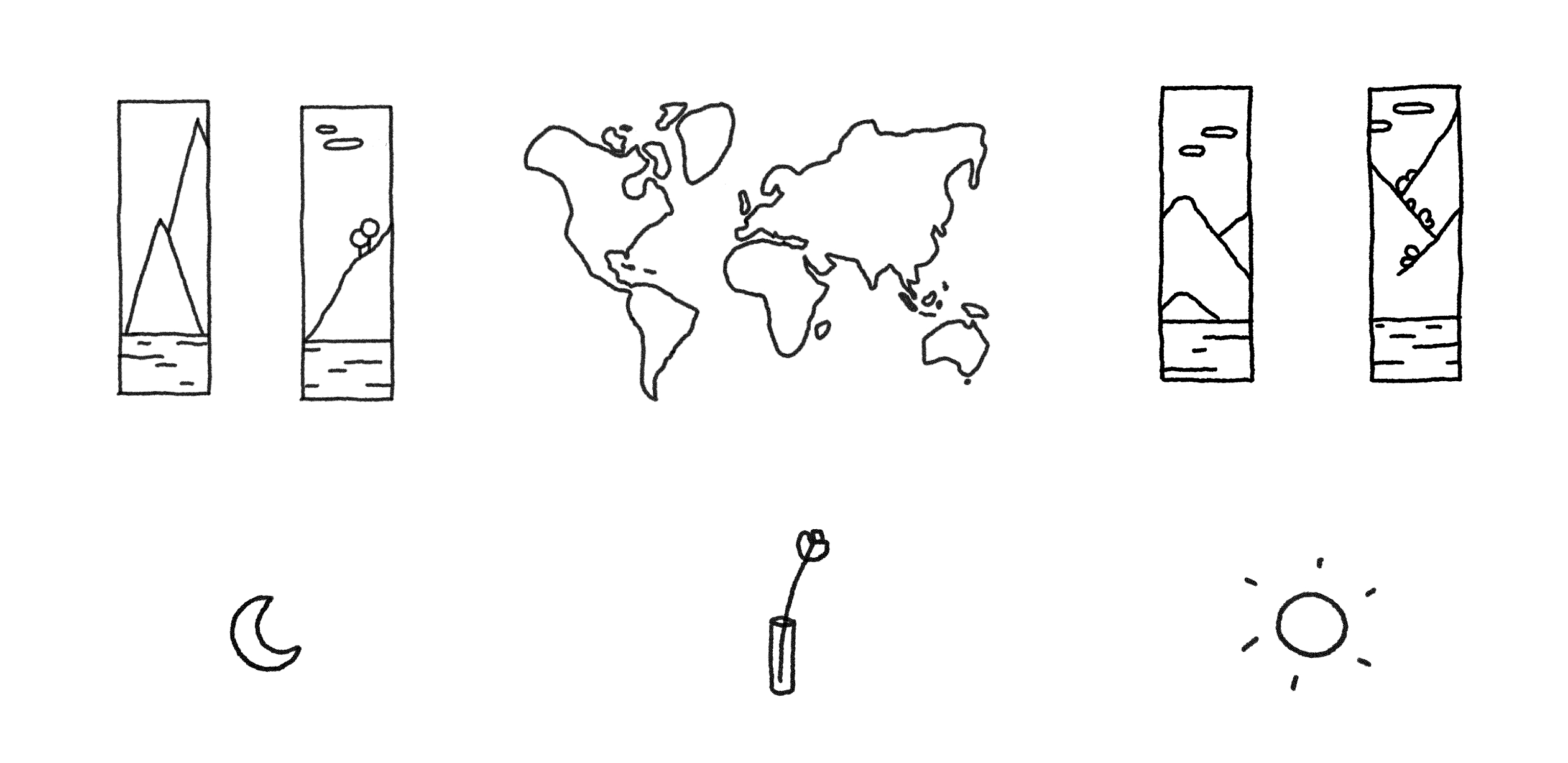
Main product illustrations complete the visual language creating evocative vignettes of daily life and events.
Product naming is short, punchy, precise.
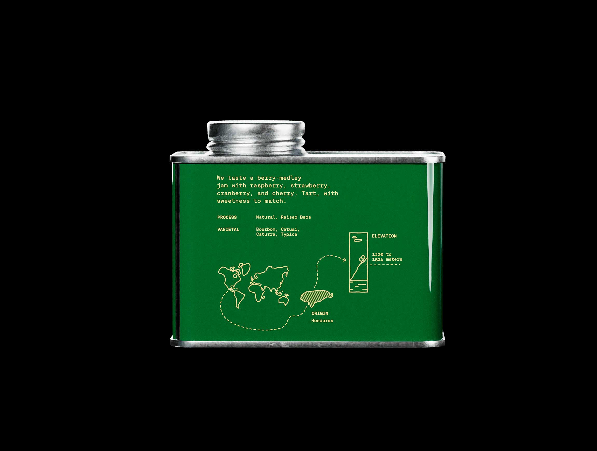
Combined with illustrations and taste notes, this produces stories on the front of the packaging, giving readers space to interpret.
A relaxed, irreverent tone.
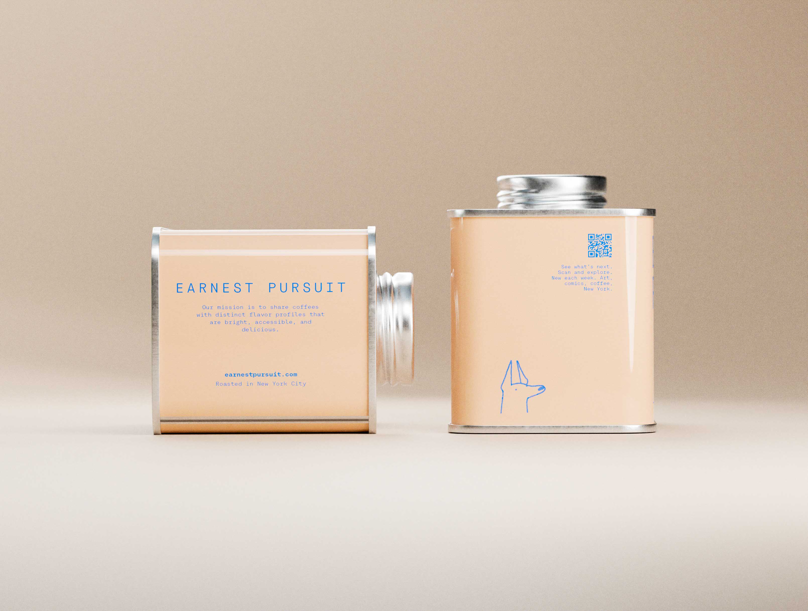
Expect customers to toy with the packaging while enjoying their cup. Tell interesting stories.
Tell interesting stories.
A series of ever expanding (go ahead think of something) illustrations gives Earnest Pursuit a visual language.
Tell stories through packaging, social media, communications and merchandise.
Make Earnest Pursuit memorable.
Apply illustrations creatively. Create merchandise that is attractive and well made. This adds depth and authenticity to the brand.
Tactile, interesting object of desire. Something one gives as a gift. Something that tastes good.
earnestpursuit.com