Top Hat
focus on tactility and
a vintage level of detailing
a vintage level of detailing

A bespoke project for a craft kombucha brand.
-
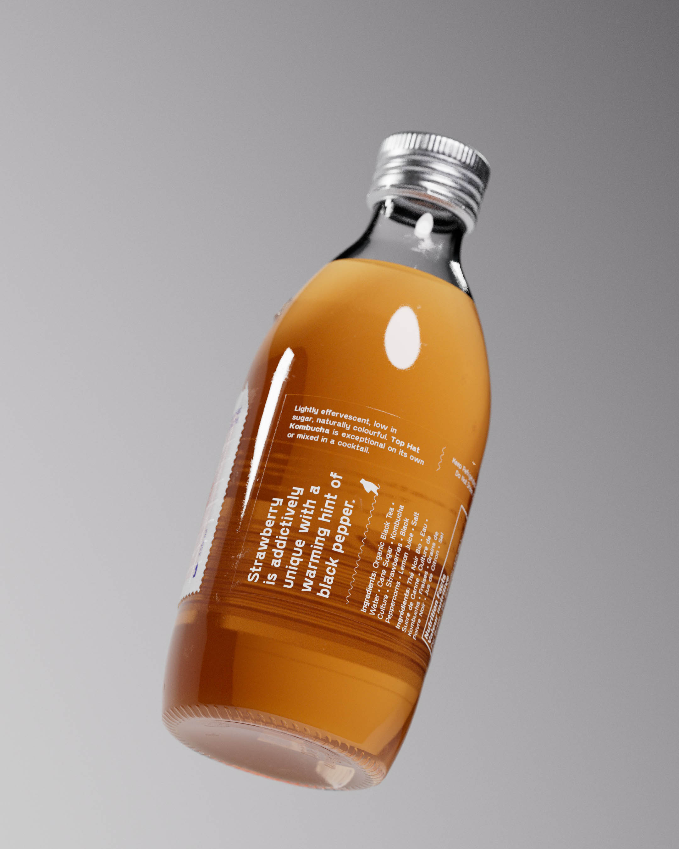
Custom glass, cap, label and brand with all little details considered. A visual and tactile treat.


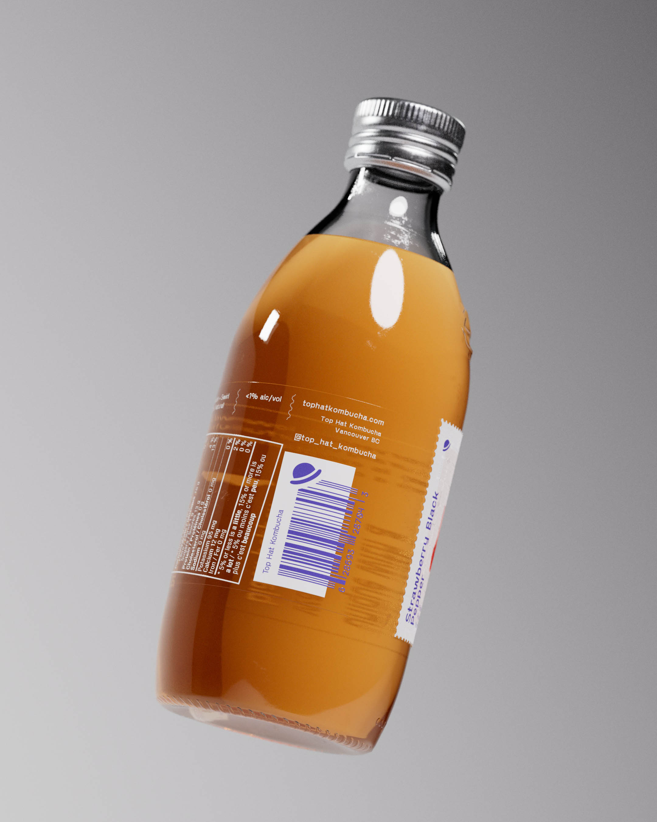
Bottle caps printed with Top Hat iconic logo in metallic Pantone 2347 on shiny aluminium ROPP enclosure formed a recognizable look that shines under natural light or fridge illumination.

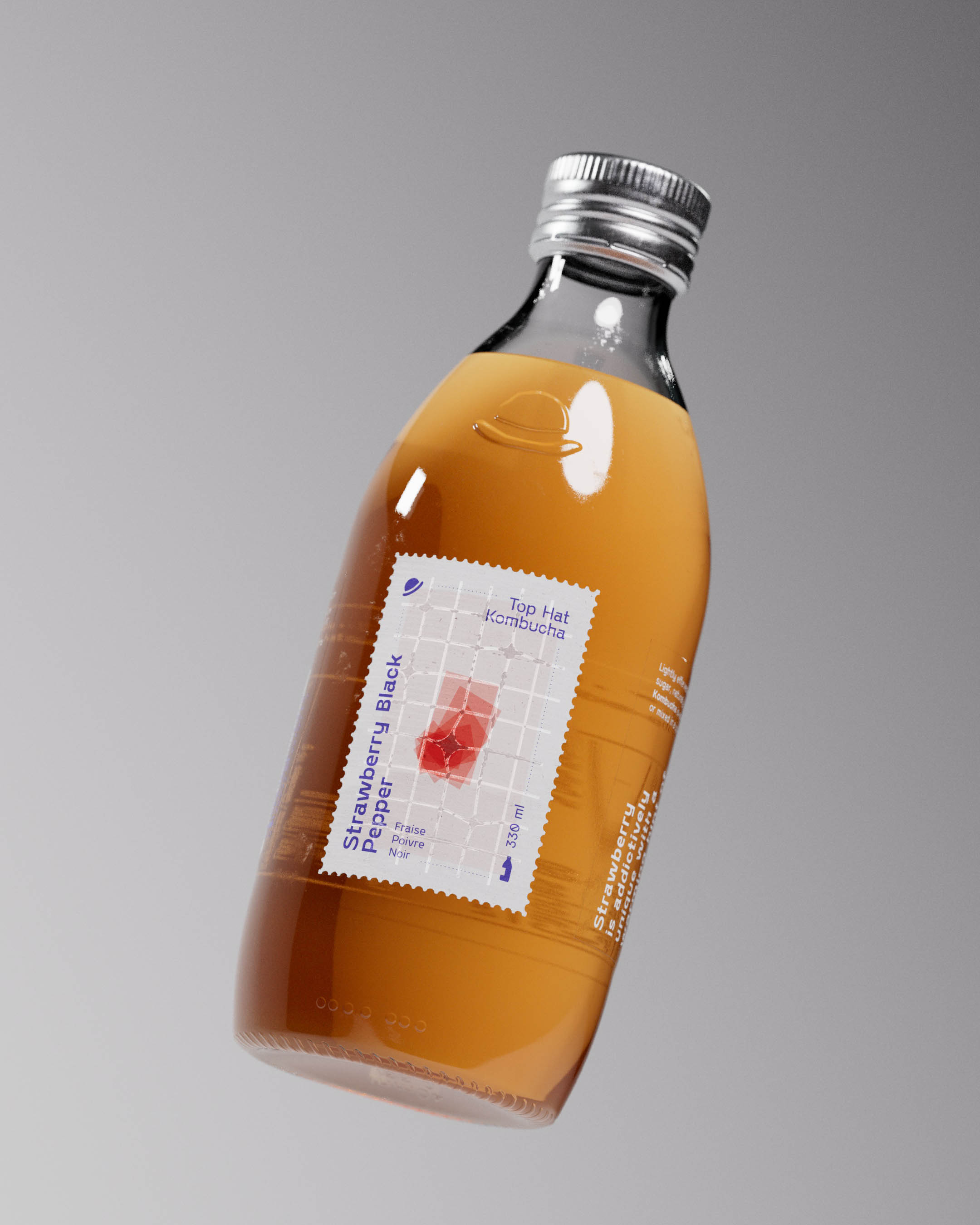
Structural mold was created producing custom glass bottles with an embossed logo underscoring the printed ROPP cap and crowning the diecut stamp-shaped label below.
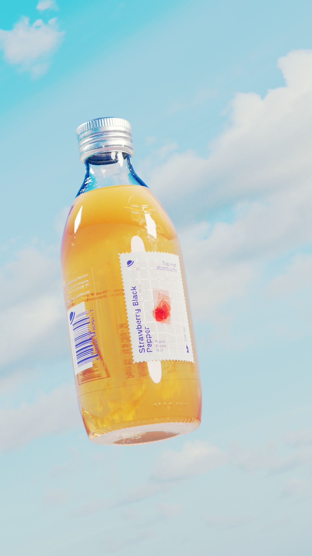
Top Hat Kombucha bottle floating against a clear blue sky with soft clouds. The bottle features a rich golden liquid and a minimalist diecut label design with the flavor Strawberry Black Pepper prominently displayed. The label is detailed with clean typography and a textured finish, emphasizing the brand's premium quality. The embossed top hat icon is visible on the bottle, adding a tactile element. The metallic cap, reflecting light, showcases the spot-printed top hat logo, enhancing the overall sophisticated packaging design.
Top Hat Kombucha bottle floating against a clear blue sky with soft clouds. The bottle features a rich golden liquid and a minimalist diecut label design with the flavor Strawberry Black Pepper prominently displayed. The label is detailed with clean typography and a textured finish, emphasizing the brand's premium quality. The embossed top hat icon is visible on the bottle, adding a tactile element. The metallic cap, reflecting light, showcases the spot-printed top hat logo, enhancing the overall sophisticated packaging design.
Top Hat Kombucha bottle floating against a clear blue sky with soft clouds. The bottle features a rich golden liquid and a minimalist diecut label design with the flavor Strawberry Black Pepper prominently displayed. The label is detailed with clean typography and a textured finish, emphasizing the brand's premium quality. The embossed top hat icon is visible on the bottle, adding a tactile element. The metallic cap, reflecting light, showcases the spot-printed top hat logo, enhancing the overall sophisticated packaging design.

Custom diecut, signature stamp-shaped primary label was printed on premium Neenah Laid paper, and finished with a glossy spot UV grid to reflect light and create a tactile contrast between smooth and textured finishes.