Say hello to...

Lets not look like typical ice cream, - Say Hello asked.
-
Looking eye brandmark was paired with hand drawn family of animated characters, and dipped in matching colors on bespoke structural cube packaging design.
Client
Say Hello Sweets is a Vancouver-based company specializing in non-dairy frozen desserts.
Known for its creative flavors and high-quality ingredients, the brand aims to bring joy and satisfaction to customers seeking delicious, plant-based alternatives.
Known for its creative flavors and high-quality ingredients, the brand aims to bring joy and satisfaction to customers seeking delicious, plant-based alternatives.
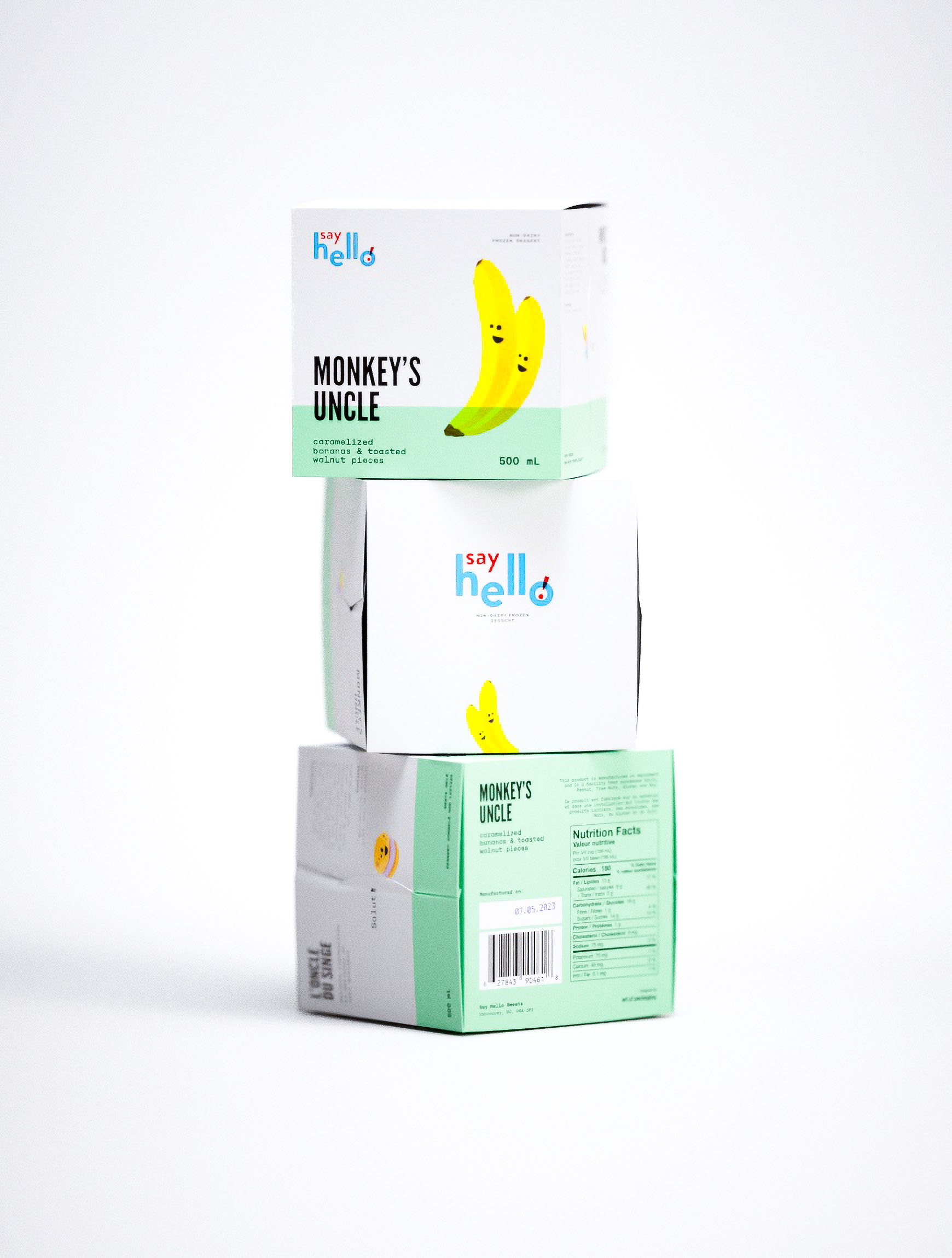
Details
The development process began with an in-depth understanding of the brand's ethos and target audience.
Sketches and prototypes were created to explore various illustrative styles and color schemes. Feedback loops with the client ensured the designs aligned with their vision.
Final iterations focused on refining the artwork and typography to balance playfulness with professionalism. The result is a cohesive set of packaging that stands out on the shelves and resonates with consumers looking for delightful, non-dairy treats.
Sketches and prototypes were created to explore various illustrative styles and color schemes. Feedback loops with the client ensured the designs aligned with their vision.
Final iterations focused on refining the artwork and typography to balance playfulness with professionalism. The result is a cohesive set of packaging that stands out on the shelves and resonates with consumers looking for delightful, non-dairy treats.
Brief
The brief required packaging design that reflects the playful and welcoming nature of the brand while clearly communicating the product's flavor and non-dairy attributes.
The design needed to be eye-catching, fun, and easily recognizable on retail shelves.
The design needed to be eye-catching, fun, and easily recognizable on retail shelves.
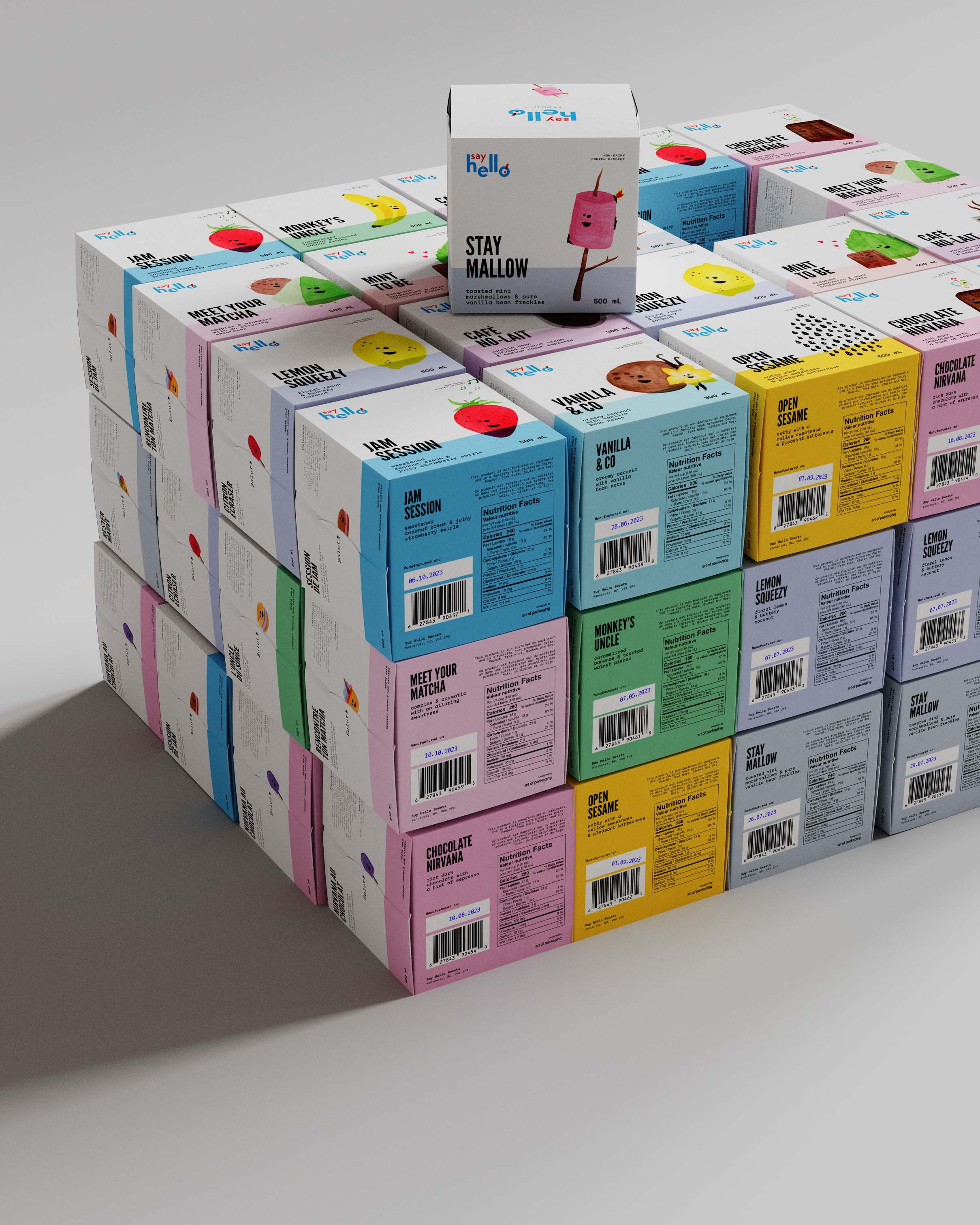


Made with food safe Aquapel paper, the structural is leak proof and glue free. Side folds snap into each other creating a tight seal.
