CLAY pitcher candle in coral-red glaze beside its natural kraft cube box, portrait crop. Signature pitcher vessel with angled pour spout and rough hand-textured clay surface. Orange pitcher icon and CLAY stacked wordmark on the box front. Embossed CLAY mark on the ceramic body. Brand identity and packaging design — the vessel silhouette used as the brand mark mirrors the physical product form, by a branding studio in New York.CLAY pitcher candle in coral-red glaze alongside its natural kraft cube box. Signature pitcher form — a custom vessel shape developed as the brand's core identity object. Pitcher silhouette icon printed in orange on the box face, CLAY wordmark stacked below. Embossed CLAY logotype on the ceramic body. Visual identity design and packaging design — brand mark, box print system, and signature vessel form by a packaging design studio in New York.
Sand and deep green Earnest Pursuit coffee tins under soft directional studio light. Left tin: matte sand, bold blue sans-serif, seated-figure line illustration, blue Let's Chill tasting block. Right tin: deep green, warm gold type, animal-and-moon illustration, Let's Jam callout. Typographic hierarchy, restrained illustration, and considered brand architecture -- graphic design and art direction by a packaging design studio.Sand and deep green Earnest Pursuit coffee tins under soft directional studio light. Left tin: matte sand, bold blue sans-serif, seated-figure line illustration, blue Let's Chill tasting block. Right tin: deep green, warm gold type, animal-and-moon illustration, Let's Jam callout. Typographic hierarchy, restrained illustration, and considered brand architecture -- graphic design and art direction by a packaging design studio.

Identity

Naming

Branding

Packaging Design

Art Direction

Clay
United States
2026

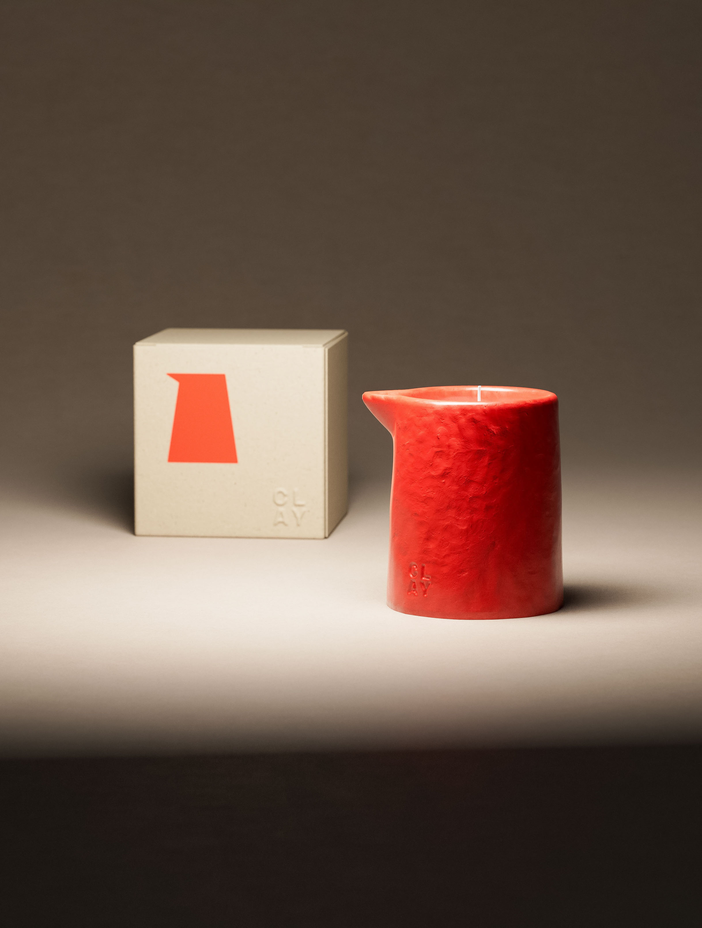
Concept development, form, identity and packaging for Clay, a luxury candle line in New York.

Combining Pitcher physical design from Creative Round 1 with brandmark created for Puffed Grid concept in Creative Round 2.

CLAY pitcher candle in terracotta amber glaze, close-up isolating the signature vessel without packaging. Rough dimpled hand-textured ceramic surface across the full body. Embossed CLAY logotype on the lower vessel. The pitcher form — with its distinctive angled pour spout — is the brand's signature shape. Art direction and visual identity design — close composition foregrounding the embossed mark and custom vessel form by a packaging design studio in New York.
Two CLAY pitcher candles in contrasting colorways — cobalt blue and terracotta amber — displayed side by side. Both in the brand's signature pitcher form with angled pour spout and rough hand-textured ceramic surface. CLAY embossed logotype on each vessel. Visual identity design system — a signature shape deployed across a multi-colorway range as a coherent brand identity, by a packaging design studio in New York.
Previously - Concept Development - Round 2
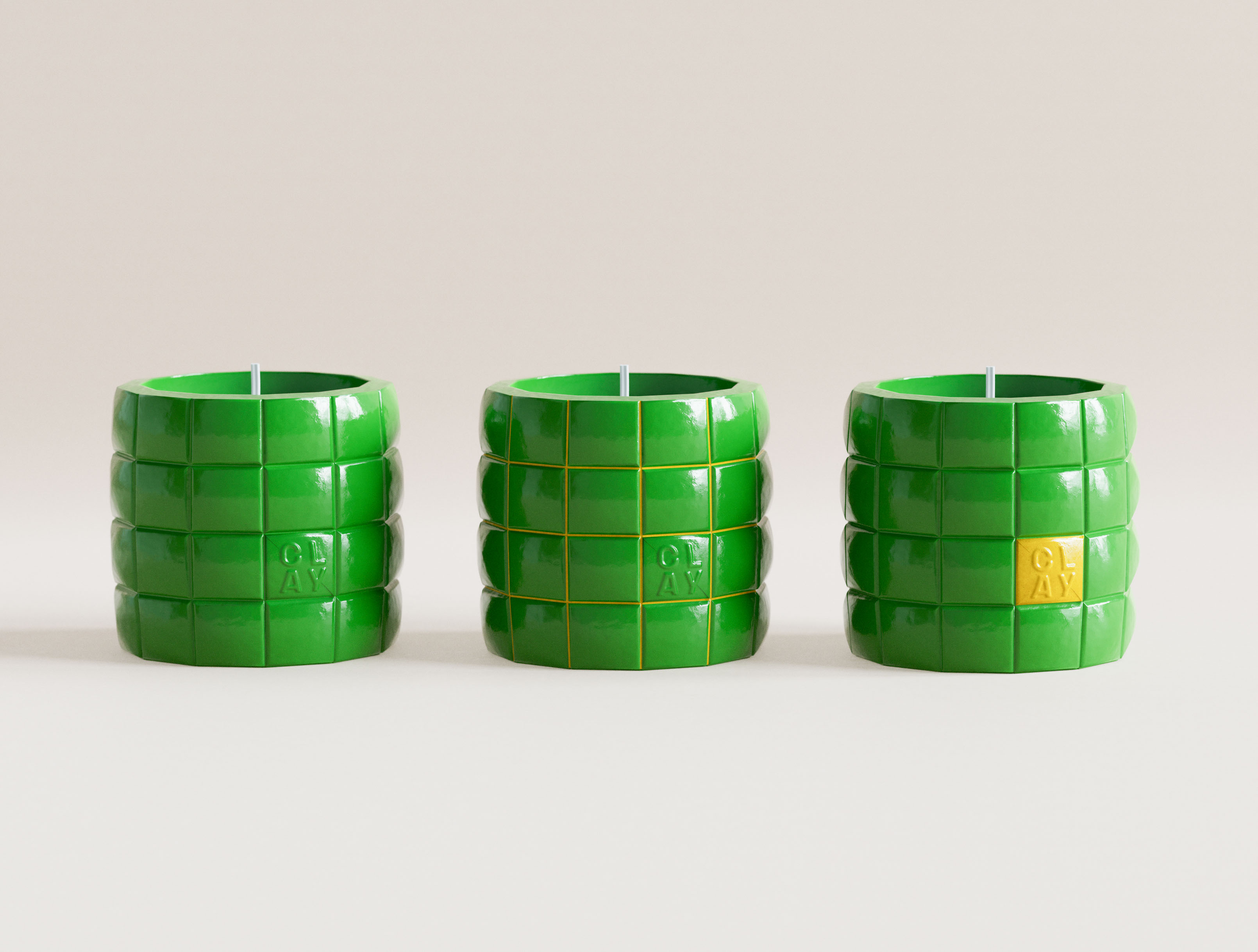
Round 2 of concept development for Clay brand candle line produced three standout results.
Two emerald green CLAY grid candles at low angle, large negative space above. Left: monochrome gloss green with embossed CLAY mark. Right: yellow grid lines and yellow CLAY accent tile. Puffy tile geometry and glossy surface under directional studio light. Art direction and structural packaging design for a New York candle brand by a graphic design studio.
Concept A — Puffed Grid
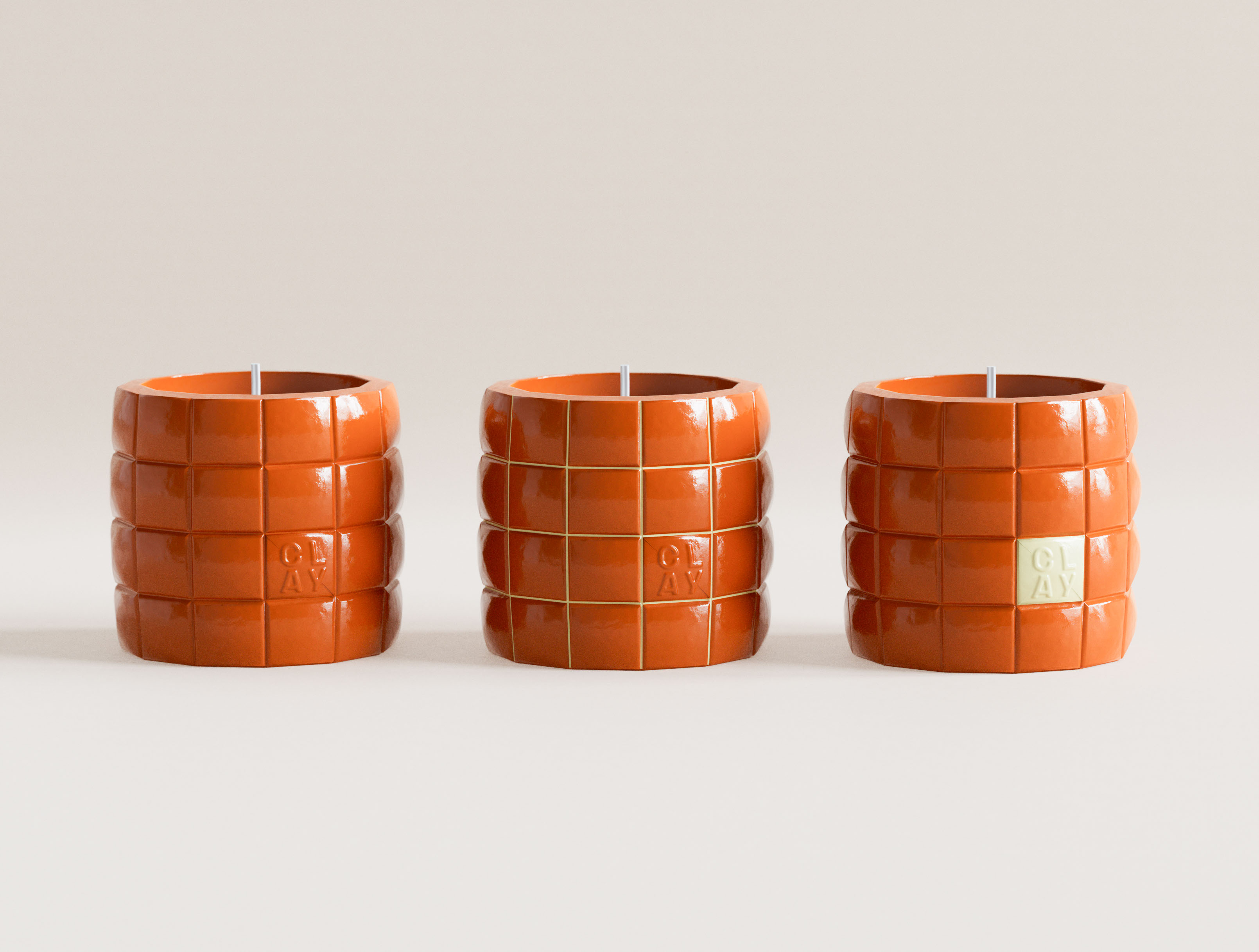
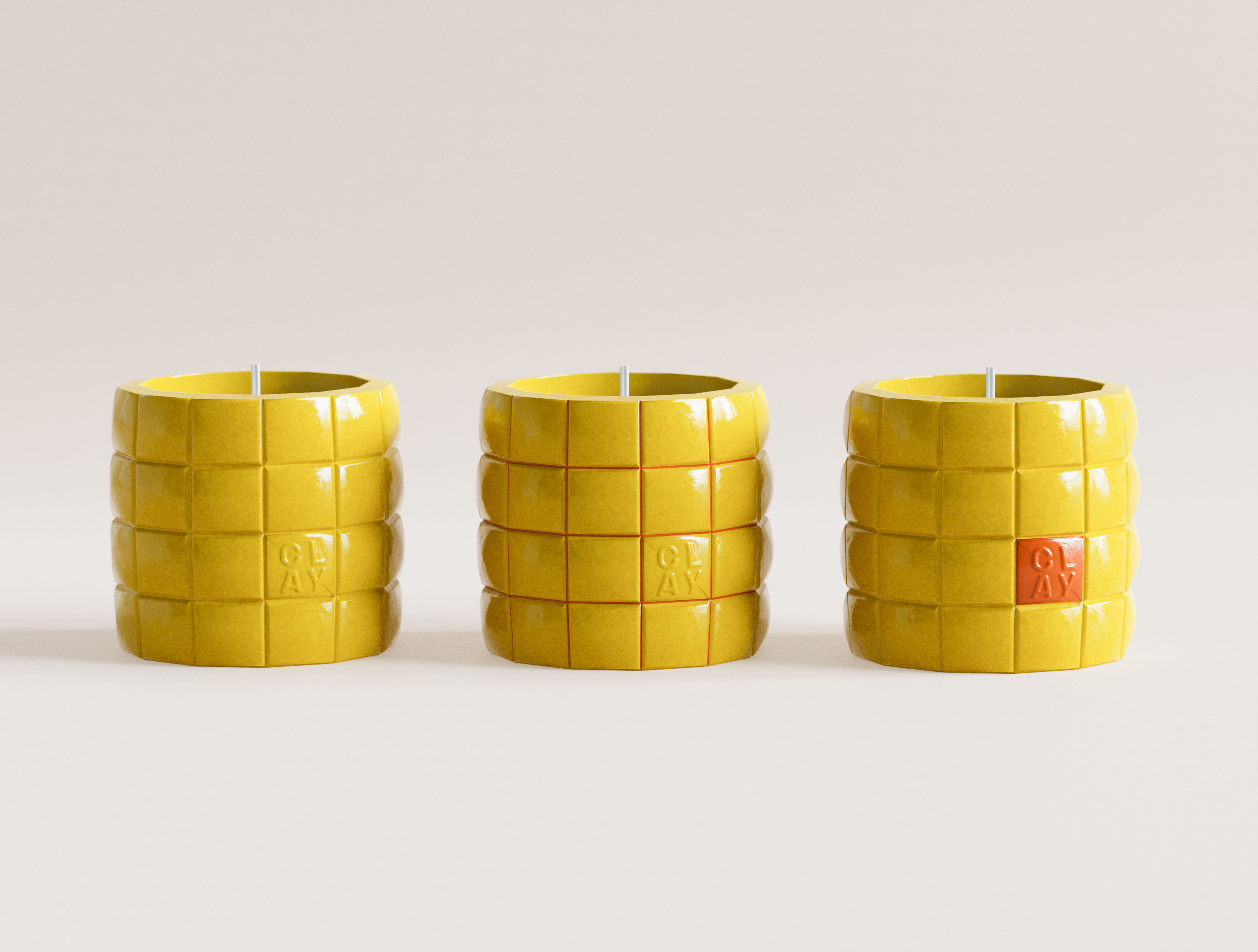
The first concept inflates a grid to form a unique, yet systematic look.

Grid sections (approximately 1.5 x 1.5cm) retain size regardless of product shape. This results in a consistent visual language.

Grid grooves offer opportunity to develop unique color combination. Brandmark follows grid and can be emphasized with color.
Three emerald green CLAY grid candles in studio lineup. Left: monochrome gloss green with embossed CLAY mark in tile cell. Centre: same form with yellow grid lines dividing puffy tile segments. Right: monochrome green with single yellow CLAY accent tile. Glossy ceramic-form surface, embossed logotype. Visual identity design system and structural packaging design for a New York candle brand by a graphic design studio.
Three terracotta orange CLAY grid candles in studio lineup. Left: monochrome gloss orange, embossed CLAY mark. Centre: orange with olive-green grid lines. Right: orange with pale cream CLAY accent tile. Glossy ceramic-form glaze across all three. Color-variant visual identity design system and structural packaging design for a New York candle brand by a graphic design studio.
Three yellow CLAY grid candles in studio lineup. Left: monochrome gloss yellow, embossed CLAY mark. Centre: yellow with orange-red grid lines. Right: yellow with orange-red CLAY accent tile. Glossy ceramic-form glaze. Color-variant visual identity design system and structural packaging design for a New York candle brand by a graphic design studio.
Close-up of CLAY grid candle in emerald green. Puffy tile segments divided by yellow grid lines; CLAY embossed logotype set within one tile cell. Glossy ceramic-form glaze, tactile three-dimensional tile relief. Brand identity and graphic design detail for a New York candle brand by a graphic design studio.
Concept 2 — Contrast Consistency
The second concept utilizes a geometric shape with contrast in texture, and lively color scheme.

Pairing uncoated, tactile ceramic on the body with a glazed finish on the handle. This creates an artistic, visually active object, that asks to be touched and played with.

The contrasting handle introduces an interesting option for packaging with the handle exposed.

Brandmark builds on the visual language.
CLAY candle base close-up. Rough uncoated stone-texture cylinder face-on with CLAY. logotype in black on raw matte base. Powder blue gloss disc left edge, mint green gloss disc lower right. Deliberate material contrast — uncoated porous substrate against high-gloss coated lids. Art direction and brand identity and graphic design for a New York candle brand by a branding studio.
Two CLAY two-piece candles face to face. Left: rough uncoated white stone-texture cylinder with powder blue semi-circular gloss disc. Right: stone-texture cylinder with mint green gloss disc. Bold color blocking — high-gloss coated disc contrasting uncoated matte body as the core design language. Art direction and structural packaging design for a New York candle brand by a branding studio.
CLAY two-piece candle in rigid matte grey gift box. CLAY. logotype in warm yellow at lower front corner. Vivid yellow circular disc lid partially emerging from die-cut slot on right side face. Matte grey textured board against high-gloss coated disc. Structural packaging design and brand identity and graphic design for a New York candle brand by a graphic design studio.
Three CLAY two-piece candles in studio lineup. Left: uncoated stone cylinder with yellow disc partially visible. Centre: stone cylinder with powder blue disc. Right: stone cylinder with mint green disc. Three-colorway visual identity system built on a single structural form — contrasting uncoated body and gloss disc accent. Visual identity design and structural packaging design for a New York candle brand by a graphic design studio.
Concept 3 — Refined Ceramic
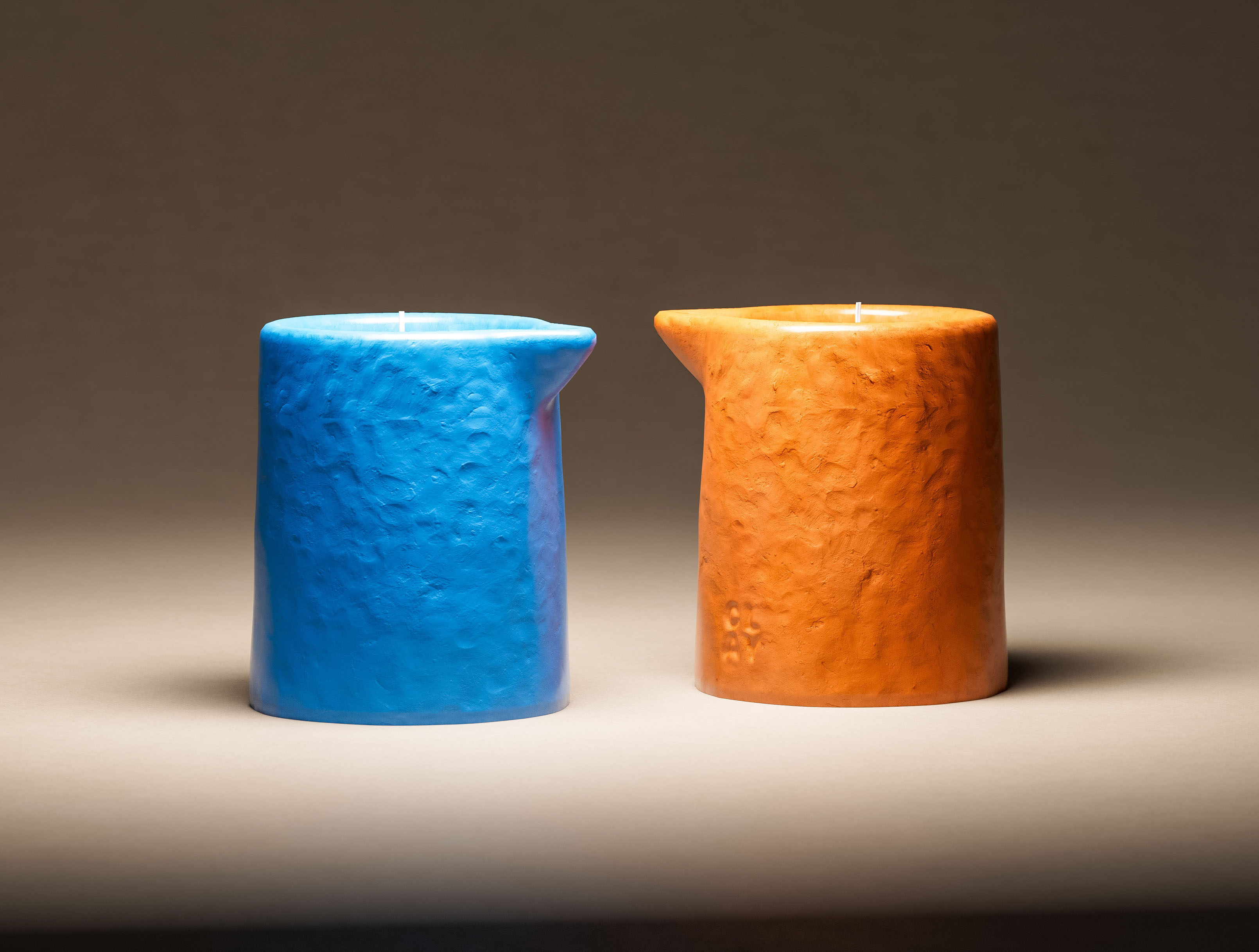
The third creates a minimal but unique form, using a double lip band at the top of a glazed ceramic.

The lip forms an ergonomic element, preventing the candle from slipping through the hand.

Color options, as well as the textural detailing can range from minimal to complex. Speckled blue variant being an example below.
Three CLAY ergonomic candles stacked: powder blue, navy, yellow ochre. Detached unglazed base disc with clay. logotype lying flat in foreground left. Tri-colour visual identity system presented as tower composition. Art direction and brand identity and graphic design for a New York candle brand by a branding studio.
CLAY ergonomic candle base close-up. Matte unglazed white base disc face-on; clay. logotype in black serif set toward the top of the disc. Yellow ochre glazed candle body behind, powder blue disc edge left. Unglazed porous material as deliberate material contrast to gloss glaze body. Brand identity and graphic design for a New York candle brand by a packaging design studio.
Two CLAY ergonomic candles. Left: yellow ochre glazed candle upright, double-shoulder ergonomic form. Right: deep navy glazed candle on its side, unglazed matte white base with clay. logotype facing camera. High-gloss speckled ceramic glaze against raw unglazed white base disc. Art direction and visual identity design for a New York candle brand by a packaging design studio.
Two CLAY ergonomic candles in depth-of-field composition. Powder blue glazed candle foreground in focus. Navy and yellow ochre candles stacked right background, soft blur. Double-shoulder ergonomic form consistent across colorways. Art direction (depth-of-field staging) and visual identity design system for a New York candle brand by a graphic design studio.

Along with the original Functional Pitcher this creates a good range of concepts for Clay.

Once selected we can further finess colors, final forms, and develop an extended branding system suitable for product line expansion.

art of packaging / 2026 /