Hats on.


Client
Top Hat is a kombucha brand in Vancouver British Columbia, focused on offering unique flavors that cater to adventurous palates. Its blends are meant to be enjoyed on their own or as cocktail mixers, providing consumers and mixologists with versatile beverages that pairs creativity and flair.
Natural ingredients and traditional brewing methods do not hurt either :)
Natural ingredients and traditional brewing methods do not hurt either :)
Brief
Top Hat wanted packaging that reflects sophistication and stands out on the shelves while also fitting in seamlessly next to premium bottles at the bar.
The look needed to convey the unique flavors clearly while maintaining a cohesive, upscale brand identity.
The look needed to convey the unique flavors clearly while maintaining a cohesive, upscale brand identity.
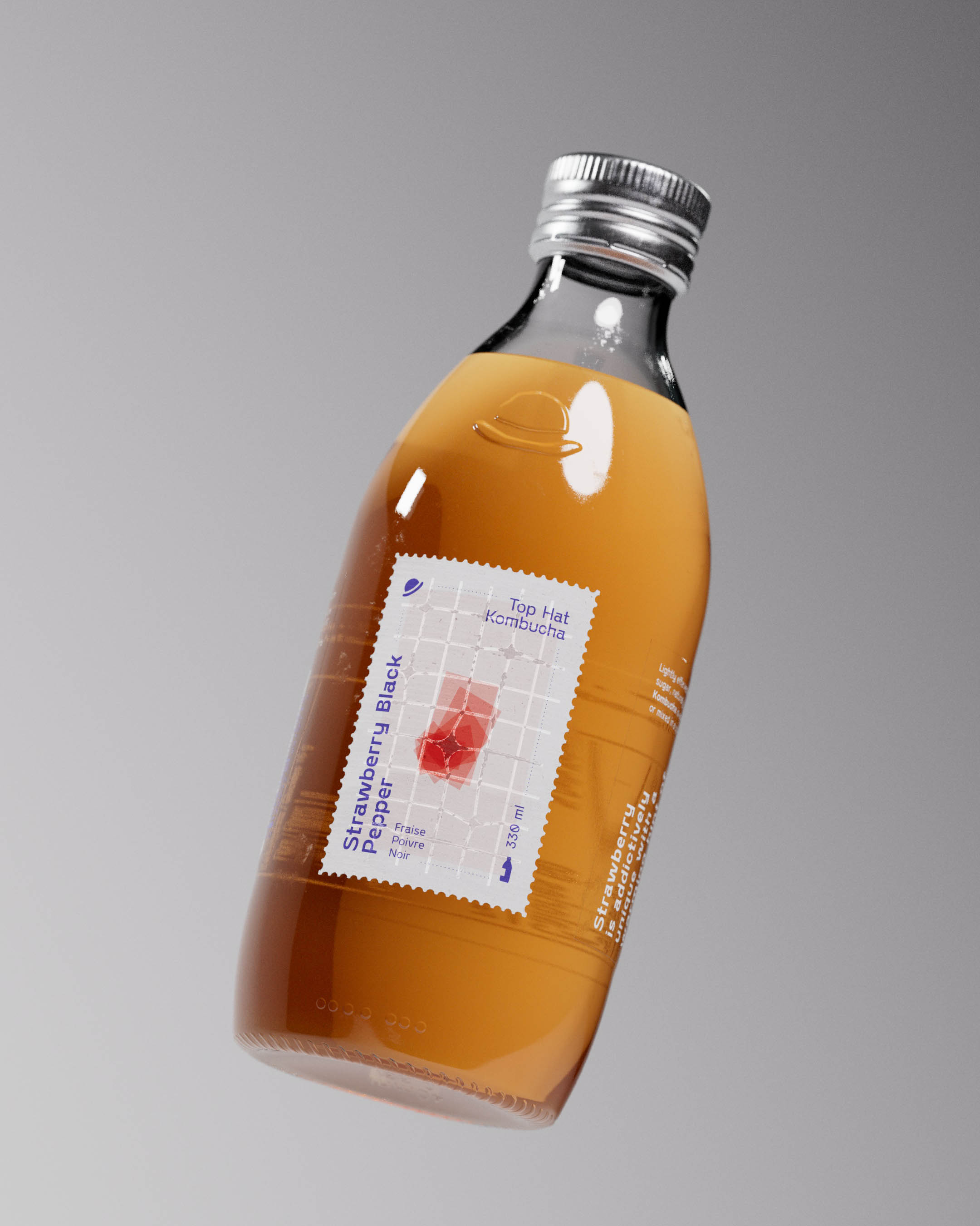
Top Hat Kombucha bottle floating against a clear blue sky with soft clouds. The bottle features a rich golden liquid and a minimalist diecut label design with the flavor Strawberry Black Pepper prominently displayed. The label is detailed with clean typography and a textured finish, emphasizing the brand's premium quality. The embossed top hat icon is visible on the bottle, adding a tactile element. The metallic cap, reflecting light, showcases the spot-printed top hat logo, enhancing the overall sophisticated packaging design.
Results
A lively visual identity, with minimal illustrations paired with a structured but expressive typeface. All set by hand on glossy, tactile metal tins, direct printed with spot colors.
Irreverent tone of voice and a naming direction building on the illustration system, exploring life's small vignettes.
Encyclopedia of relevant content about coffee, life, and New York with an accompanying (and ever expanding) illustration system.
A design system that scales to additional roasts, wholesale and delivery packaging, merchandise and communications.
Irreverent tone of voice and a naming direction building on the illustration system, exploring life's small vignettes.
Encyclopedia of relevant content about coffee, life, and New York with an accompanying (and ever expanding) illustration system.
A design system that scales to additional roasts, wholesale and delivery packaging, merchandise and communications.
A bespoke project for a craft kombucha brand.
-
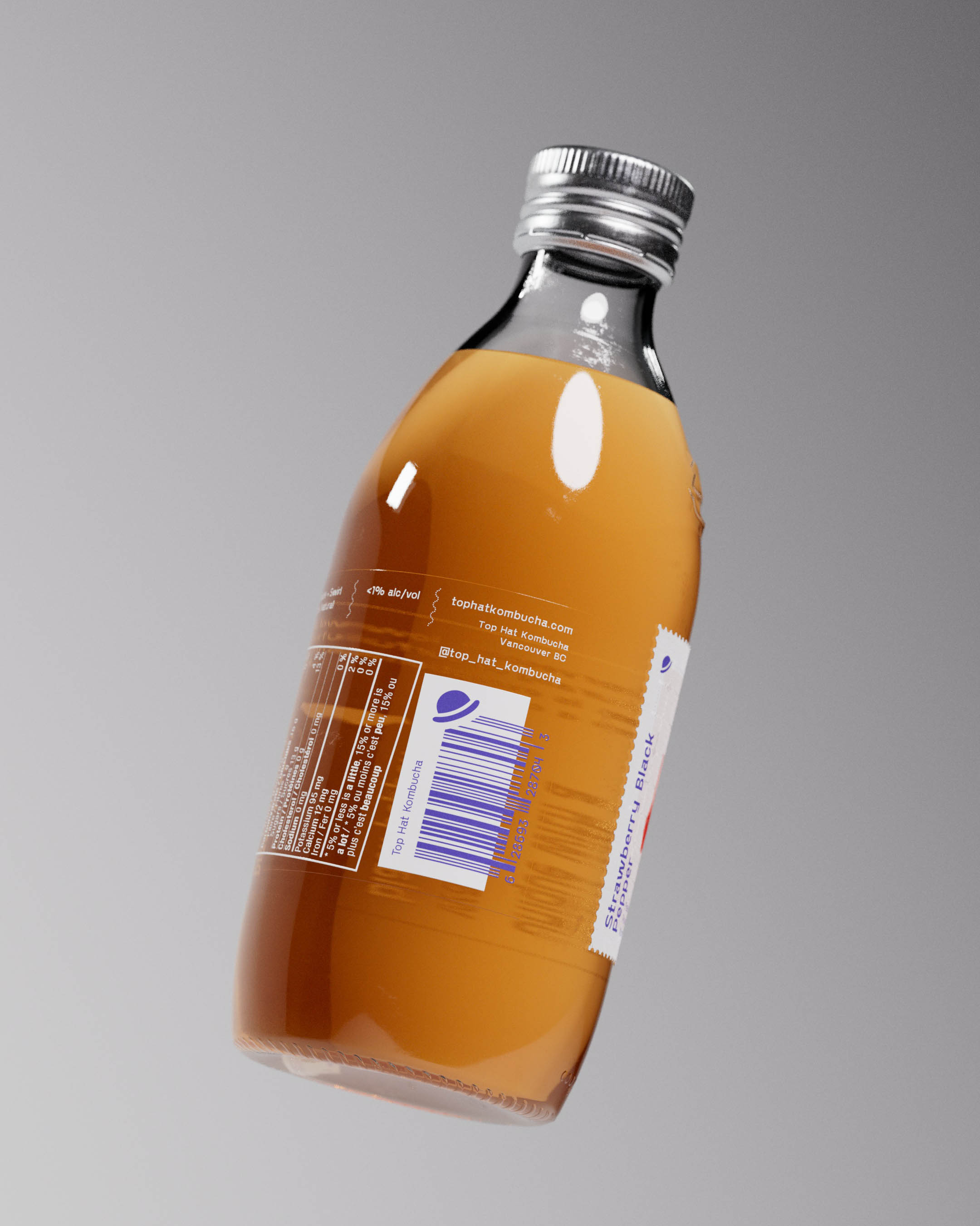
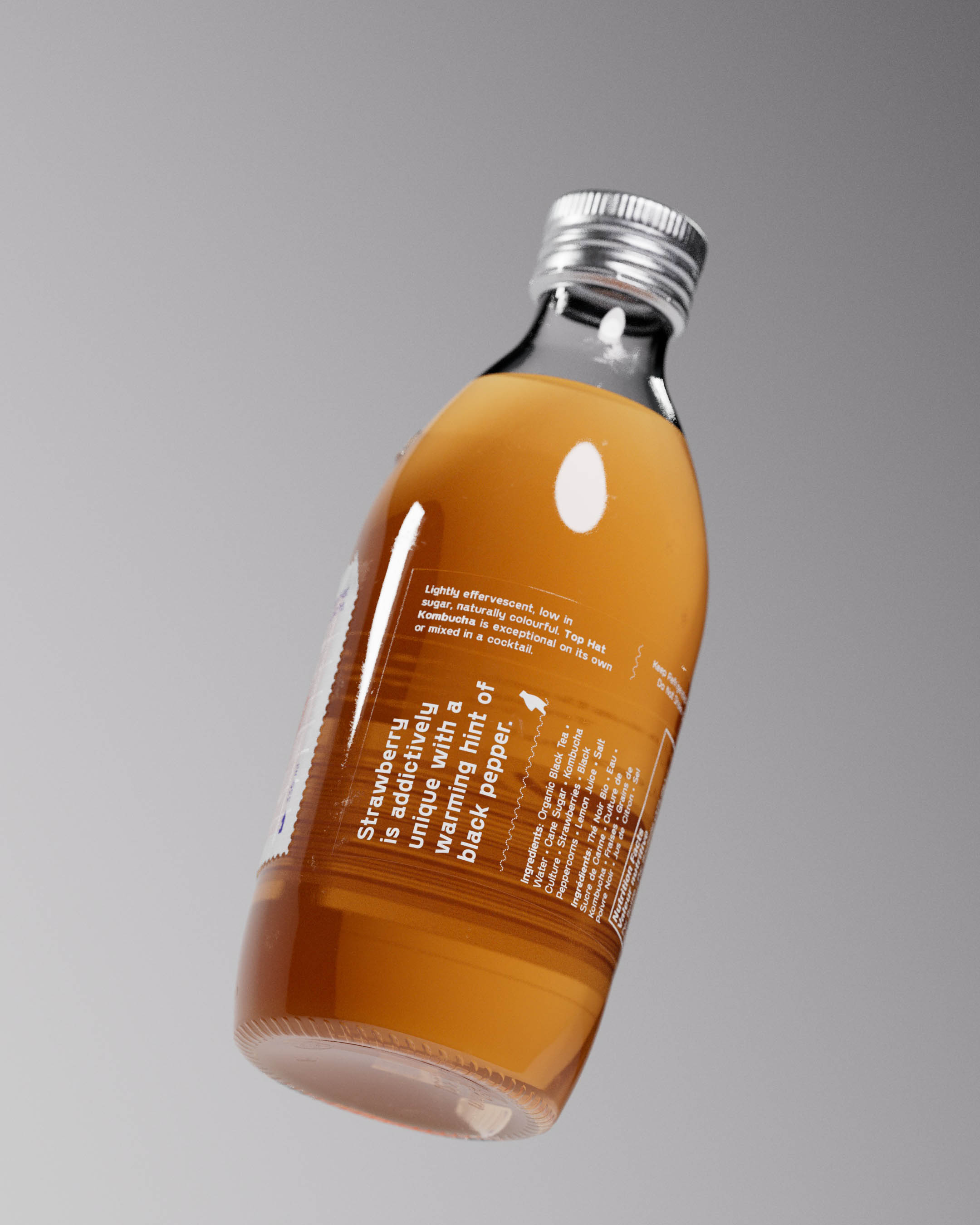
Custom glass, cap, label and brand with all little details considered. A visual, tactile, and of course a taste experience.


Bottle caps printed with Top Hat iconic logo in metallic Pantone 2347 on shiny aluminium ROPP enclosure formed a recognizable look that shines under natural light or fridge illumination.

Structural mold was created producing custom glass bottles with an embossed logo underscoring the printed ROPP cap and crowning the diecut stamp-shaped label below.
Top Hat Kombucha bottle floating against a clear blue sky with soft clouds. The bottle features a rich golden liquid and a minimalist diecut label design with the flavor Strawberry Black Pepper prominently displayed. The label is detailed with clean typography and a textured finish, emphasizing the brand's premium quality. The embossed top hat icon is visible on the bottle, adding a tactile element. The metallic cap, reflecting light, showcases the spot-printed top hat logo, enhancing the overall sophisticated packaging design.
Top Hat Kombucha bottle floating against a clear blue sky with soft clouds. The bottle features a rich golden liquid and a minimalist diecut label design with the flavor Strawberry Black Pepper prominently displayed. The label is detailed with clean typography and a textured finish, emphasizing the brand's premium quality. The embossed top hat icon is visible on the bottle, adding a tactile element. The metallic cap, reflecting light, showcases the spot-printed top hat logo, enhancing the overall sophisticated packaging design.
Top Hat Kombucha bottle floating against a clear blue sky with soft clouds. The bottle features a rich golden liquid and a minimalist diecut label design with the flavor Strawberry Black Pepper prominently displayed. The label is detailed with clean typography and a textured finish, emphasizing the brand's premium quality. The embossed top hat icon is visible on the bottle, adding a tactile element. The metallic cap, reflecting light, showcases the spot-printed top hat logo, enhancing the overall sophisticated packaging design.
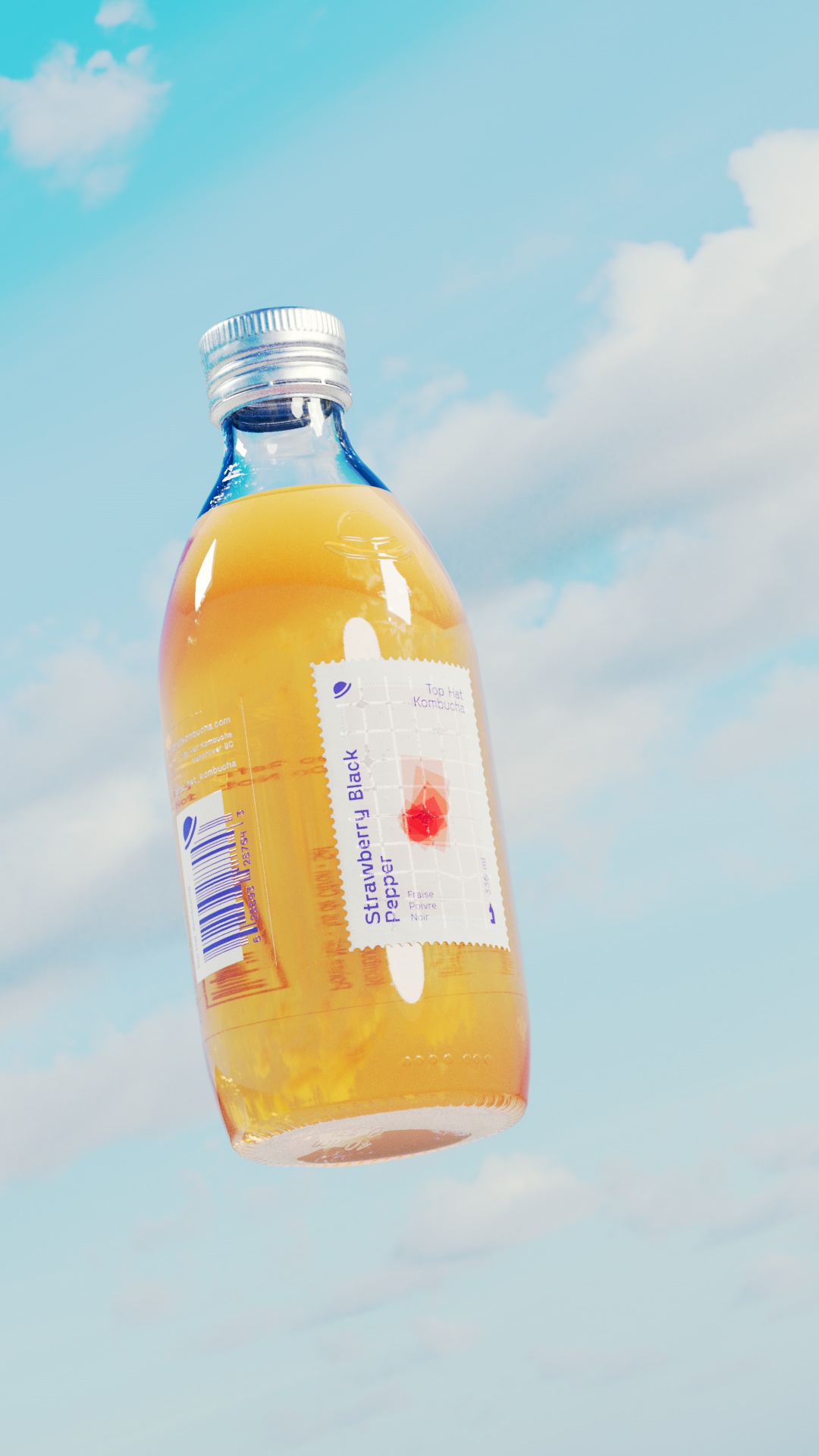


Custom diecut, signature stamp-shaped primary label was printed on premium Neenah Laid paper, and finished with a glossy spot UV grid to reflect light and create a tactile contrast between smooth and textured finishes.