Four KAITO coffee capsule boxes in a cascading staggered arrangement, each box displaced progressively to the left on a neutral grey ground. White coated paperboard, single-color cyan print. KAITO wordmark in horizontal stripe type fill across the front face; LØVE variant wordmark and concentric arc stripe pattern on the blue vertical band. Bilingual English/French copy: "10 capsules biodégradables." Origami bird logomark on all boxes. Art-directed multi-format range composition — visual identity design system and art direction by a packaging design studio.
Sand and deep green Earnest Pursuit coffee tins under soft directional studio light. Left tin: matte sand, bold blue sans-serif, seated-figure line illustration, blue Let's Chill tasting block. Right tin: deep green, warm gold type, animal-and-moon illustration, Let's Jam callout. Typographic hierarchy, restrained illustration, and considered brand architecture -- graphic design and art direction by a packaging design studio.Sand and deep green Earnest Pursuit coffee tins under soft directional studio light. Left tin: matte sand, bold blue sans-serif, seated-figure line illustration, blue Let's Chill tasting block. Right tin: deep green, warm gold type, animal-and-moon illustration, Let's Jam callout. Typographic hierarchy, restrained illustration, and considered brand architecture -- graphic design and art direction by a packaging design studio.

Identity

Naming

Branding

Packaging Design

Art Direction

Kaito — Distinctly Minimal Nespresso
Hudson, Quebec
2023

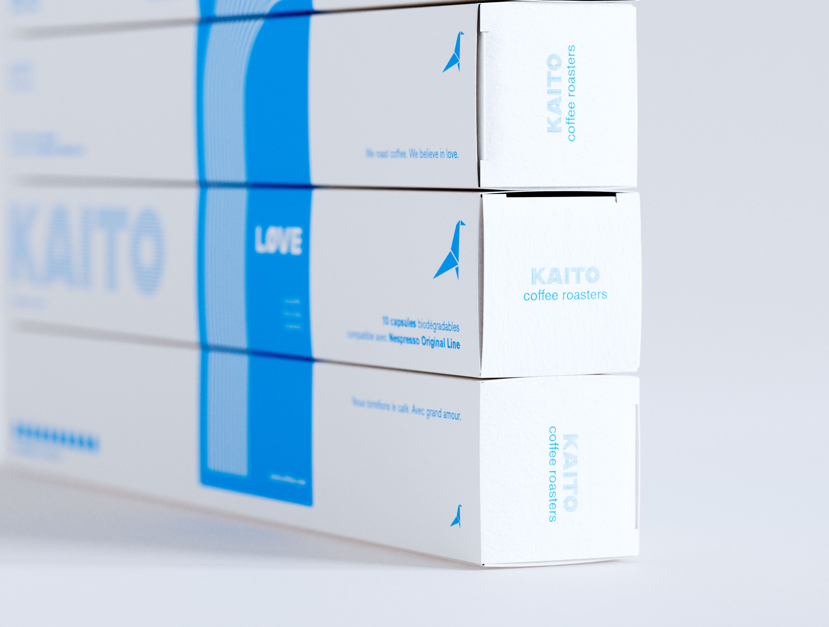
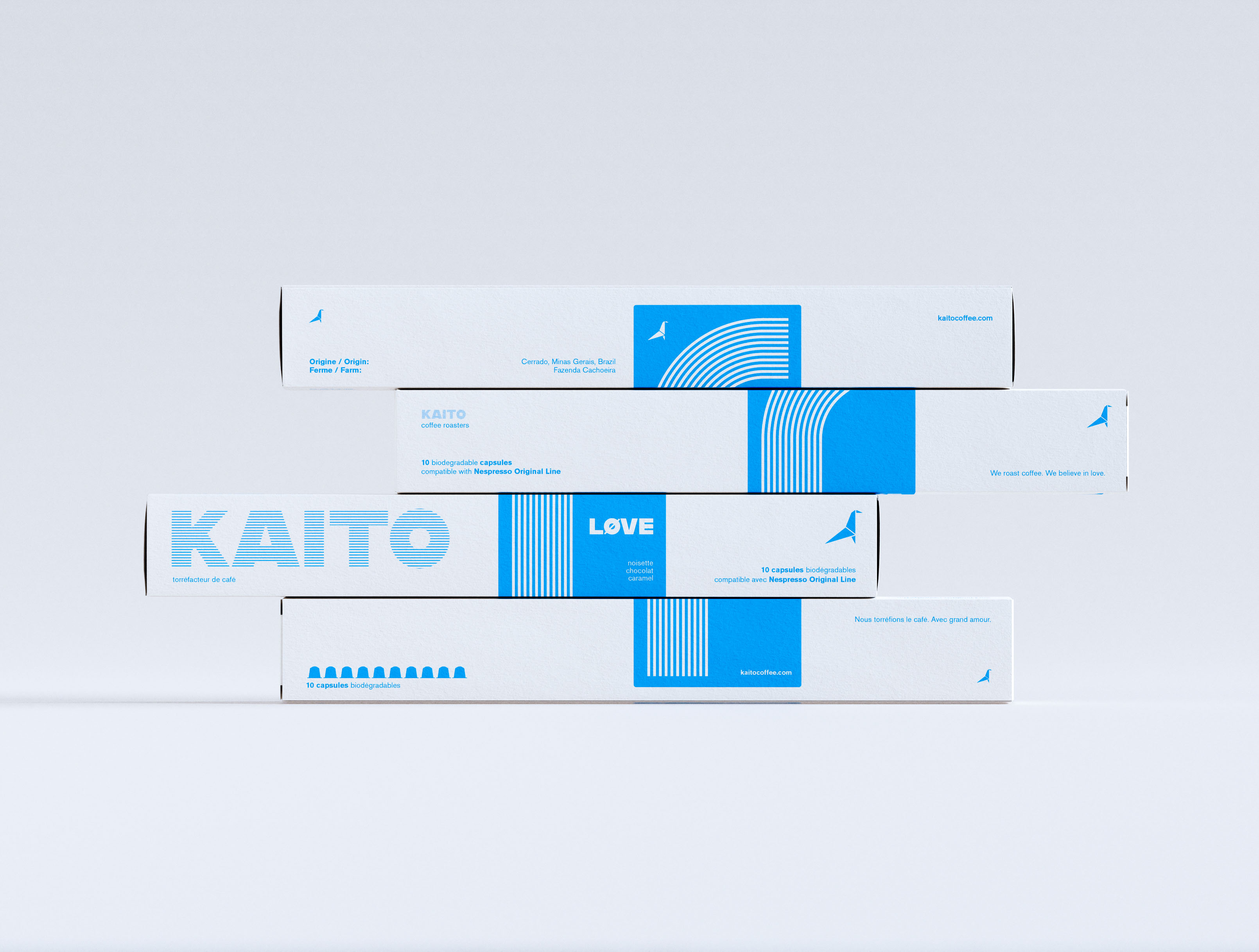
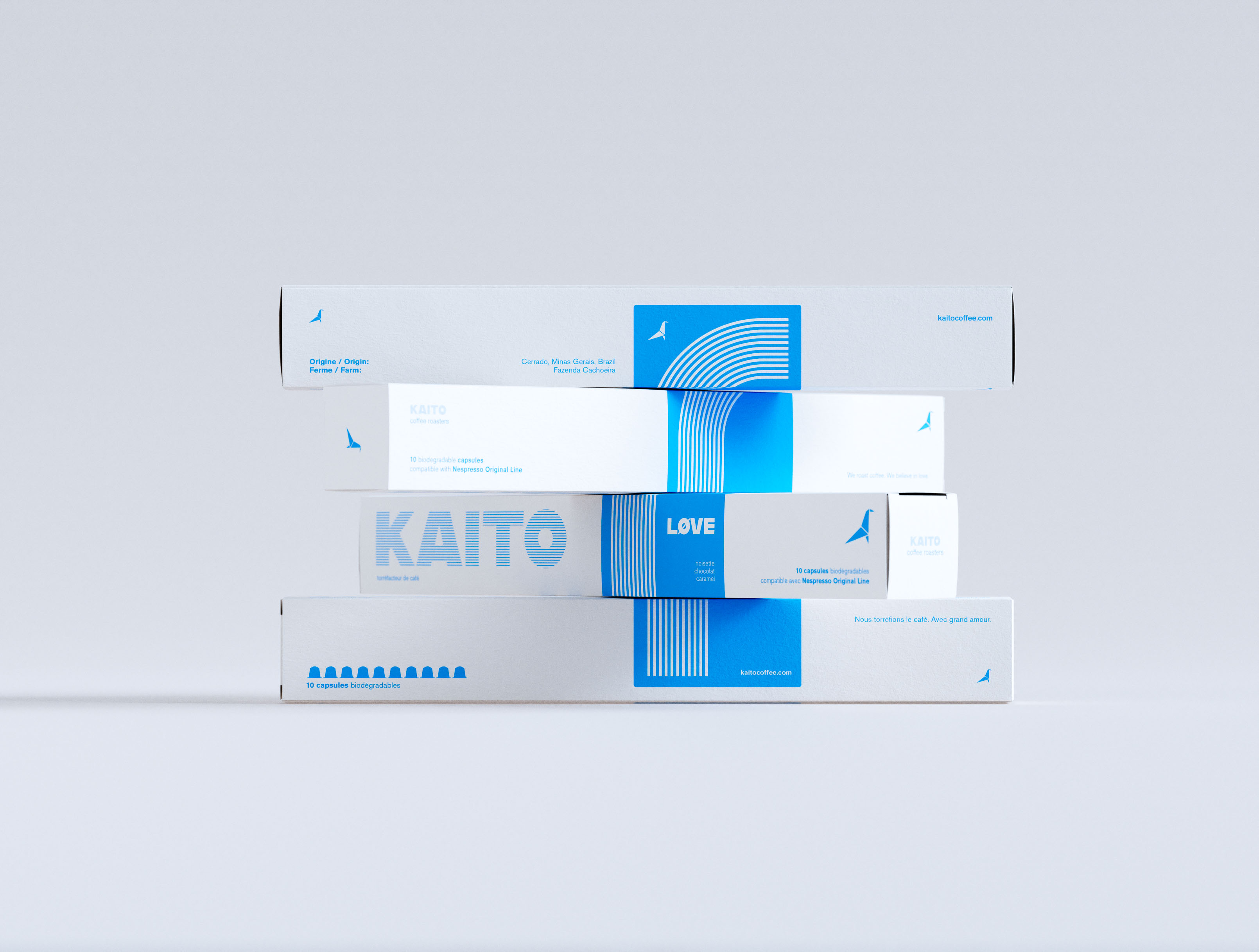
Kaito is a coffee roastery in Hudson, Quebec (merged and co branded with Mikko in 2024).

Kaito’s visual design language is distinctly minimalist, with a visual aesthetic built on color signifying flavour, mood, and feel.

Yellow - safe & comforting, blue - new & interesting, red - bold and adventurous.


Project Info ↗
Close-up of the right end panels of KAITO coffee capsule boxes stacked four high. White coated paperboard, single-color cyan print. End panels read "KAITO coffee roasters" in clean geometric sans-serif with the origami bird logomark on each tier. Front face visible at left: "10 capsules biodégradables compatible avec Nespresso Original Line," "Nous torréfions le café. Avec grand amour." and LØVE variant on the blue band. Bilingual French/English label architecture and typography and graphic design by a packaging design studio.
Four KAITO coffee capsule boxes in an alternating staggered offset arrangement against neutral grey, each box shifted to expose the box beneath. White coated paperboard, single-color cyan print. Front face shows the large striped KAITO wordmark; LØVE variant in white on the blue vertical band with concentric arc stripe pattern. Tasting notes: noisette, chocolat, caramel. Bilingual French/English pack copy. Origami bird logomark throughout. Art direction and brand identity and graphic design by a packaging design studio.
Four KAITO coffee capsule boxes in a horizontal-shift arrangement, each box displaced laterally to form a stepped profile against neutral grey. White coated paperboard, single-color cyan print. KAITO wordmark in striped type fill across the front face; LØVE variant on the blue vertical band with concentric arc stripe pattern. Bilingual French/English label system: "10 capsules biodégradables," "Nous torréfions le café. Avec grand amour." Origami bird logomark. Art direction and visual identity design by a packaging design studio.

This project (the last one prior to brands merging) developed tactile, textured, minimal packaging and illustration series for Kaitos line of Nespresso pod coffees.

AOFP /////
Feb2026.25