Client - INVASATI is an Italian artisanal preserve maker creating unexpected flavor combinations that challenge and delight the palate.
The brand takes inspiration from the obsessive nature of food preservation and canning, transforming traditional techniques into contemporary culinary experiences.
Brief - Create a distinctive name, brand identity and packaging system that communicates the artisanal quality and innovative spirit of INVASATI's preserves.
The design needed to stand out in the premium preserve category while conveying the brand's commitment to unexpected flavor combinations and traditional preservation methods.
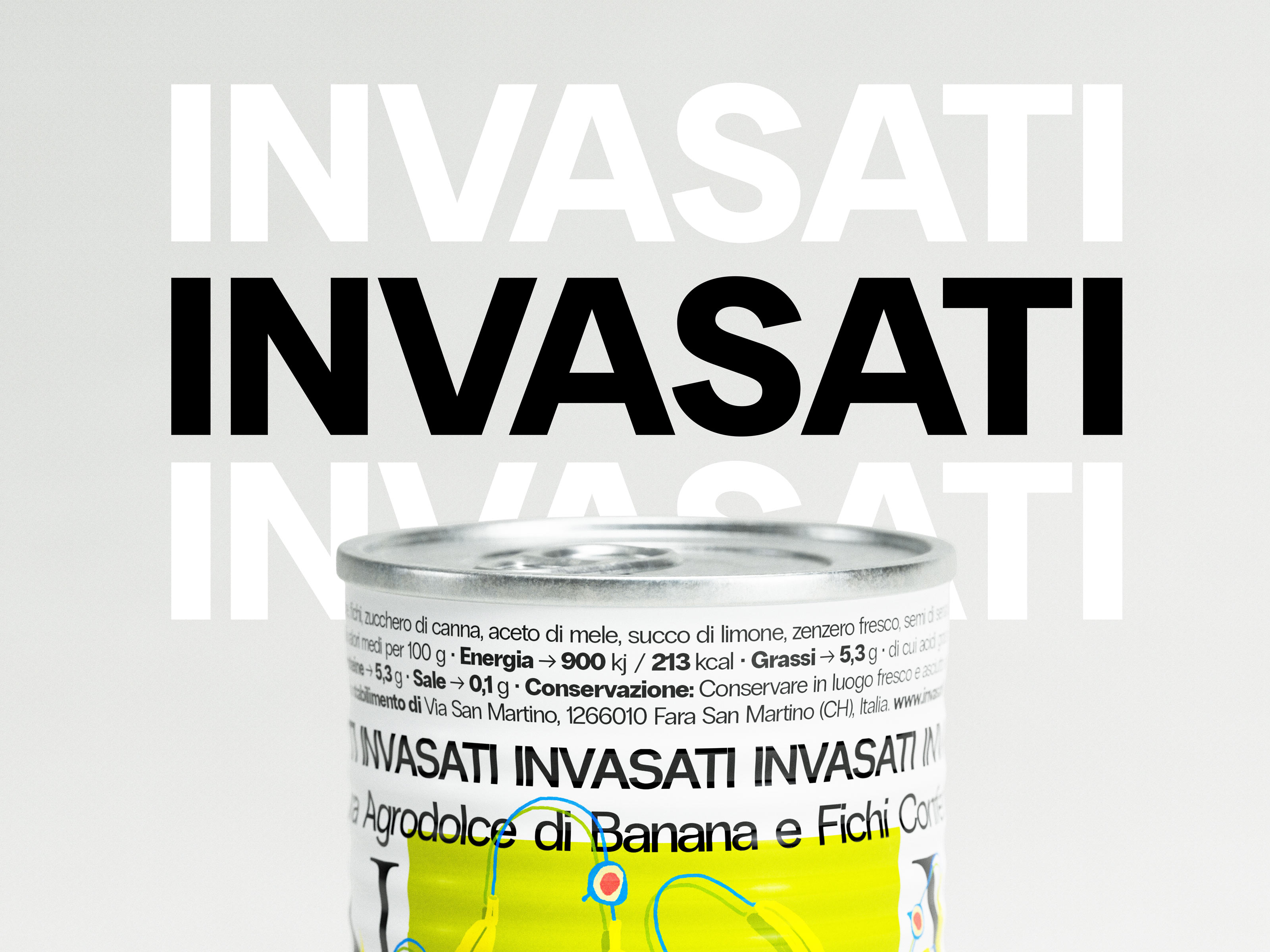
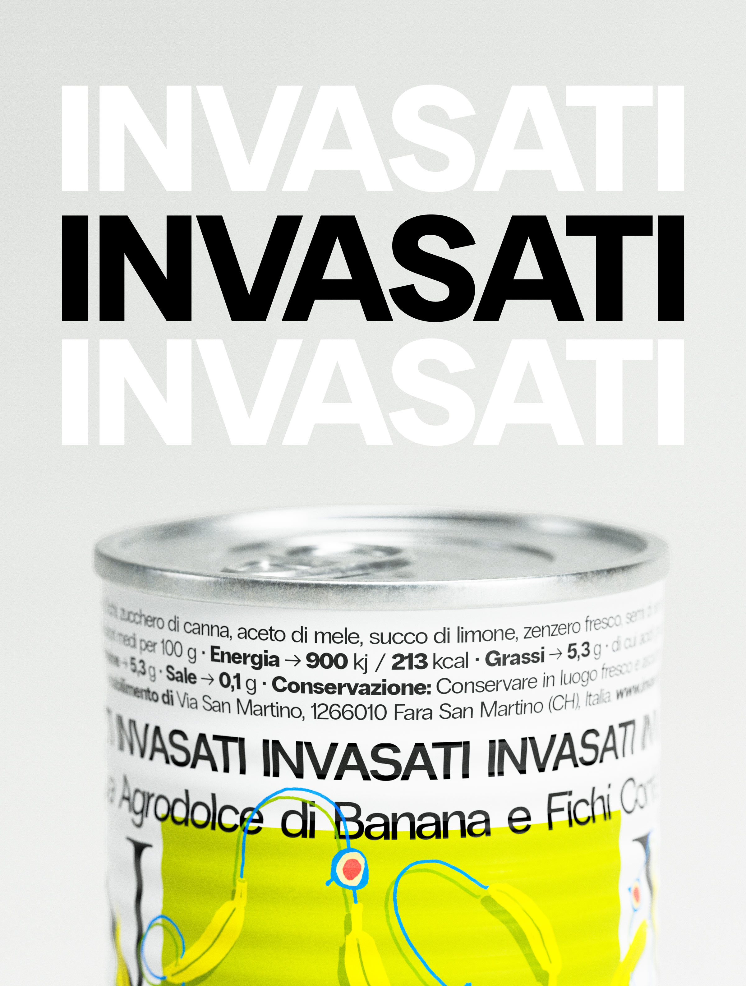
Solution - The design approach embraces brutalist typography and minimalist composition to create a bold, contemporary visual language.
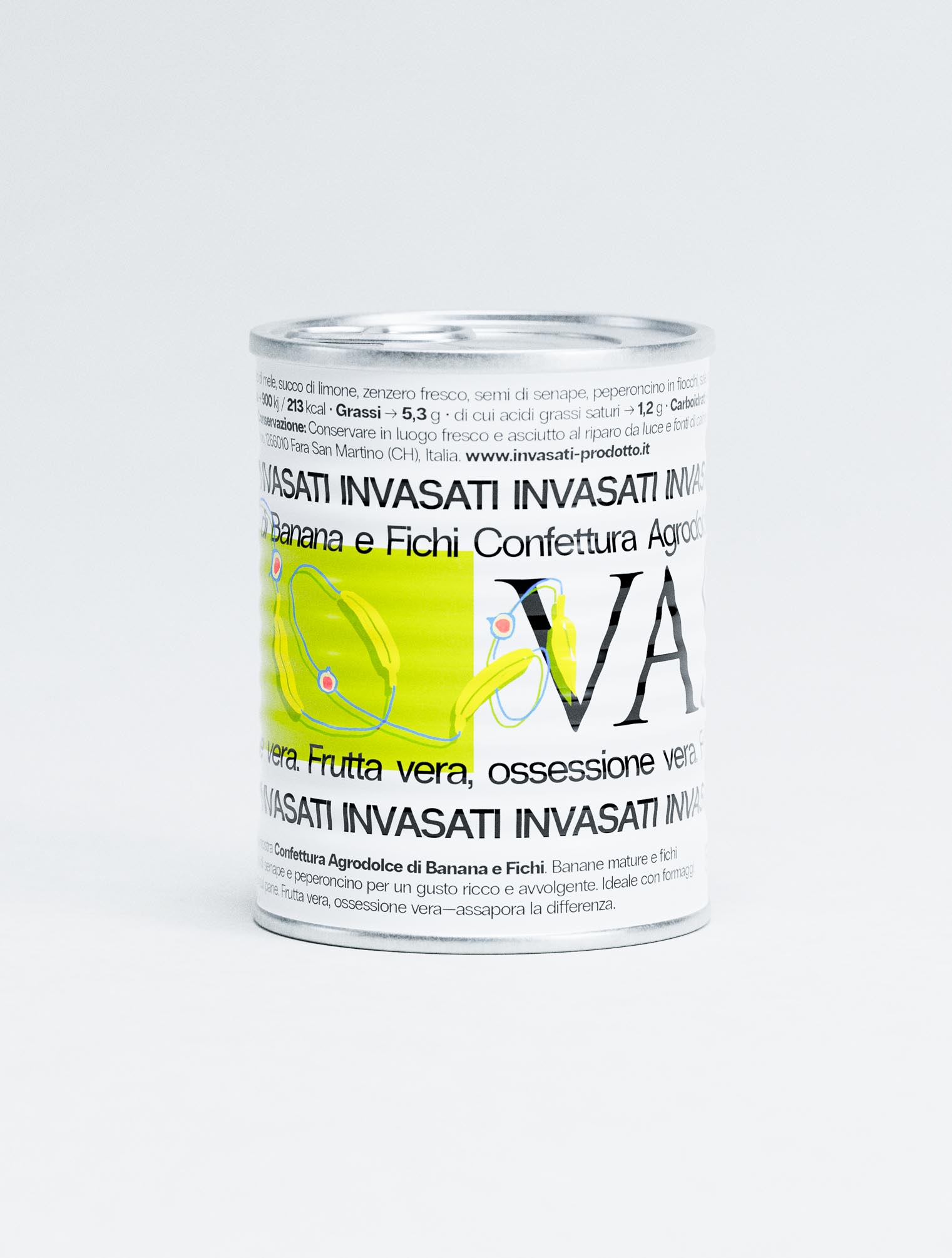
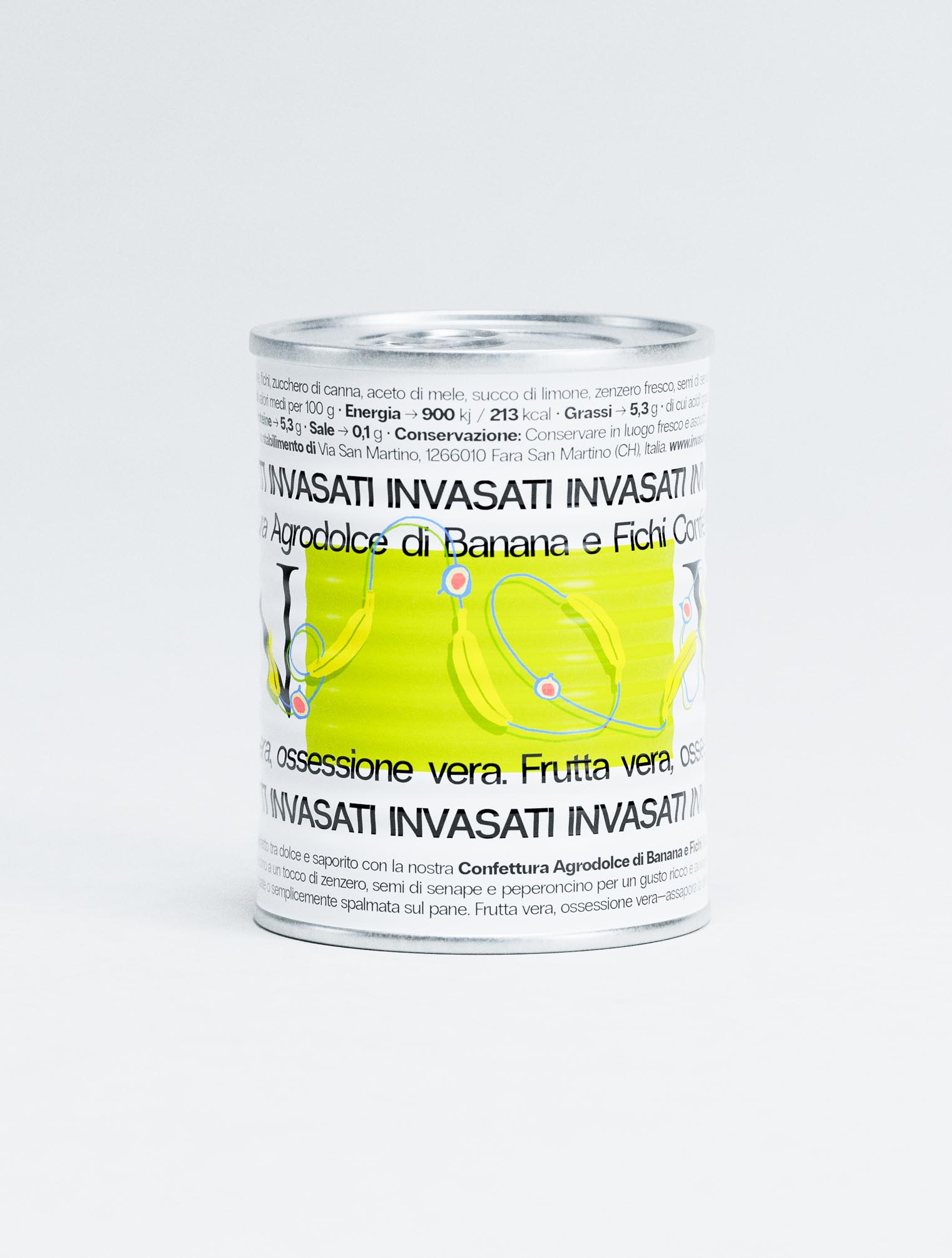
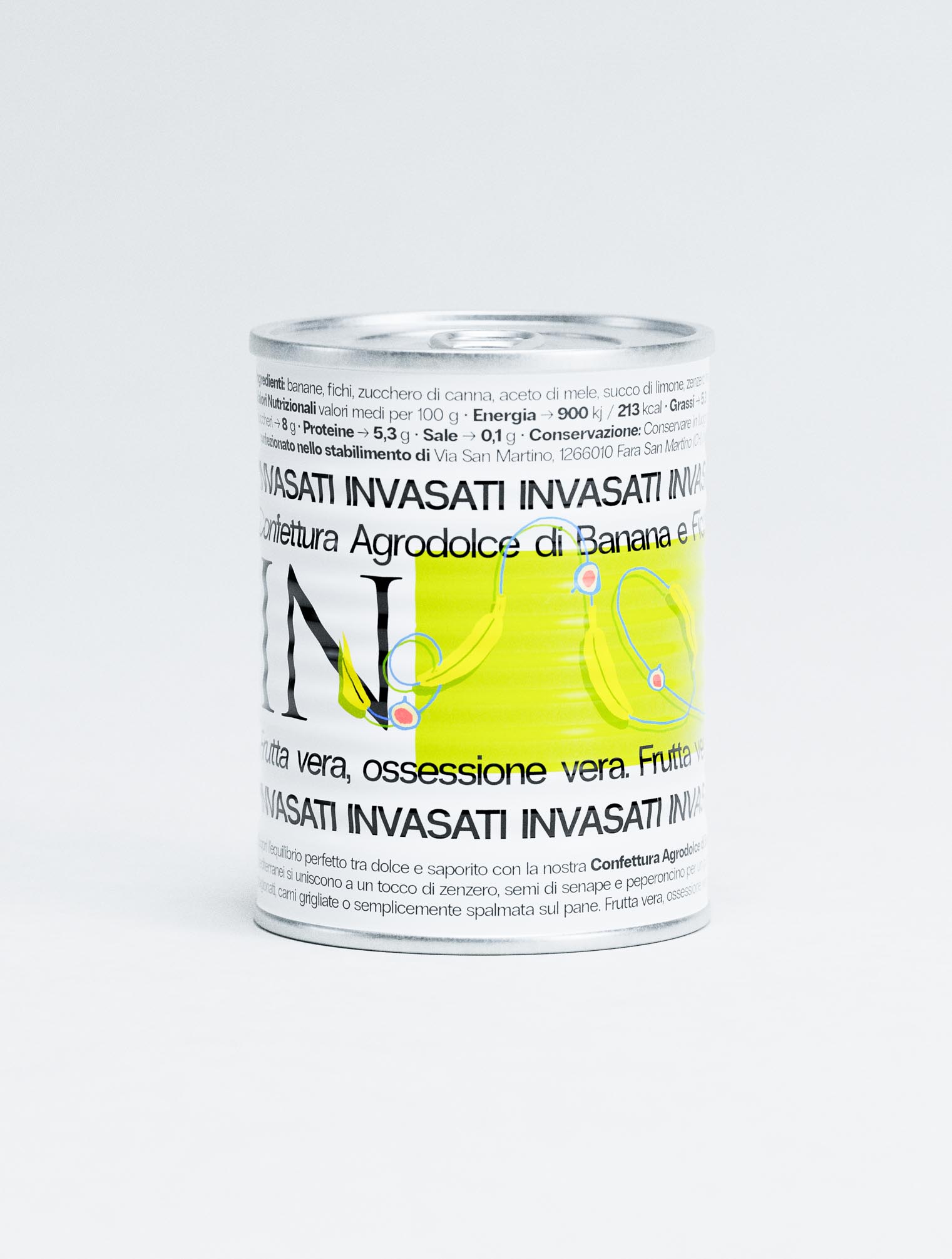
The use of the brand name "INVASATI" builds a dynamic pattern that speaks to the obsessive nature of preservation, while the vibrant backdrops provide a distinctive canvas and color that unifies the product line.
Simple ingredient illustrations in contrasting colors add a layer of playful sophistication, helping customers navigate the unique flavor combinations.
Details - Process began with naming exploration, settling on the concept of "invasati" - an Italian word that captures both the literal act of canning and preservation as well as the metaphorical state of being consumed by passion. This dual meaning became the foundation for developing the visual language.
Needing to work in harmony with the dominant typography while providing clear flavor cues minimalist illustrations were developed. Starting with realistic renderings before evolving into simpler, iconic forms.
Precise grid system ensured consistent placement of regulatory information and nutritional details without compromising the artistic integrity of the design.
The system successfully creates strong shelf presence through bold typography, clearly communicates product information through structured hierarchy, and maintains premium positioning through sophisticated minimalism. Importantly, it establishes a distinctive visual language that can flex and evolve as INVASATI develops its range of unexpected flavor combinations.