Vision.
Dylan had a specific vision for the brand, - lighthearted, fun, with a focus about New York.
Bright, accessible, delicious product.
The scope spanned naming, identity and brand with a focus on packaging, assuming active voice and likely product line expansion.
Bright, accessible, delicious product.
The scope spanned naming, identity and brand with a focus on packaging, assuming active voice and likely product line expansion.
Client.
Earnest Pursuit sources, scores, and roasts coffee with distinct flavor profiles.
Dylan Marvin, the creator behind Earnest Pursuit, reached out based on the aesthetics of Condensed Milk and Dulce de Leche work.
Dylan Marvin, the creator behind Earnest Pursuit, reached out based on the aesthetics of Condensed Milk and Dulce de Leche work.
How it developed.
Two creative concepts were were explored while structural packaging range (and there are a lot of options for coffee) was estabished.
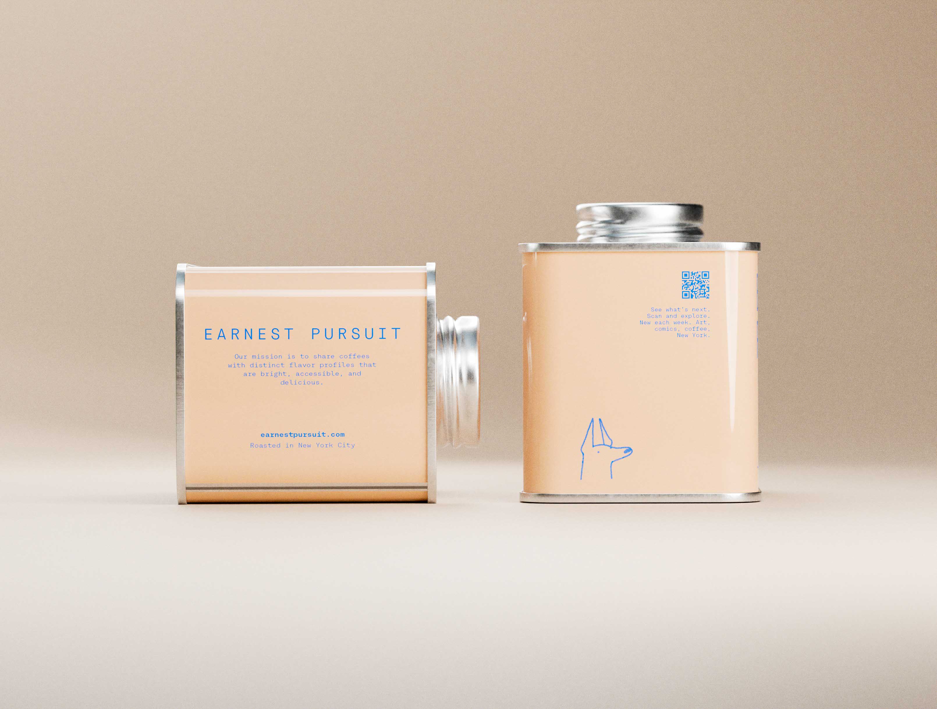
Through a few rounds of creative direction and visualized structural design we finalized and finessed the near final form you see here.
Through a few rounds of creative direction and visualized structural design we finalized and finessed the near final form you see here.
Finally.
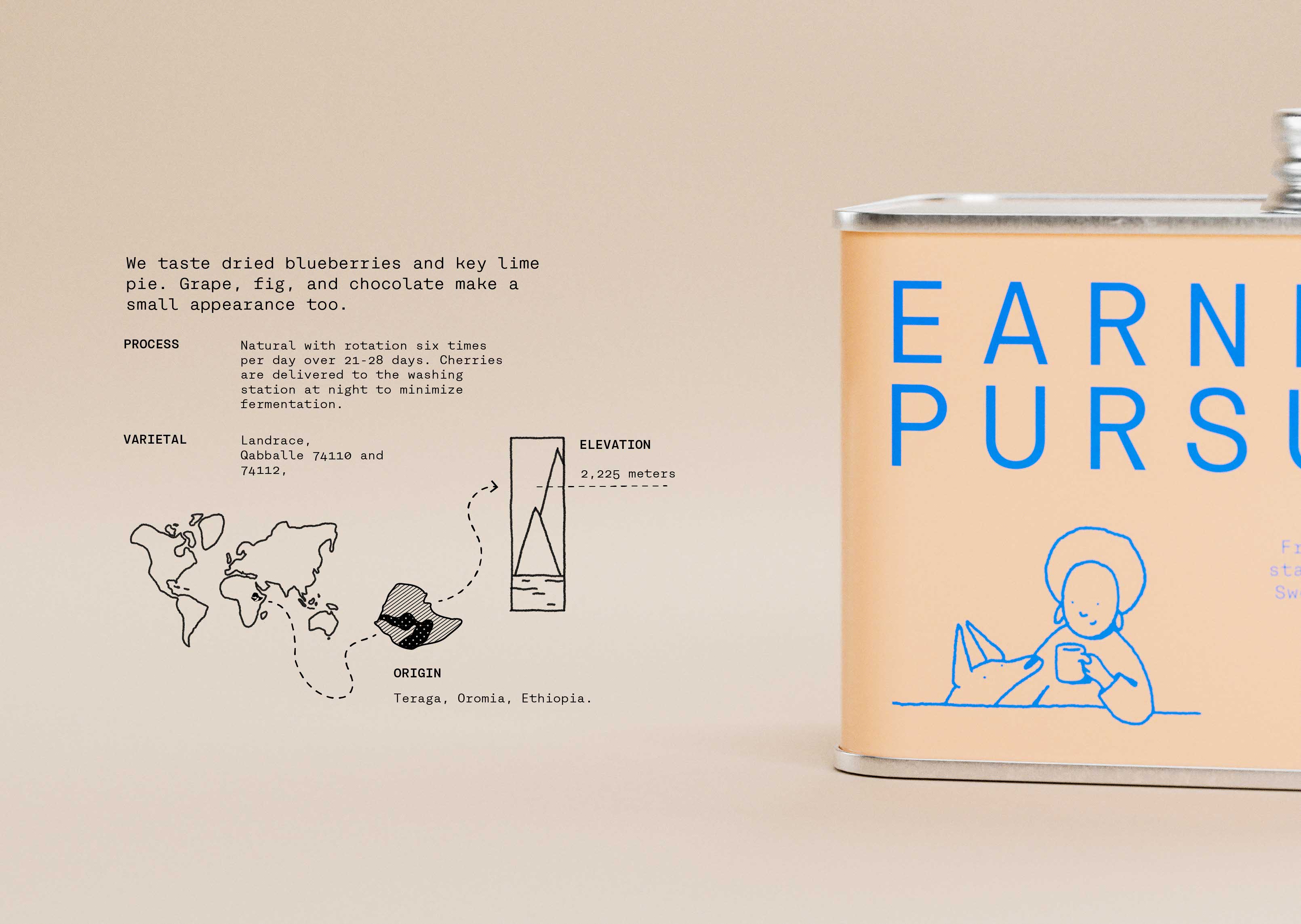
Minimal New Yorker style cartoons and a expressively structured typeface, set by hand in paired color combinations on high gloss, spot printed metal tins.
Illustrations highlight pleasant mundanities of day-to-day life and drive stories about coffee and day to day life in New York.
Illustrations highlight pleasant mundanities of day-to-day life and drive stories about coffee and day to day life in New York.
Specialty coffee, New York City.
Name, brand, packaging, art and creative direction, communications and manufacturing setup.